So many restaurant and bar experiences are focused on bringing high end food to the masses. Each chef trying to out chef the other with an experience that mounts to lackluster and oversold. Common Man is a restaurant and bar in Melbourne, Australia with a different approach. It’s designed inside and out for the everyday person who puts in a hard day’s work. As a result the materials chosen for the interiors through design accoutrements all pull from residential and classic design.
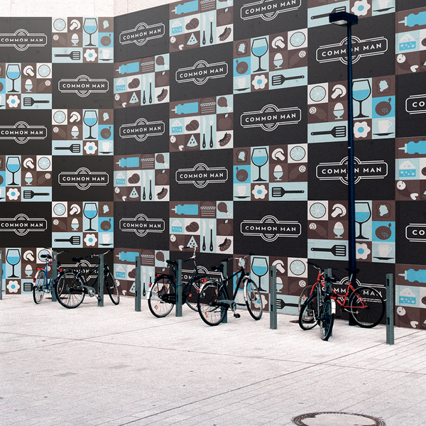
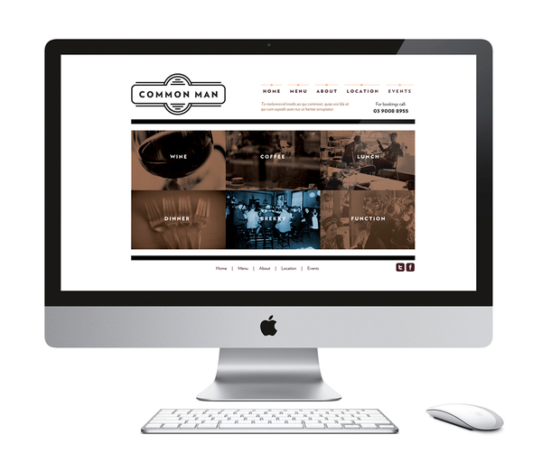
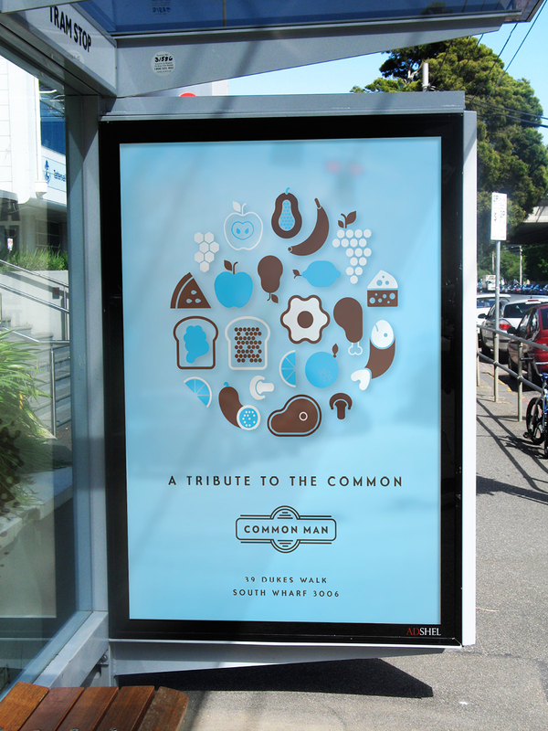
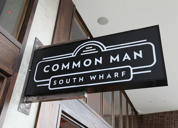
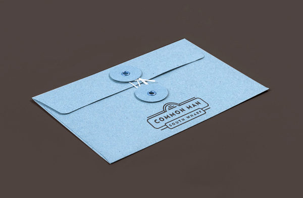
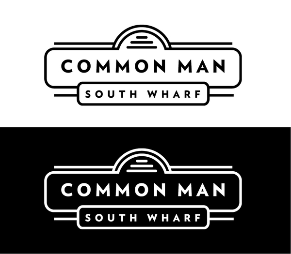
The identity is centered on an art deco style logo that features simple typography encased in simple geometric shaped lines. This is a nod to the times when a hard day’s work usually involved a lot of sweat, elbow grease and weathering the elements.
The designer, Josip Kelava, explains a little further:
Common Man is a restaurant bar. Offering satisfying rustic, hearty meals and a range of local and imported beers fit for a hunger created by a hard days work. A hub of hearty meat pies, pasta and pizza… the staples that have erased hunger in bellies since days of yore.
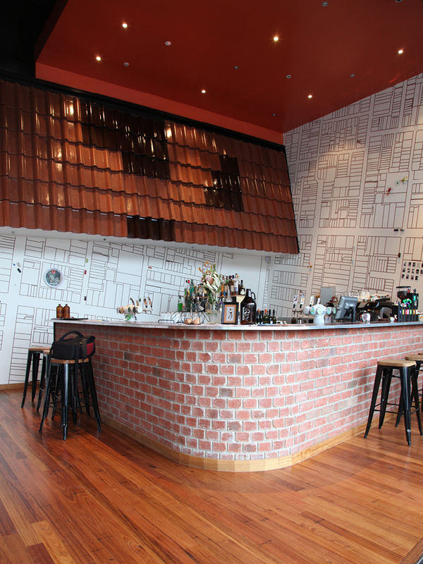
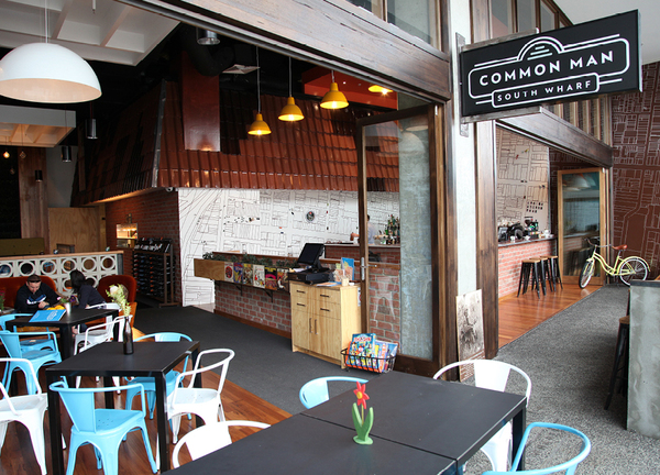
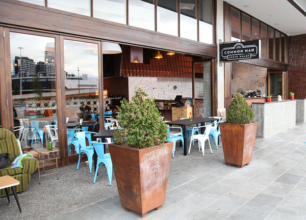
Everyday residential building materials have been used in the design – bringing the exterior into the interior. The canopy for the kitchen is finished in familiar red ceramic roof tiles and bricks and besser blocks have been used to build internal storage/bars and joinery. A green wall at the back of the space that acts as a garden in the leafy inner east suburbs.
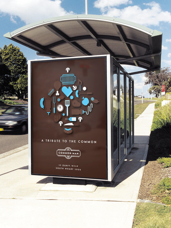
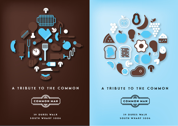
Common Man is a tribute to the working men and women of Melbourne town. A reflection on where they lived, worked and played to shape the city that Melbourne is today. Its interior design resembles the four corners of Melbourne, providing a different visual experience every time you visit.


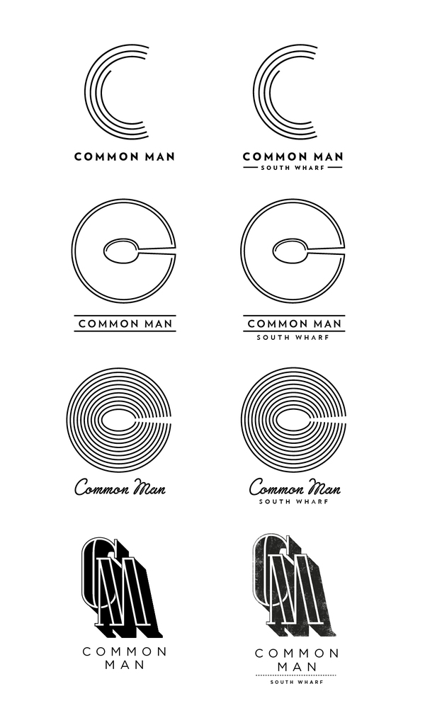
Other logo design directions not chosen:



One Response
Pretty neat