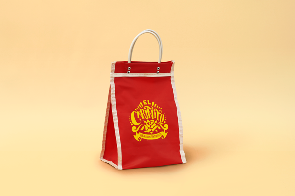
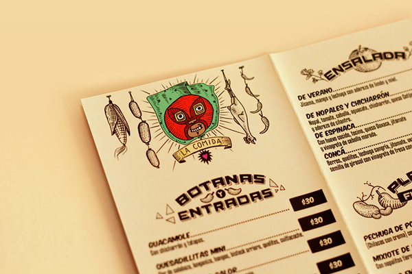
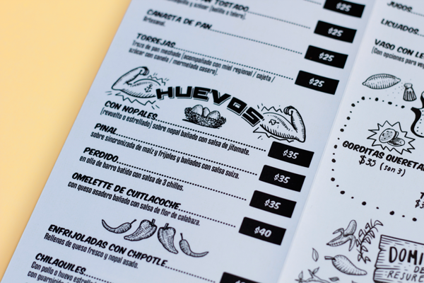
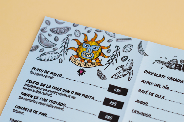
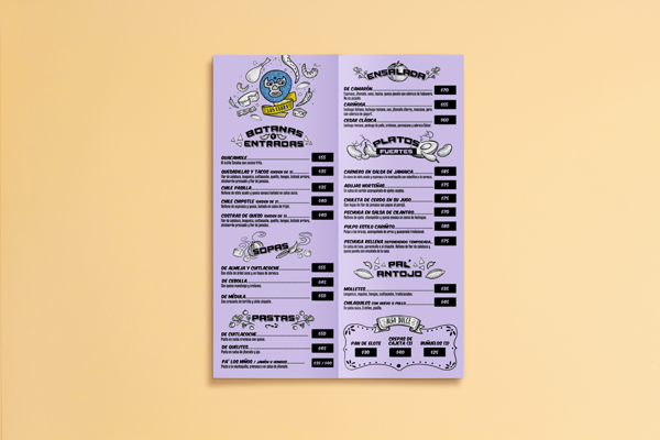
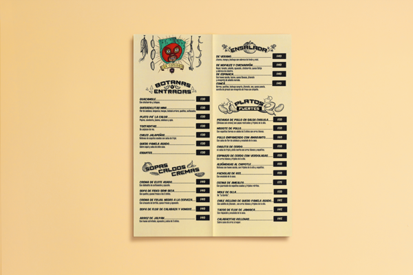
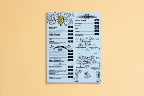
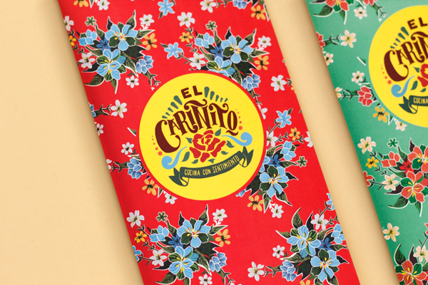
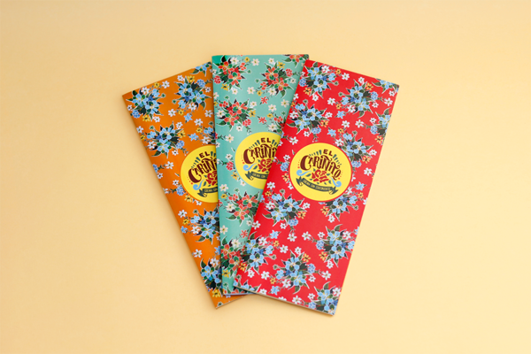
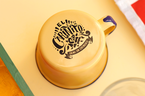
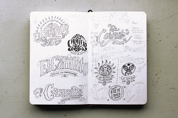
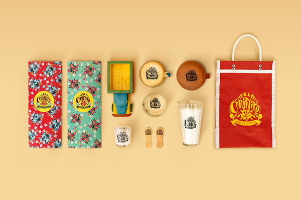
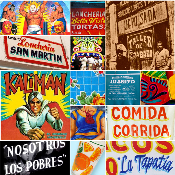
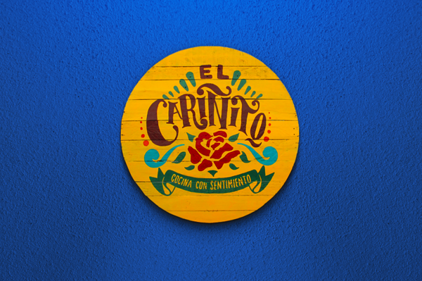
The brand for El Carinito cocina con sentimiento is identified by a strong primary color palette with pops of illustrative florals and various other Mexican iconography. The bright color palette mixed with the hand drawn illustrations and typography create the approachable effect desired by the restaurant. Abraham Lule, the creative brain behind this restaurant brand, quotes the client as saying:
[They] wanted us to evoke a laid-back marketplace atmosphere with hints of mexican kitsch elements in their logotype and in the restaurant branding. In order to represent a traditional culture without shout out clichés in every element, we focused on what defines a typical restaurant in town, besides the food, the higher colorful aesthetics that brings folk into a every detail of the eating experience.
I especially enjoy the extra thought put into the design of the restaurant’s takeout packaging and check presenters. Very well done.

