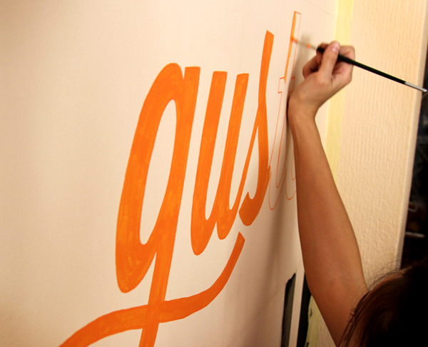
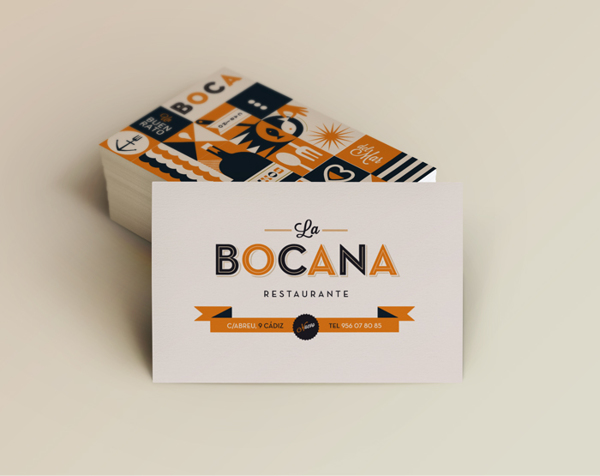
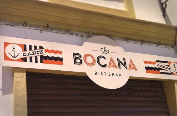
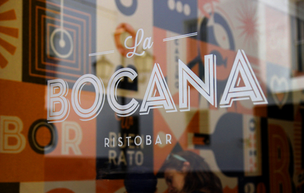
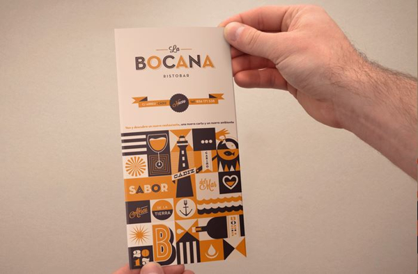
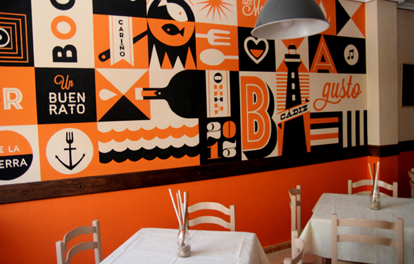
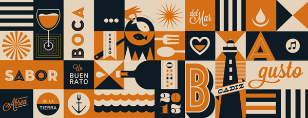
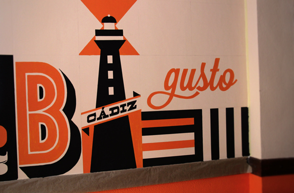
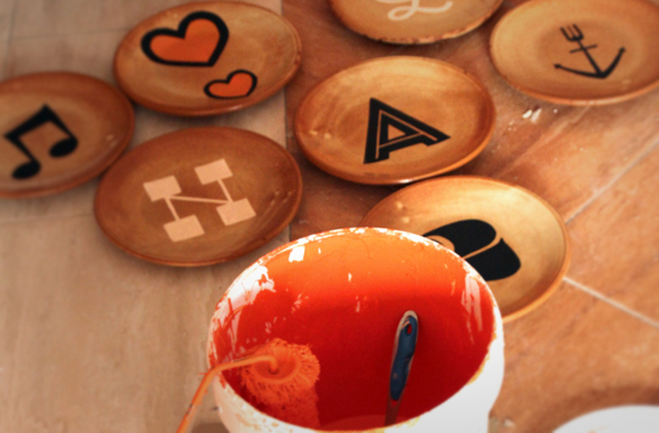
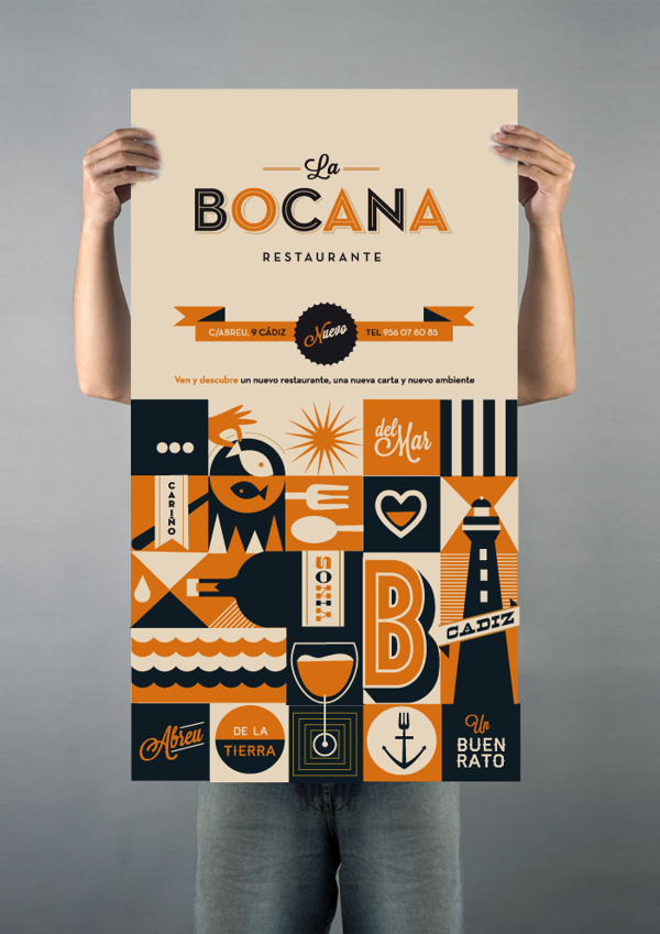
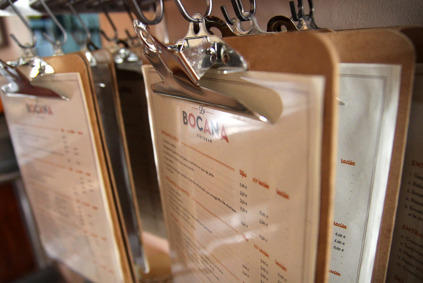
La Bocana’s limited color palette is based on a bright orange warmth. The supporting colors are variations in the same family making a ultra-approachable vibe inside and throughout the identity. With graphic treatments seen in print materials repeated throughout the space, this restaurant / bar brand identity has a complete, cohesive look about it. The interiors are complete with murals pulling in typography treatments and awesome illustrations. Excellent work by Raul Gomez Studio.
