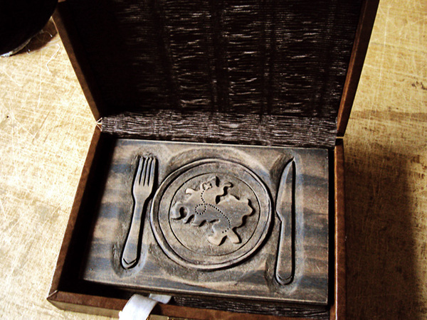
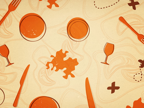
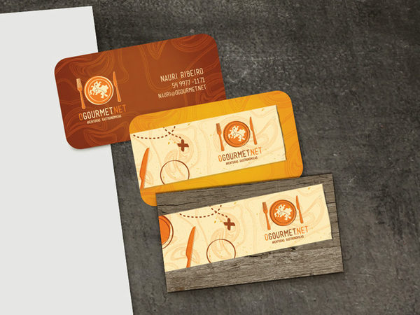
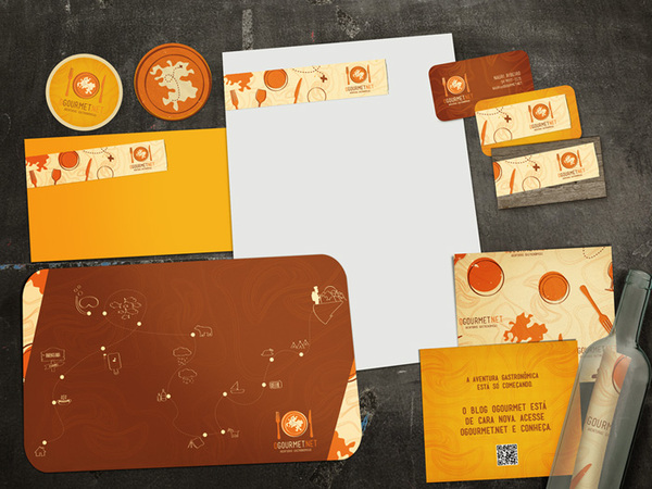
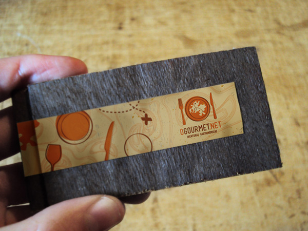
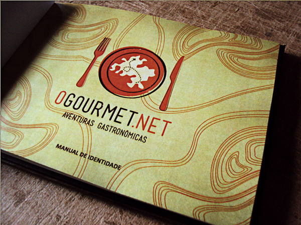
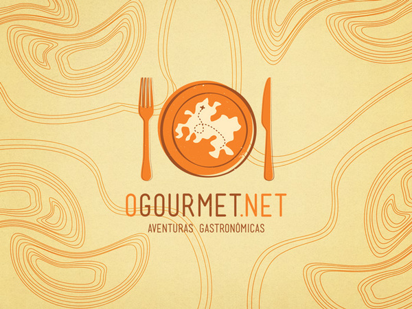
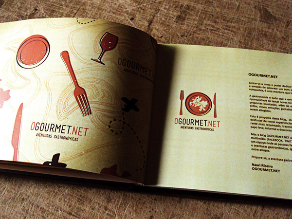
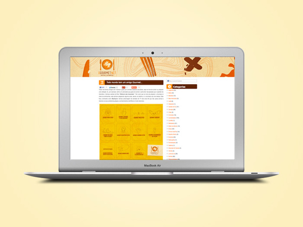
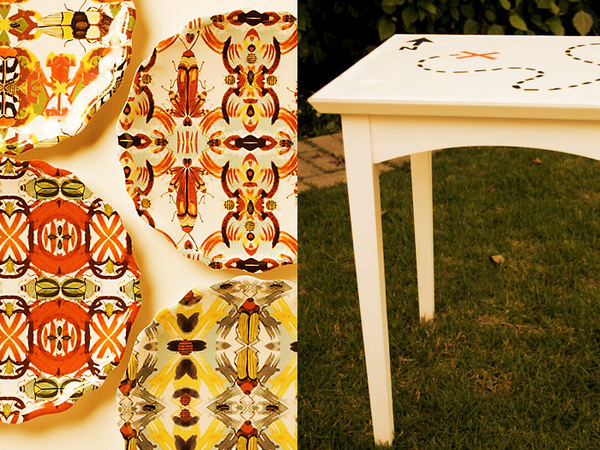
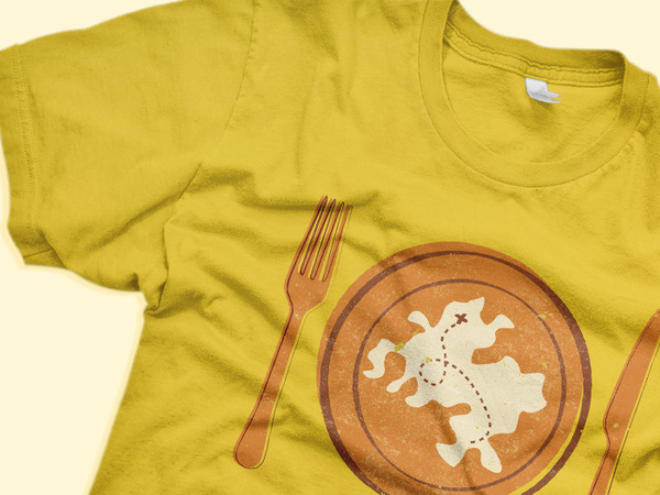
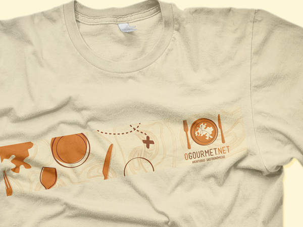
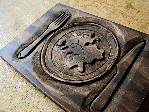
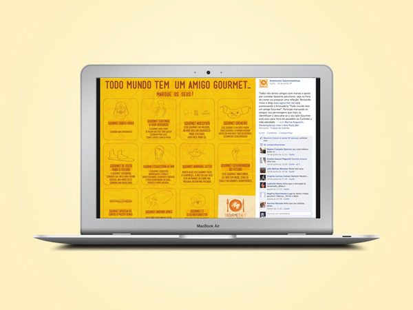
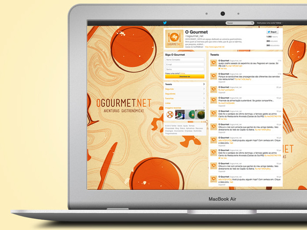
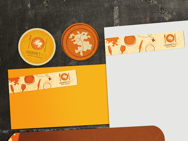
The branding for this online food service is pretty on point. It’s fully thorough in its execution throughout the many touch points from promotional items through standard brand stationery. Bigode out of Brazil pulls in rustic, earthy textures via wood and natural prints then overlays an earthy color palette to send the vibe home. The use of classic treasure map imagery adds an explorative element making the connection to exploring new flavors and food ideas. It supports the tagline of “Adventurous Gastronomy”
