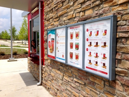
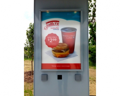
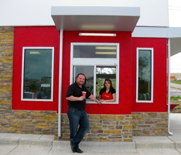
Seattle’s Best Drive-through concept

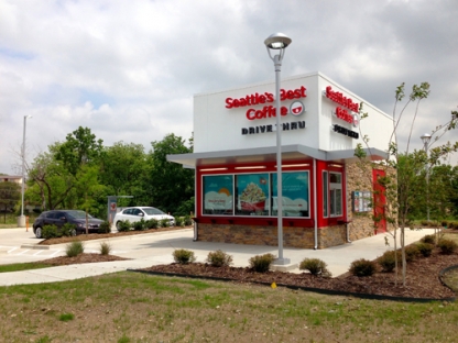
Starbucks has set the bar very high and the other major players in the coffee space are struggling to keep up. Seattle’s Best tried partnerships with various retailers to push their goods with some success, but it seems like they want to take it a step further with their own branded experience with a drive-through window just like their parent company, Starbucks, and rival, Caribou. After rebranding a few years back, Starbucks really came into its own as a coffee brand. With a fresh, vibrant look to oppose the calming, cool look of Starbucks, Seattle’s Best has it’s own vibe and story to tell.

I’m not aware of who designed the building or supporting promotional graphics. Please comment if you know who helped put this together so I can give proper credit.
SB Camera_500

SB DaveThompsonValarieFloyd DriveThru Window_500

SB Exterior_500

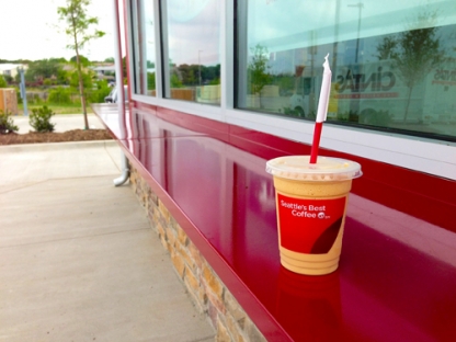
SB Ledge_500


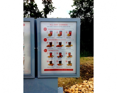
SB Menu Board Combos_500

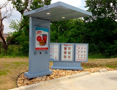
SB Order_500

SB Walkup_500

Discuss this Project

Leave a Reply

This site uses Akismet to reduce spam. Learn how your comment data is processed.

The Forktales Podcast™: Interviews with restaurant industry leaders and visionaries

Restaurant and advertising industry headlines and thinking

Reviews of restaurant experiences from around the globe 

Reviews of our favorite design, business, & restaurant books

Our favorite typography and fonts

Inspiration in your inbox

Get the latest inspiration in your inbox every Monday morning, for FREE!

"*" indicates required fields

This field is for validation purposes and should be left unchanged.

Delicious Bits in your Inbox!

Get the latest and greatest content delivered to your inbox for free!

"*" indicates required fields

This field is for validation purposes and should be left unchanged.