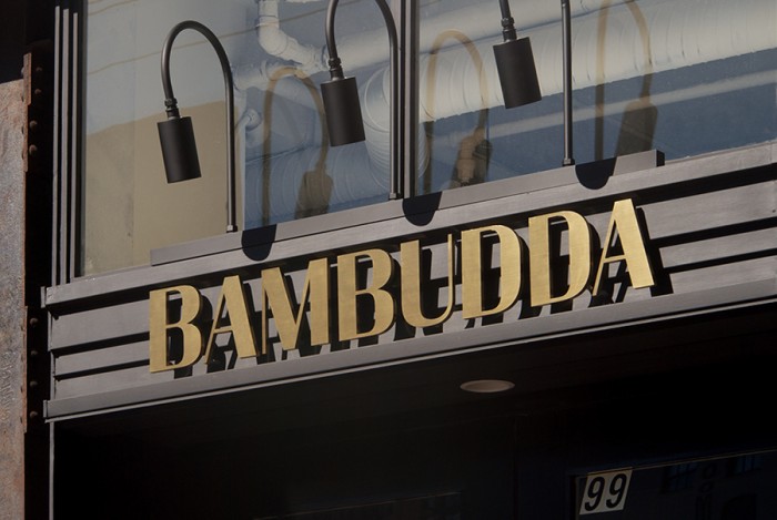
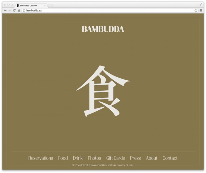
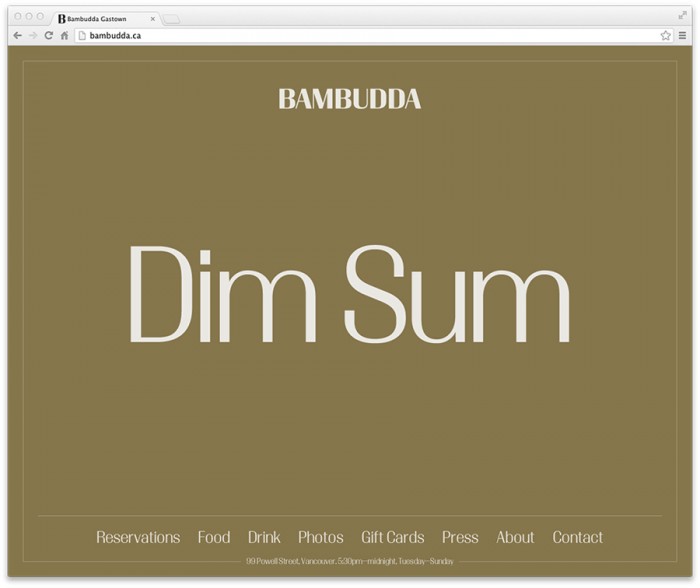
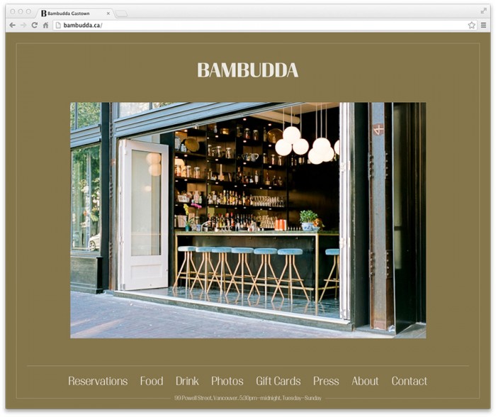
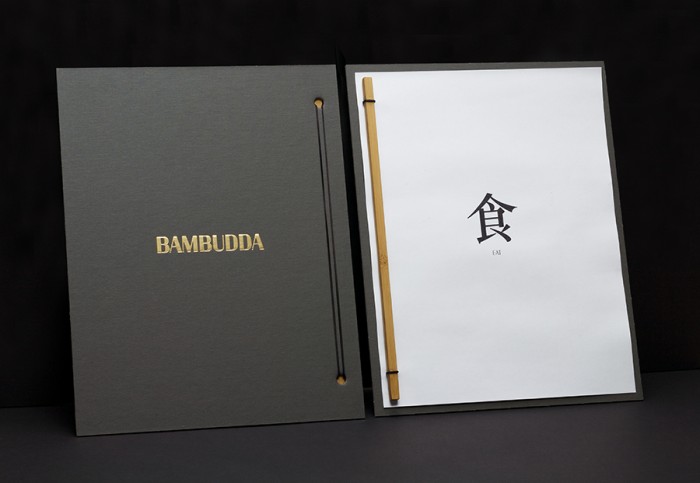
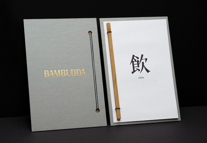
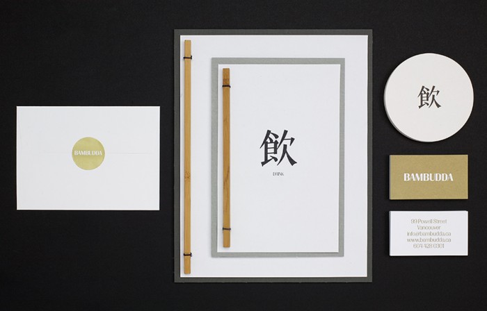
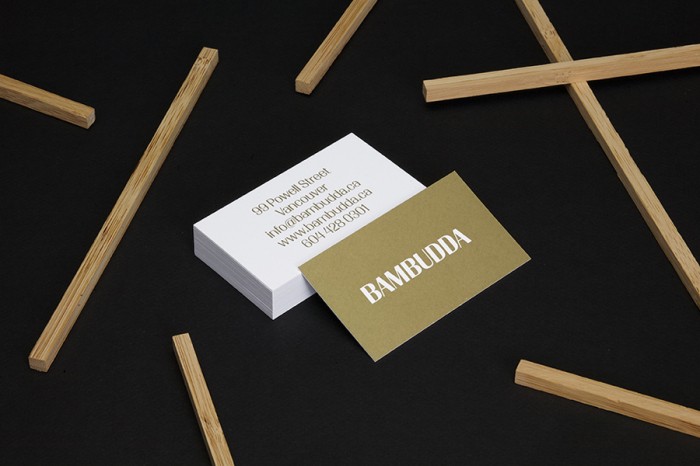
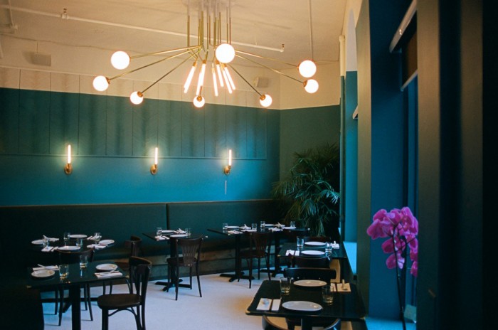
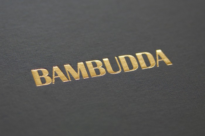
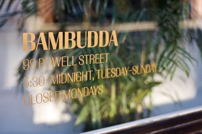
Typography and a muted color palette are at the epicenter of this asian-inspired brand identity. The large floods of color and texture set the stage for simple typography and copy to jump out and get attention. Using the colors of bamboo is a subtle, yet effective way to send home the vibe and name of the restaurant. It’s confident and elegant through and through.
The Forktales Podcast™: Interviews with restaurant industry leaders and visionaries
Restaurant and advertising industry headlines and thinking
Reviews of restaurant experiences from around the globe
Reviews of our favorite design, business, & restaurant books
Our favorite typography and fonts
Inspiration in your inbox
Get the latest inspiration in your inbox every Monday morning, for FREE!
"*" indicates required fields