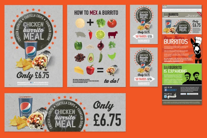
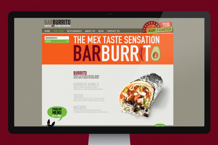
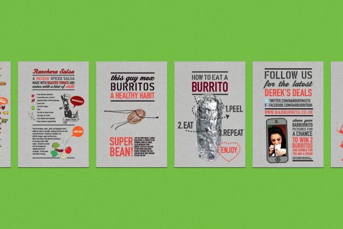
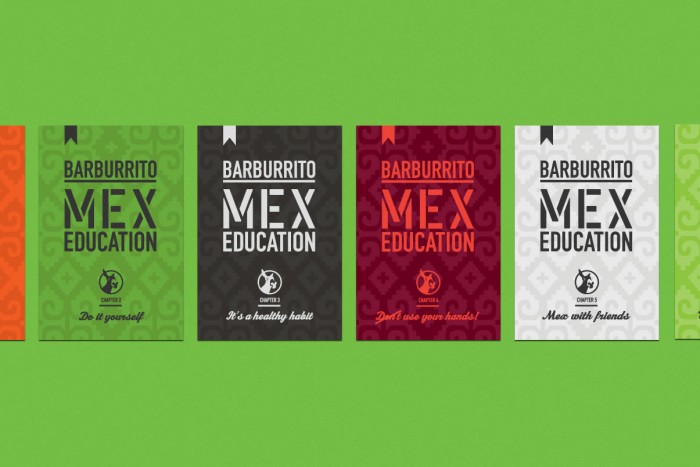
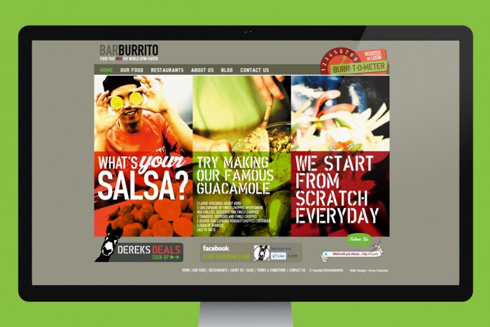
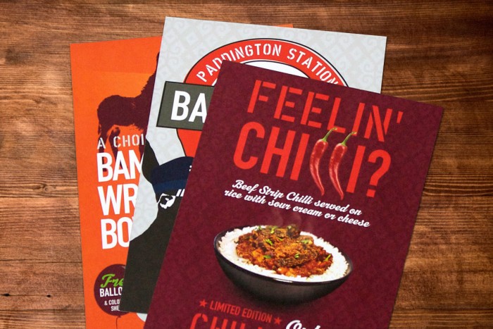
I covered more work for Barburrito, a chain of burrito joints in England, previously on here, but this work goes a bit further into the brand. Ahoy, a creative studio in England, was at the helm of directing the brand’s design and identity. With fresh color combinations and large typography, the brand has a unique look without being too wild. They have fun with introducing the food and vibe through multiple touch points like website, email marketing, fliers, etc. Job well done. Wish there were more to show. 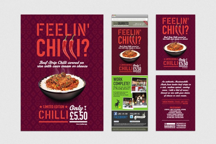
The Forktales Podcast™: Interviews with restaurant industry leaders and visionaries
Restaurant and advertising industry headlines and thinking
Reviews of restaurant experiences from around the globe
Reviews of our favorite design, business, & restaurant books
Our favorite typography and fonts
Inspiration in your inbox
Get the latest inspiration in your inbox every Monday morning, for FREE!
"*" indicates required fields


