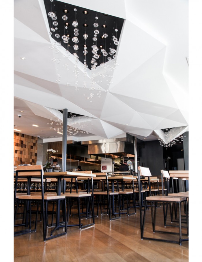
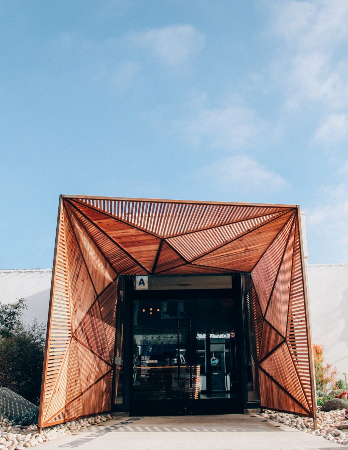
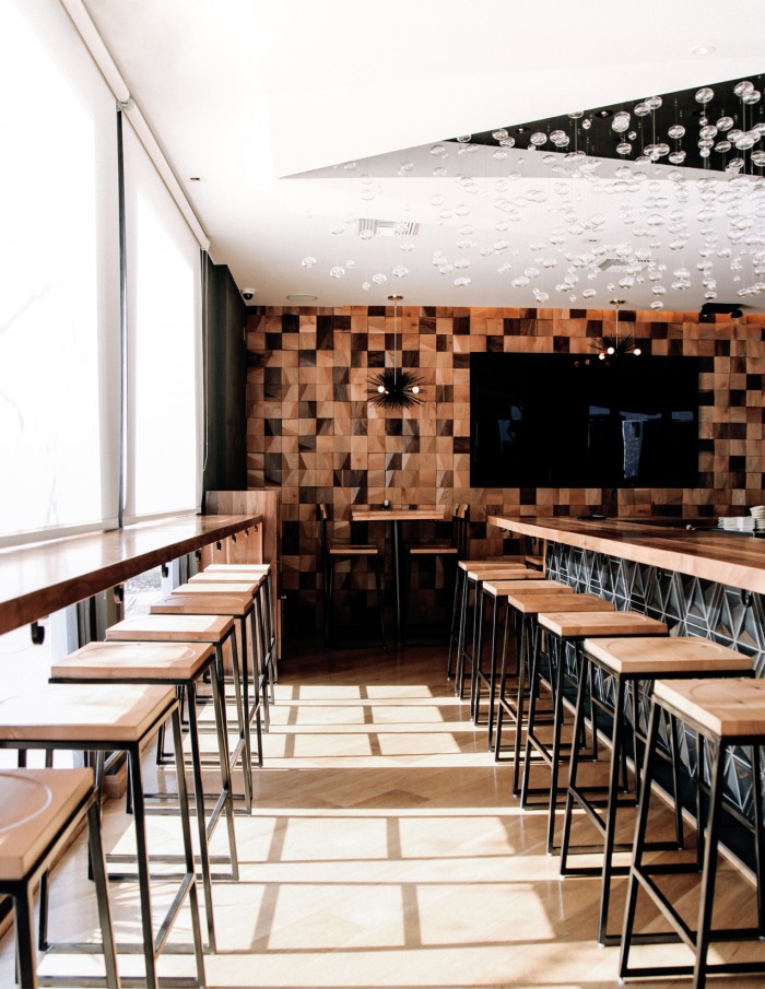
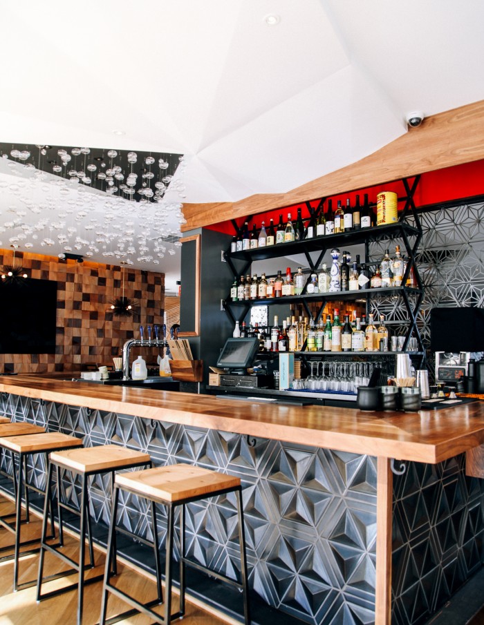
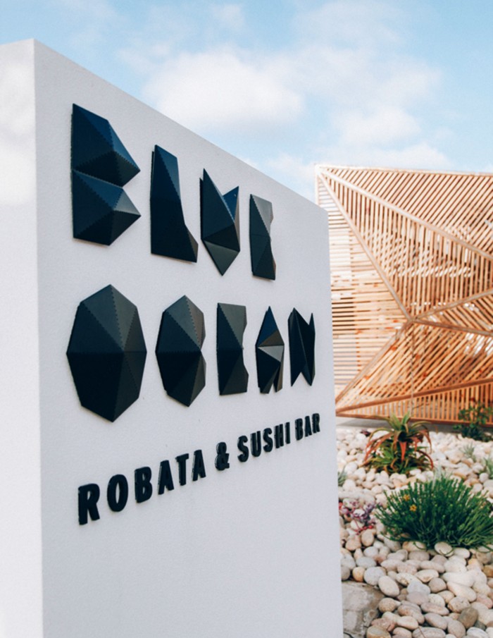
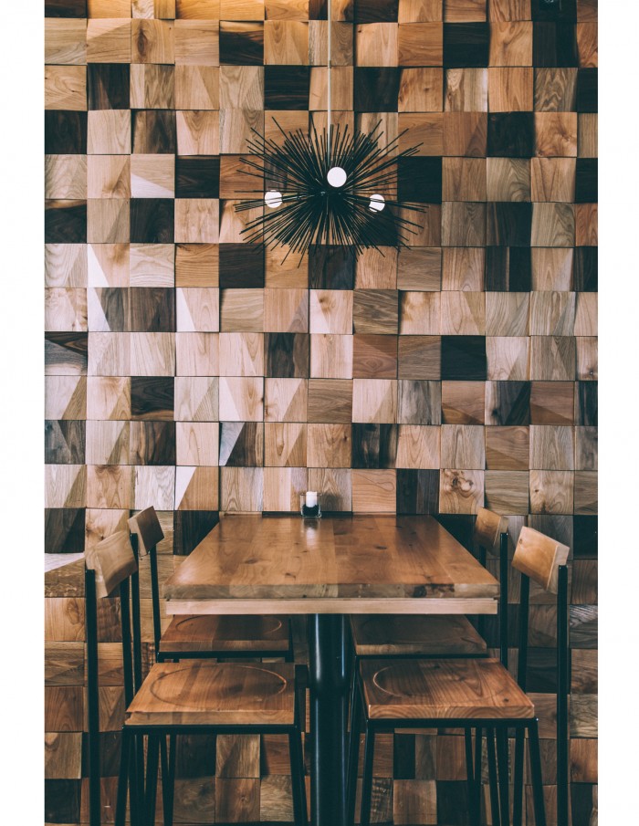
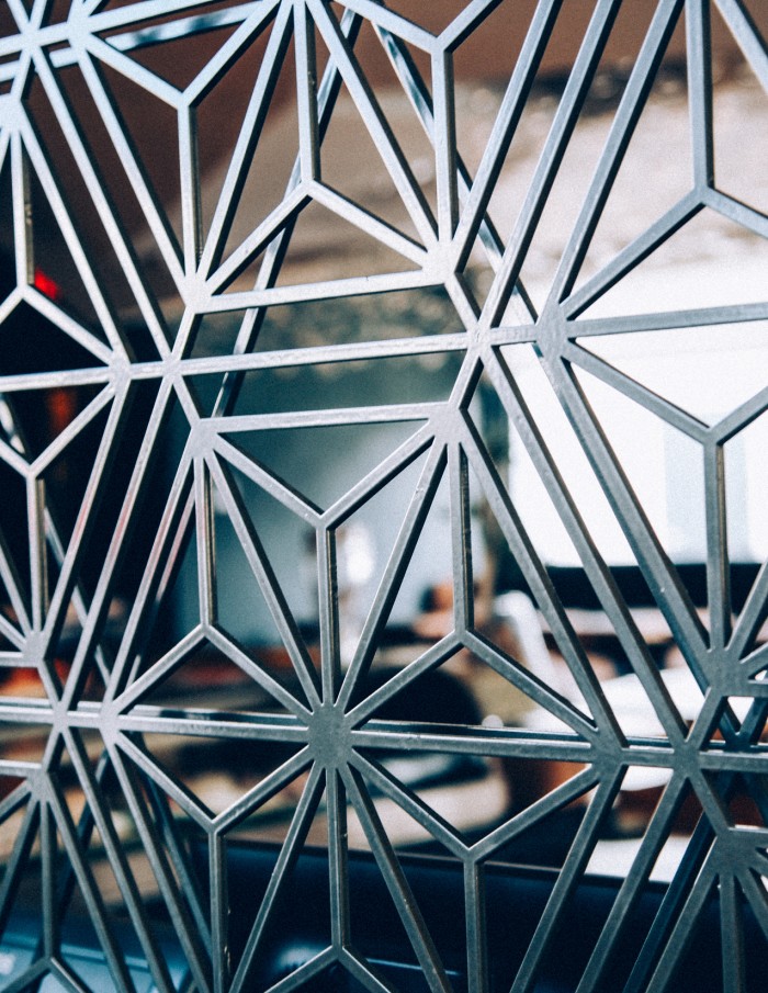
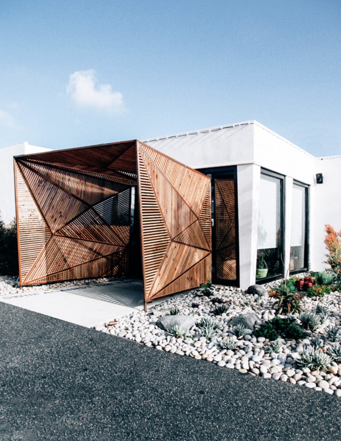
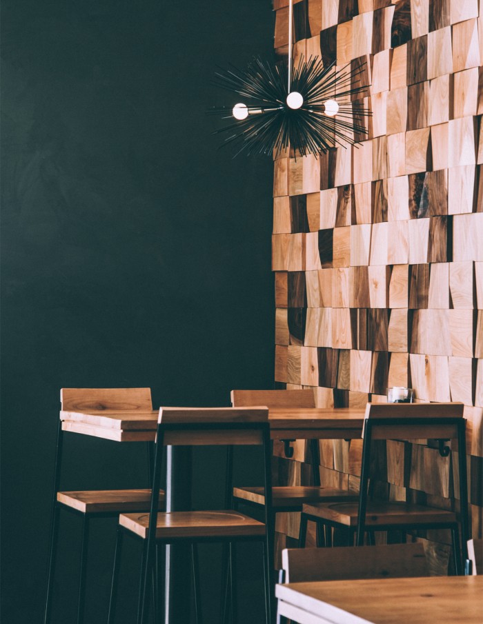
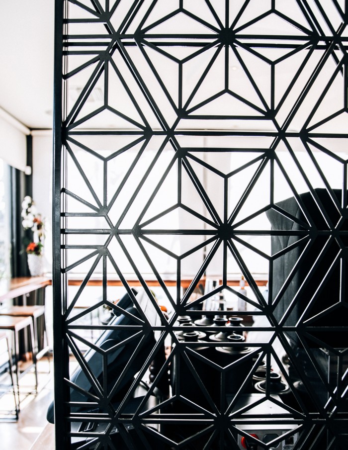
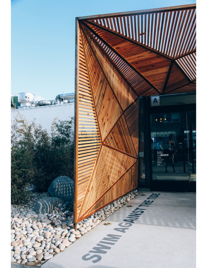
The geometric shapes used throughout the interior and exterior design of Blue Ocean are iconoclastic. They are so unique and strong. These strong lines are used throughout the restaurant experience from the ceiling to divider pieces. It creates a styled texture that reminds one of the ocean if it were made of shapes instead of fluid. Excellent work by Bells & Whistles out of California.
