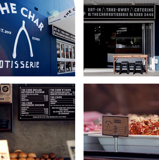
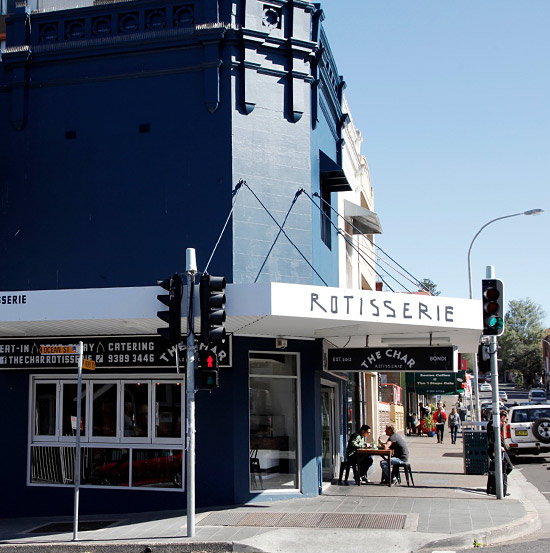
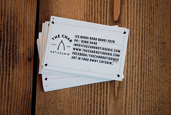
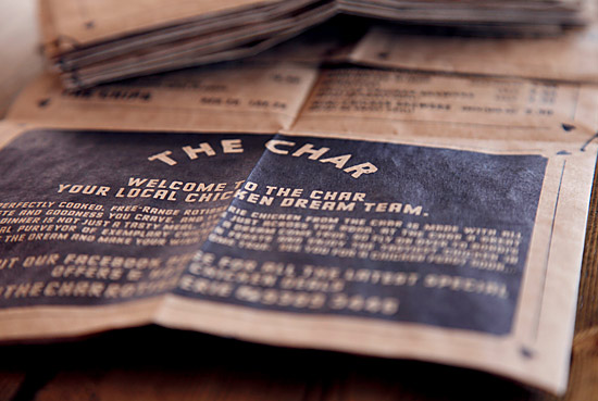
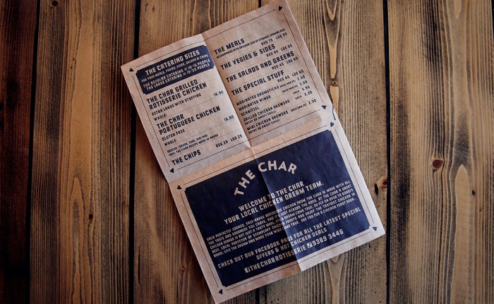
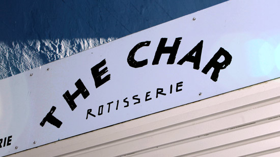
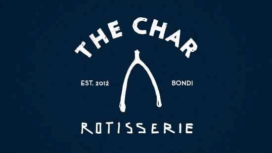
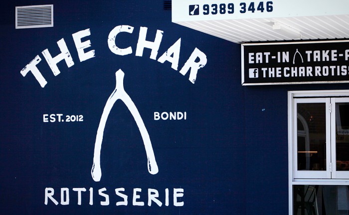
Loving the work The National Grid (design studio behind Rocket Boy Pizza branding) has put together for their restaurant clientele. It’s simple, but smart and memorable. Their work for The Char Rotisserie is no exception. Leveraging the common shape of a wishbone, and a limited color palette, the brand is elevated beyond the expected style of a rotisserie. The strong deep blue color isn’t what you’d expect, but it works and gives the brand a strong base for the typographical treatments.