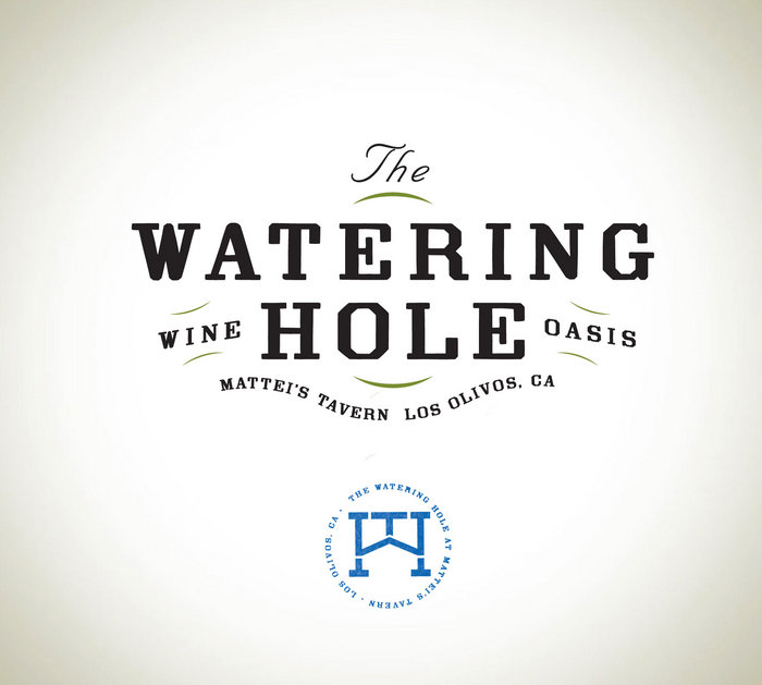
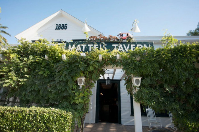
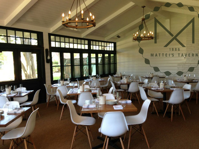
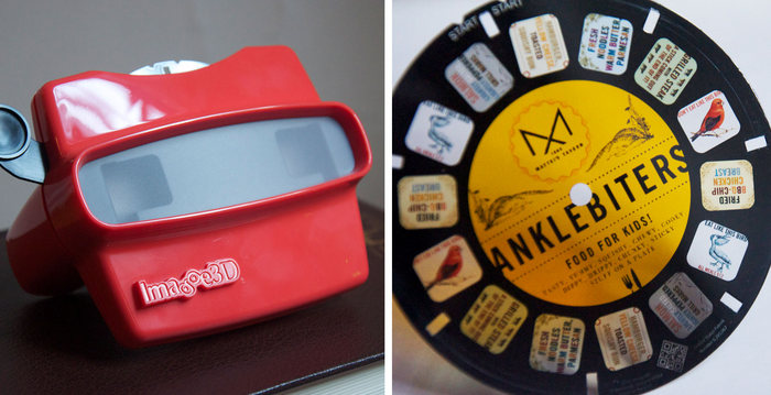
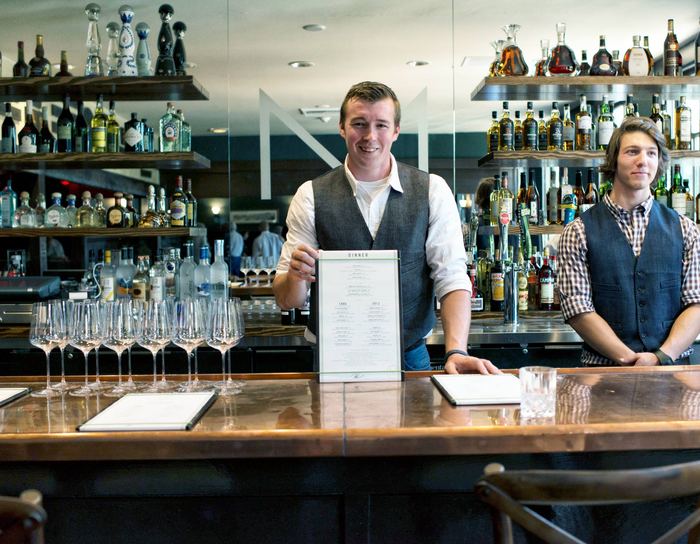
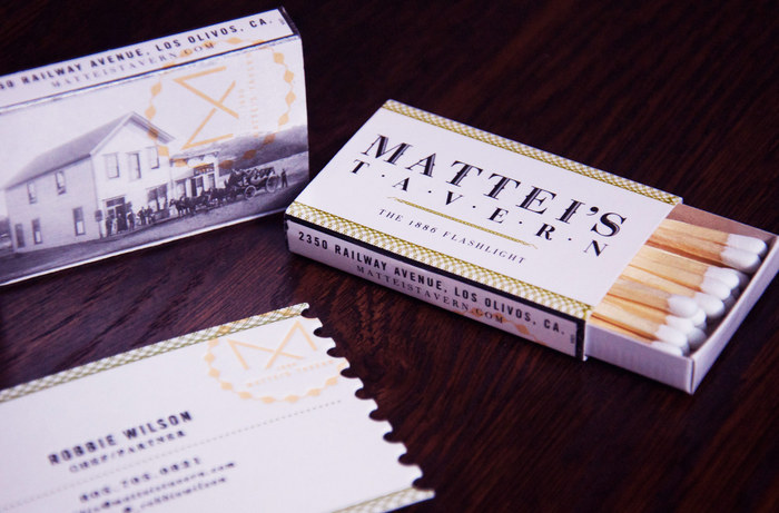
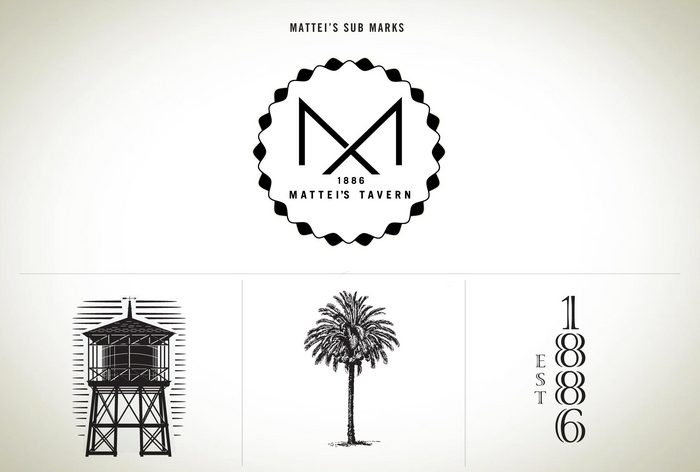
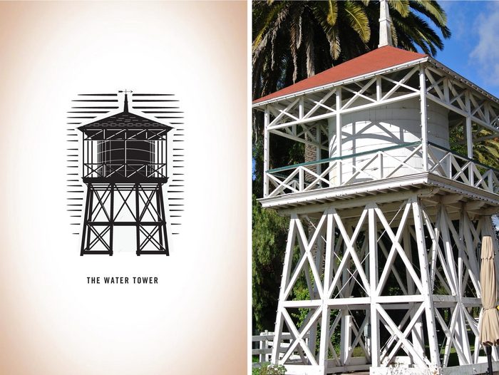
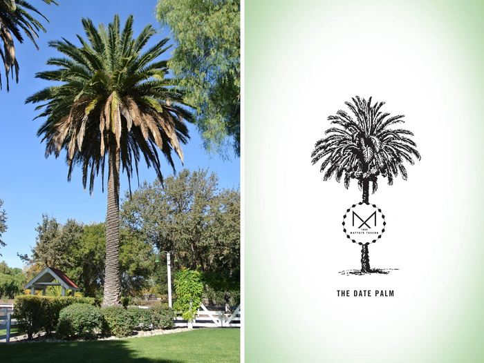
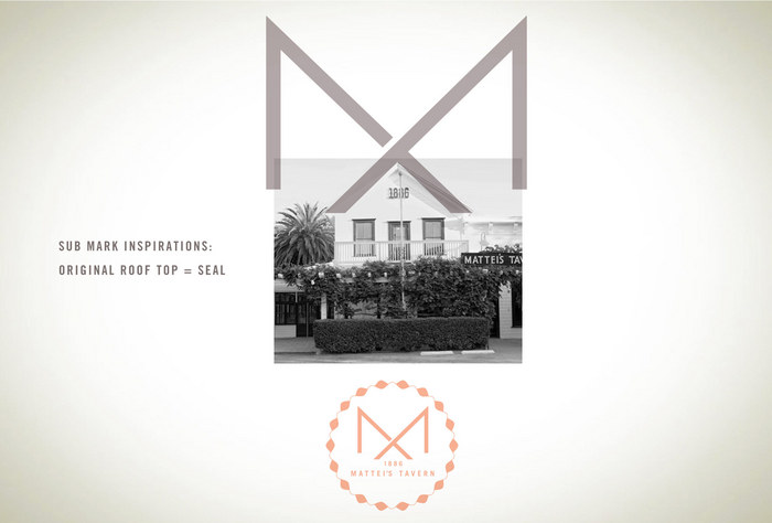
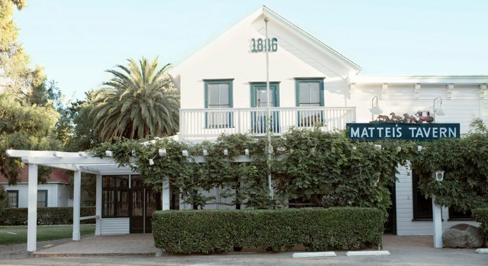
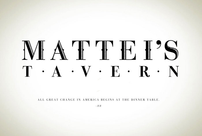
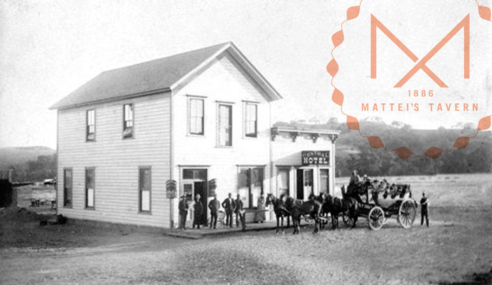
Everything about the brand identity work for Mattei’s Tavern is excellent. Each piece carries the graphic language of the brand but takes it further adding in new elements that match the brand while pulling into context. This carefully crafted restaurant branding work was by the hands of Boy Burns Barn. You may remember our interview with John Turner of BoyBurnsBarn from earlier this year.
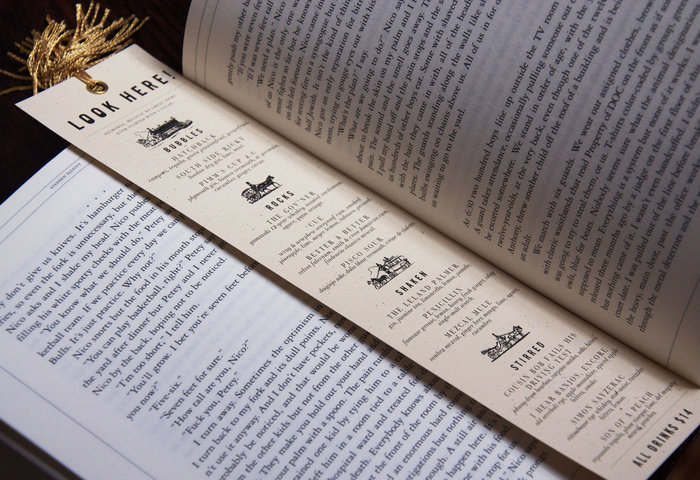
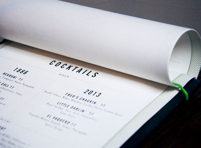
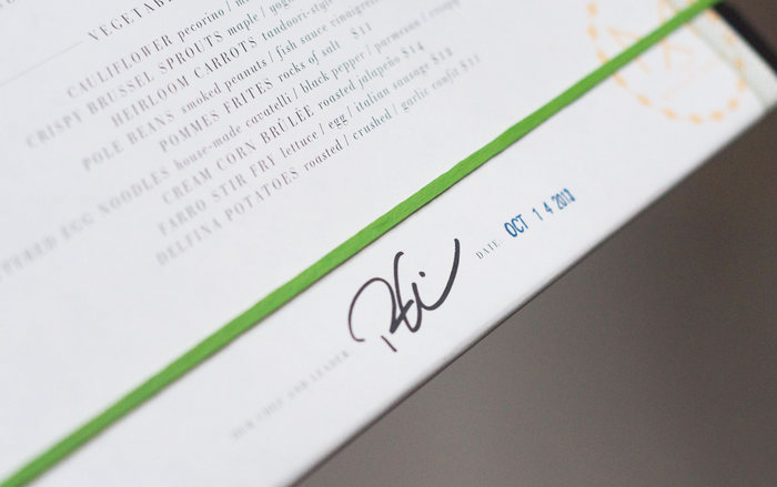
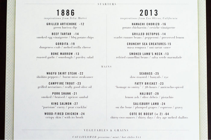
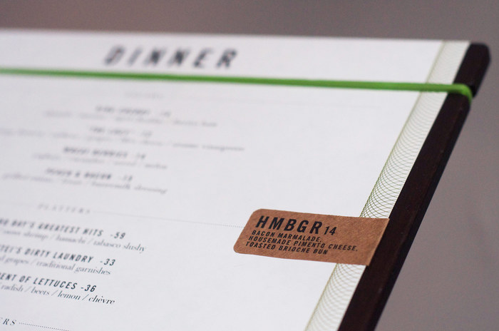
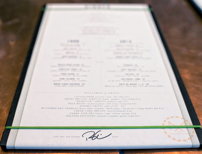
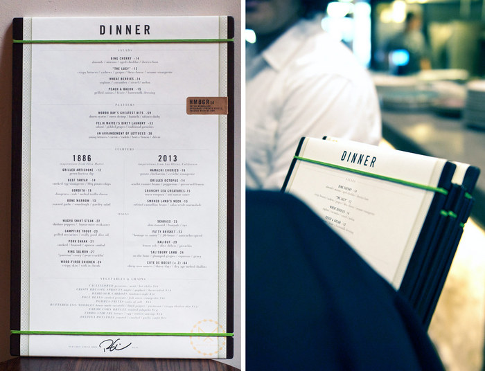
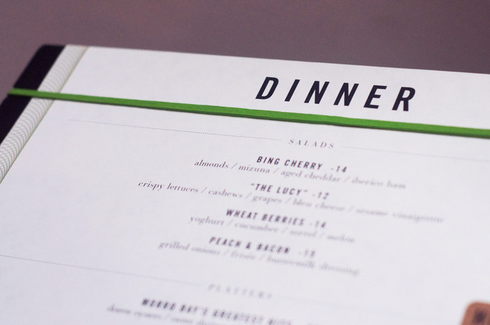
Mattei’s has an ultra classic feel with the attention to detail found in modern design. Instead of slapping a cool logo across many touch points, every piece of the puzzle has context and thought. The menus are well executed melding strong grid systems, but caring classic design aesthetics. This keeps things easy to read, while making them intriguing and fresh.
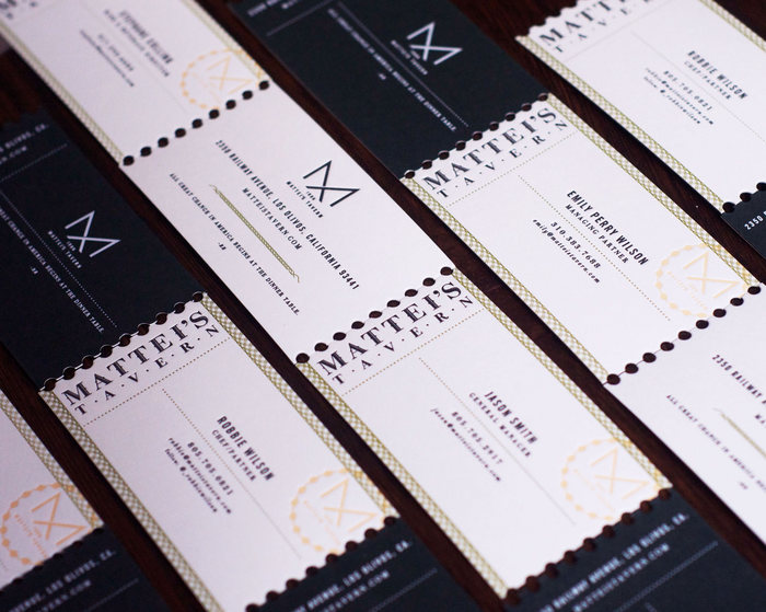
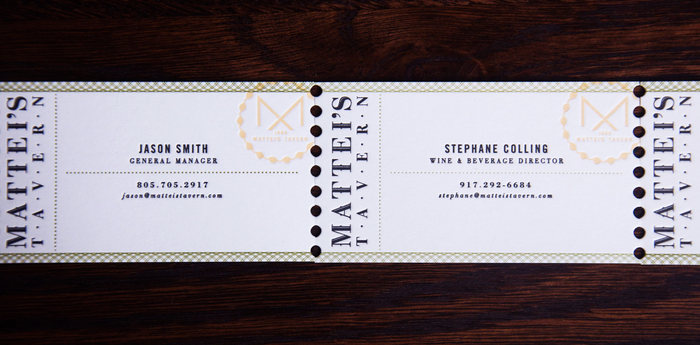
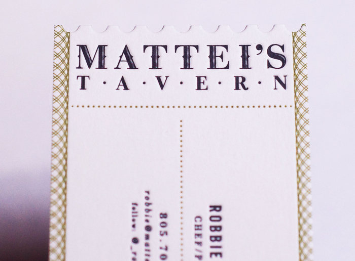
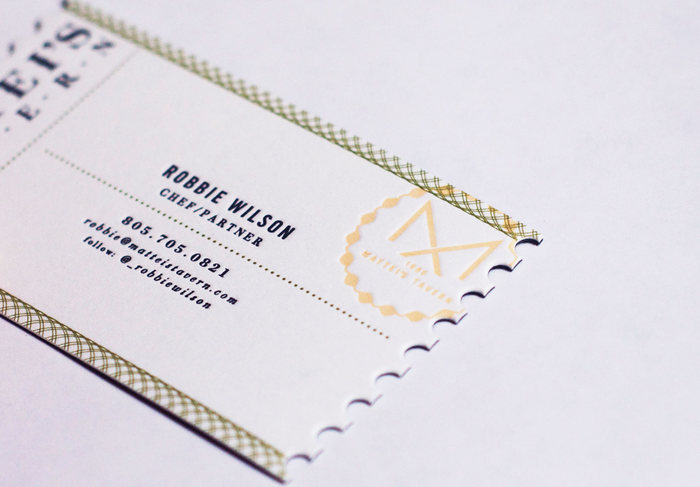
The business cards are an excellent example of how printing techniques can make a business card so much more. Worth the extra money in that they get attention. The restaurant’s business cards look like old fashioned raffle tickets, but done in the Mattei’s brand style.
Enjoy this piece of excellence.
