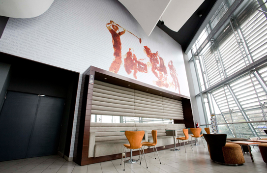
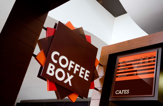
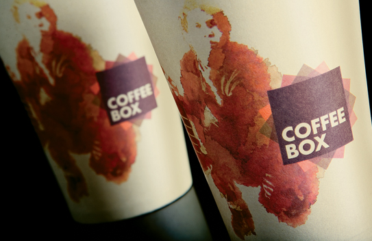
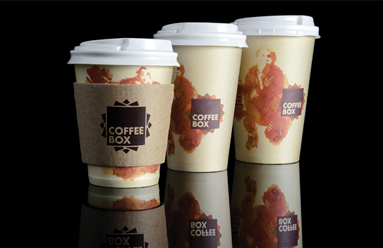
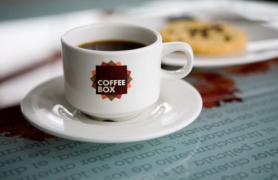
The identity for Coffee Box is especially interesting because it displays how to properly think through a logo design for a restaurant. It’s not about just one application and then you’re done. Coffee Box’s logo has variations for limited color palette, as seen on the coffee cup wrap, as well as a more three dimensional application as seen in the signage. Together they all support the same vibe and look, but take the restrictions or opportunities into account to make it better. The rest of the identity for Coffee Box is excellent with ink wash style illustrations in the color of coffee stains and modern style interior elements. Designed by Infinito.
