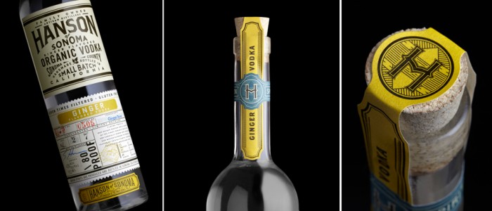
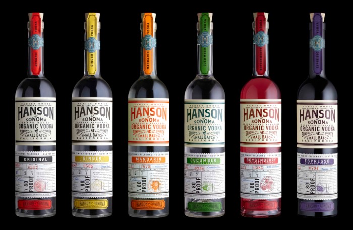
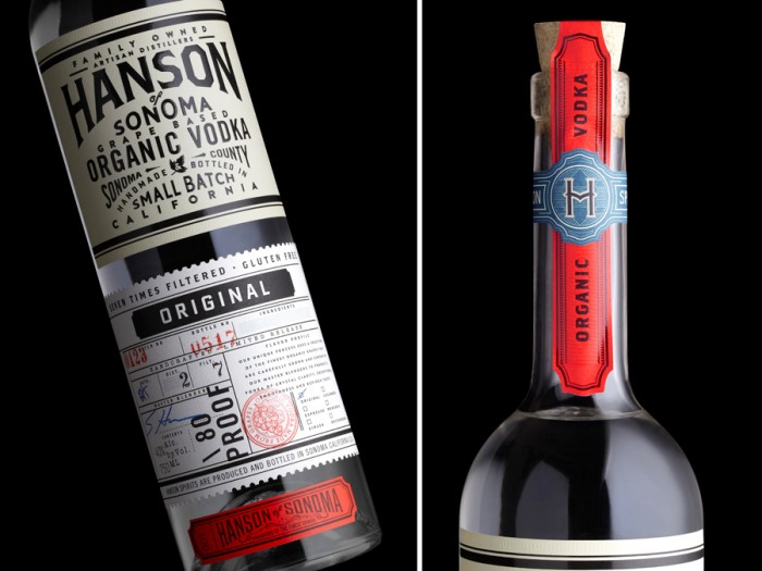
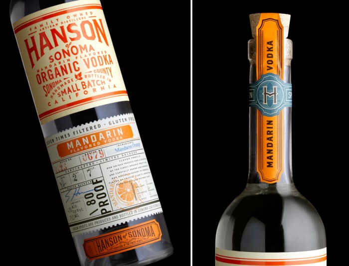
I know this isn’t a restaurant brand, but I couldn’t resist posting the lovely work for Hanson of Sonoma by Stranger & Stranger. I found this beauty over at Mr-CUP’s blog. The classic typographical treatments are just amazing. The use of colors to depict flavors are an excellent visual cue. Just… let it sink in. It’s good stuff.
stranger2014-mrcup-04

stranger2014-mrcup-03

stranger2014-mrcup-02

stranger2014-mrcup-01

Discuss this Project

Leave a Reply

This site uses Akismet to reduce spam. Learn how your comment data is processed.

The Forktales Podcast™: Interviews with restaurant industry leaders and visionaries

Restaurant and advertising industry headlines and thinking

Reviews of restaurant experiences from around the globe 

Reviews of our favorite design, business, & restaurant books

Our favorite typography and fonts

Inspiration in your inbox

Get the latest inspiration in your inbox every Monday morning, for FREE!

"*" indicates required fields

This field is for validation purposes and should be left unchanged.

Delicious Bits in your Inbox!

Get the latest and greatest content delivered to your inbox for free!

"*" indicates required fields

This field is for validation purposes and should be left unchanged.