
Today NRN announced the new brand identity for Olive Garden has been integrated along with new interiors in two concept locations in Florida. I held off on chiming in on the new Olive Garden brand overhaul back in March because I knew it’d get lost in the clutter of knee-jerk criticism that riddled the interwebs. Everyone from Slate to Business Insider had their harsh criticisms, whereas other blogs like Brand New had in depth analysis. Heck, there was even a post criticizing the criticism. It was an uproar to say the least, but with good reason.
Olive Garden has been a major brand in almost everyone’s life for decades now. I personally remember them shifting to the newer logo and thinking it was good move. Now, they’ve broken out the design tools to rethink the image more drastically. The retooling comes with the basis of the brand’s current state and desired future state.
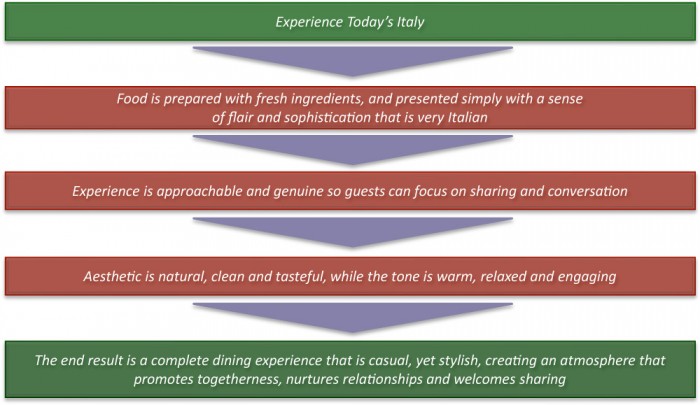
As you can see, OG is moving away from the prepackaged food that plagued the brand for so long (see more from the article earlier today on TGI Fridays). The focus is on fresher food and a more approachable, less traditional experience. These two elements alone warrant an identity redesign.
![]()
The new look is a smart move, but the execution left a lot to be desired from the design community. They’ve cursed the cursive type treatment without real reason besides preference though. They olive branches were broken down as well. Again, no reason why, they just didn’t like it.
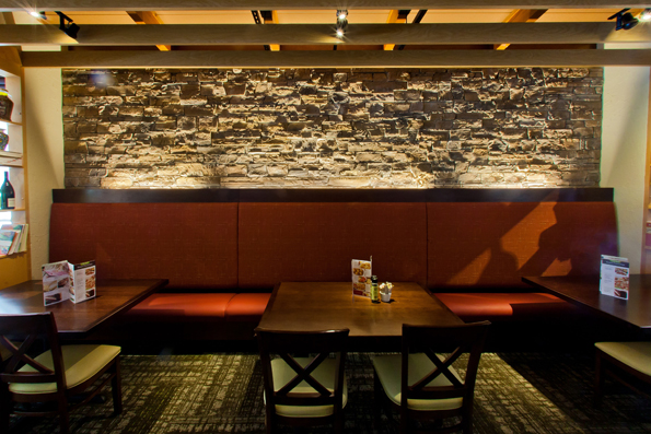
This happens quite often with change to a iconoclast of an identity such as Olive Garden’s. People fear change. They don’t take to it quite easily. Oh well, it’s here and it’s now officially live in two locations in Florida along with new interiors.

Here’s my take on the restaurants brand identity overhaul:
- It makes sense for many reasons to make the change. They’re no longer trying to be traditional Italian. The want to be MODERN Italian.
- The script typeface isn’t bad. It’s fresh, new, different. It’s easy to read and identify. It’s a smart progression to modern without eliminating the script style that’s been inherently Olive Garden for decades. It does need work on consistency and construction however. More specifically, the ascenders on the “i” and “d” flow into a perfect perpendicular angle not seen anywhere and not natural in script writing. The look is on the right path though.
- The color palette is earthy which pushes that move to natural and modern. It’s approachable and comforting.
- The olive branches seem like a missed opportunity. With Olive in the name, I’m not sure you have to bludgeon the market with a visual cue that’s so expected. Also, they’re shape is boring. This is a huge opportunity to move the brand towards a smart direction like Starbucks, Chili’s and Dominos have done with their steady brand simplification. What if the brands were in the shape of an “O”?
- The interiors have been altered, but not too much from the original. It looks like they killed the faux stucco wall treatments and made things cleaner with strong lines. The look is contemporary. It’s comforting and relaxing. The lighting is dramatic and it creates new textures on the walls. It’s a good step forward.
What are you thoughts on the logo design now that it’s finally live and out there? Love it? Hate it? Why?


One Response
The font doesn’t seem unique or strong enough to brand a concept and it looks like it was found for free on a font site or in Word and used on a craft blog header to me, especially against the background of the brown rectangle. The logo looks so generic, like it could be for any number of products from natural soap to eco-friendly baby diapers.
The olive branch is attractive and safe, and Olive Garden caters to market that probably responds well safe. It is feminine, and chances are women probably drive a large part of OG business by making dinner choices for their family and outings. I think it’s strongest asset is it’s possible use as a secondary markup on menus or promotional materials when it is isolated from the general logo.
Then brown rectangle is confusing to me- is the logo always supposed to be floating awkwardly in a sea of brown? That is another lost opportunity, as having it have a defined shape is another element that could be added to their branding (like the Starbucks circle).