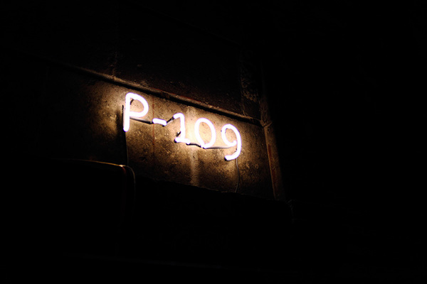
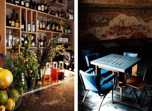
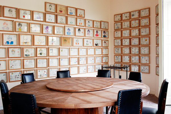
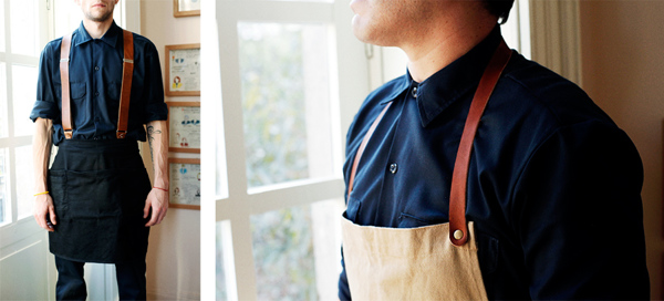
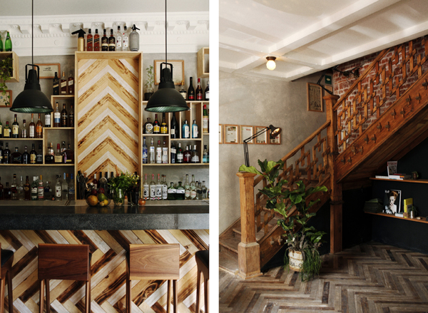
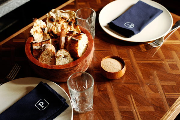
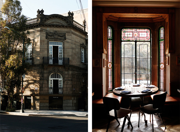
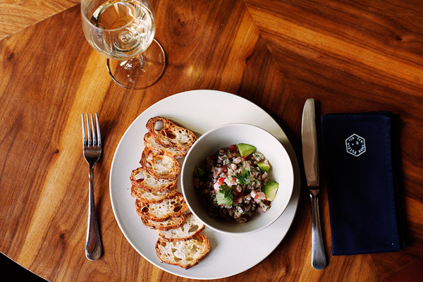
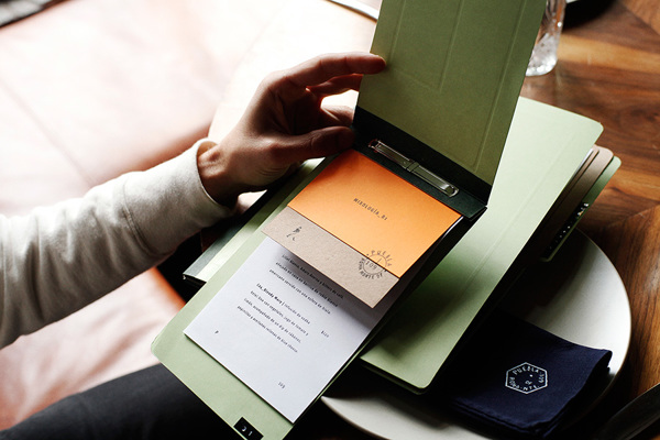
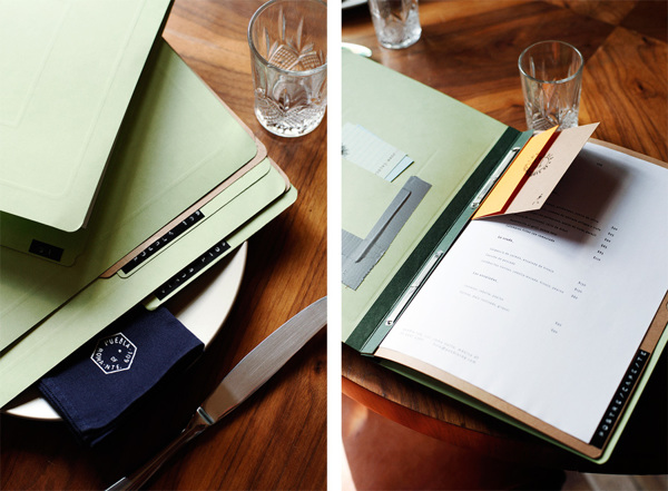
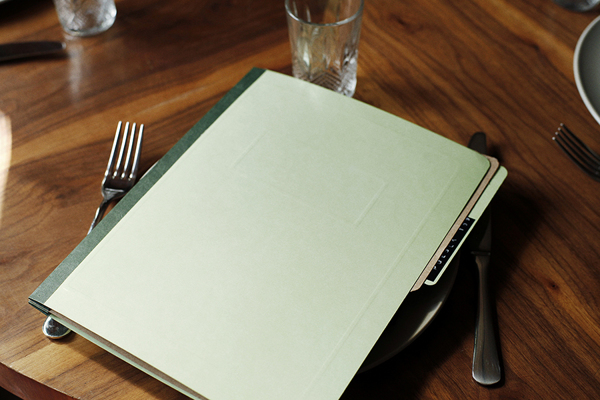
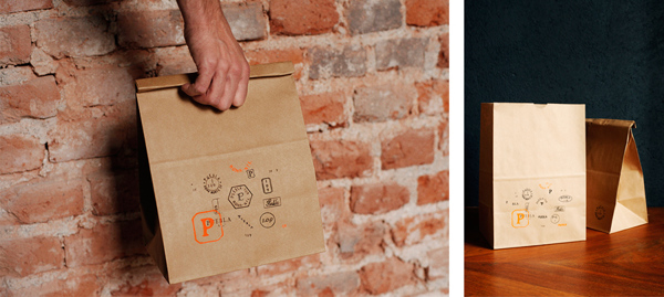
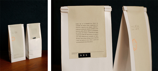
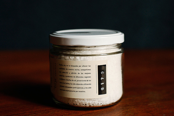
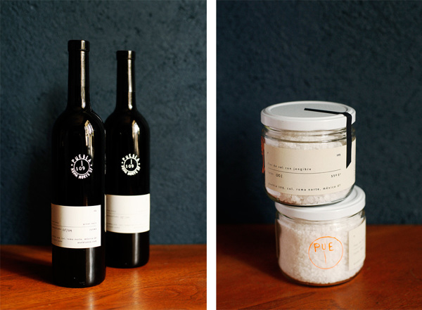
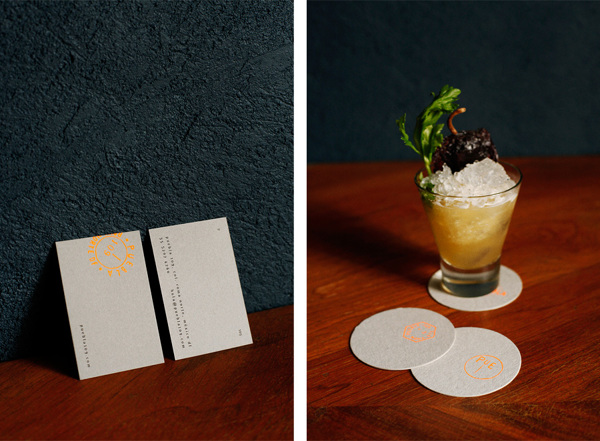
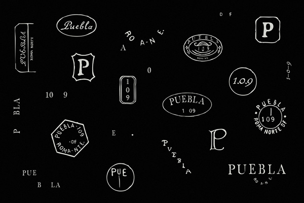
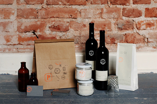
One of the hardest parts of developing a restaurant brand is ensuring the continuity between interior experiences and the graphic look. Usually these are headed up by two very different groups with two differing opinions of what the restaurant should be. Architects notoriously run off in their own direction without much regard for anything brand related leaving designers with the job of making the architect’s work fit into the proverbial round hole. What i’m liking about Puebla 109 is it’s natural shift from interiors through printed materials and accoutrements. It has the same vibe across the board creating a strong brand identity message.
Design Savvy Studio.
