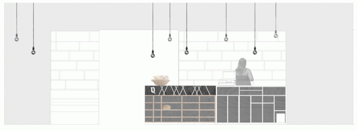
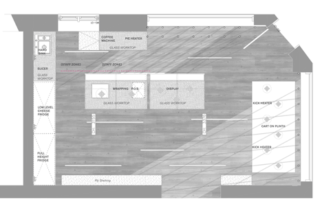
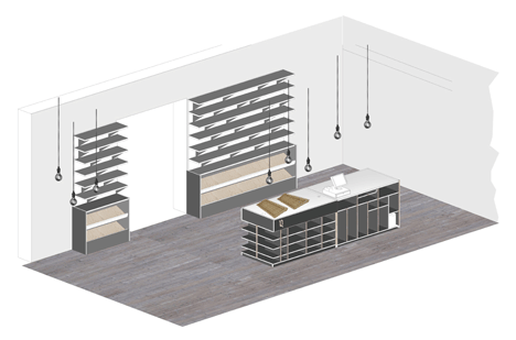
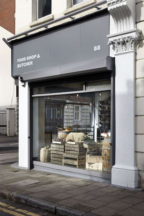
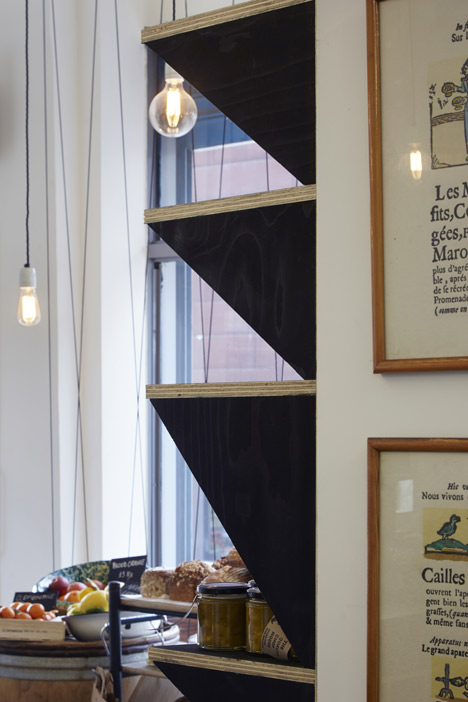
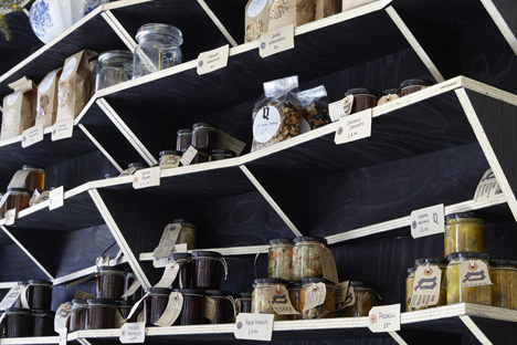
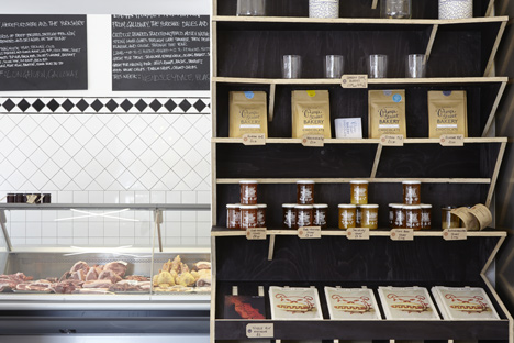
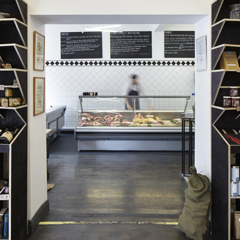
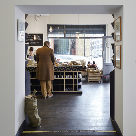
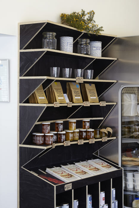
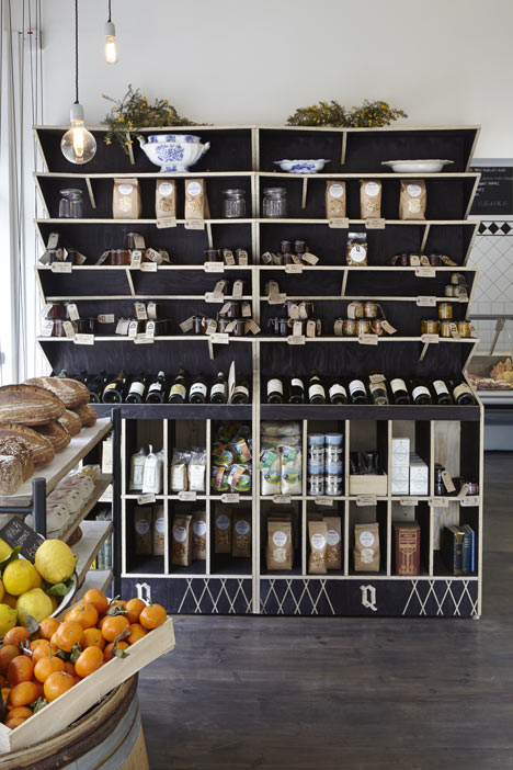
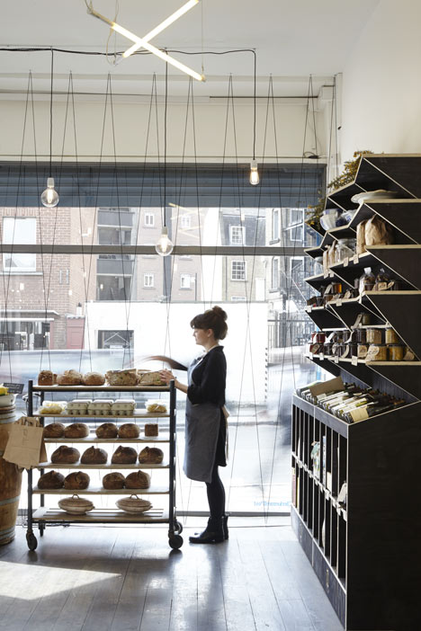
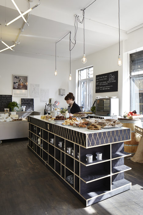
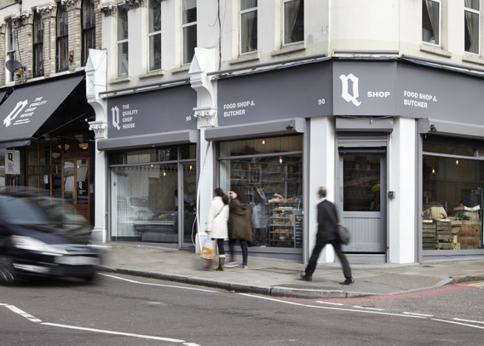
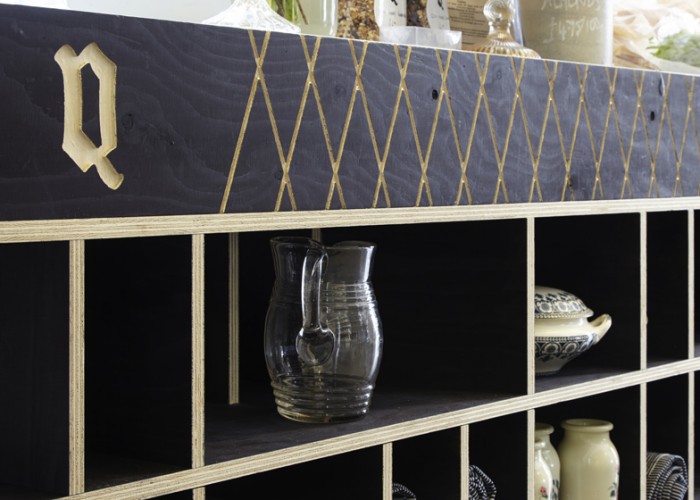
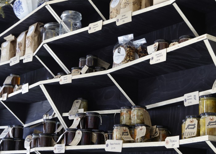
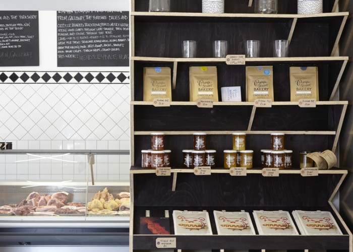
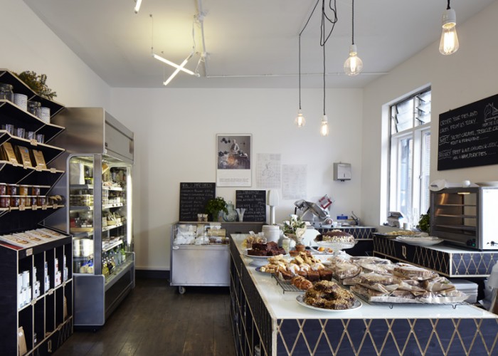
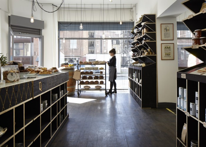
Found this gem on Dezeen. Definitely worth sharing as you get to see some of the concepting, floorplans and elevations which is a part of the design process a lot of people never get to experience. This London butcher shop pulls influence from packing materials used to ship food products and infused it throughout the design. Each part of the interiors were designed, not just selected from the unique jagged edge shelving through the centerpiece point of purchase. The idea was to convey quality ingredients that are used in its neighboring restaurant. Food products are displayed on shelves and counters made from plywood then stained black in reference to the charred or sprayed labels commonly found on wooden packing crates.
I especially enjoy the subtle way the brand identity is injected into some of the design. The strong Q logomark set in black letter typography is poignant accoutrement that sticks in your mind.
Excellent work through and through by Fraher Architects.
