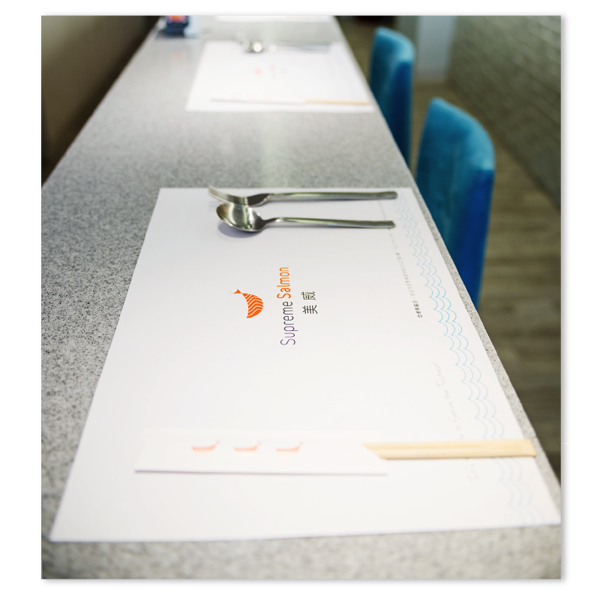
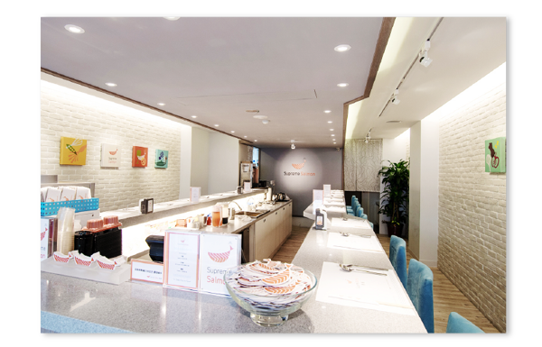
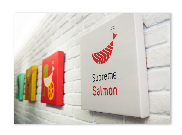
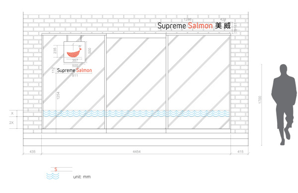
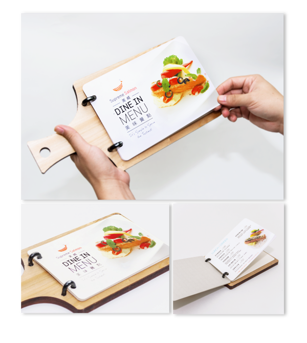
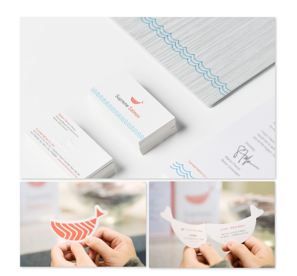
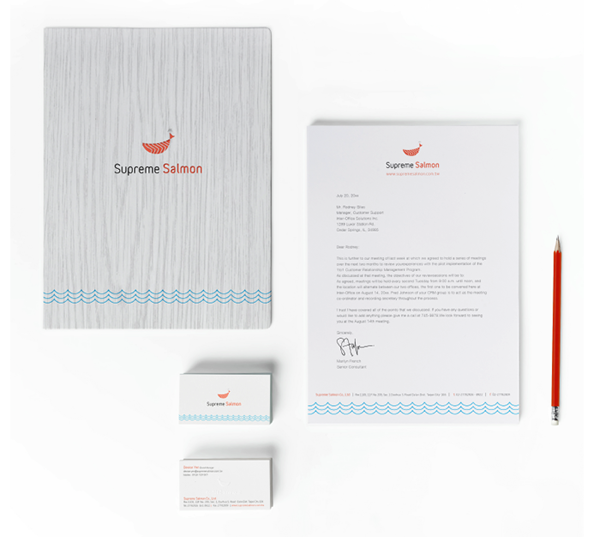
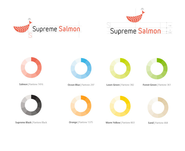
Supreme Salmon is a subsidiary of a salmon farming company with a restaurant experience as a “showroom” for their product. The identity is an excellent example of taking a literal visual cue and making it unique and graphic. Building upon the restaurant’s logo design is a series of icons, colors and textures that make for an interesting visual experience. Quite well done by Ming Island Design.

