Temporada cafe branding

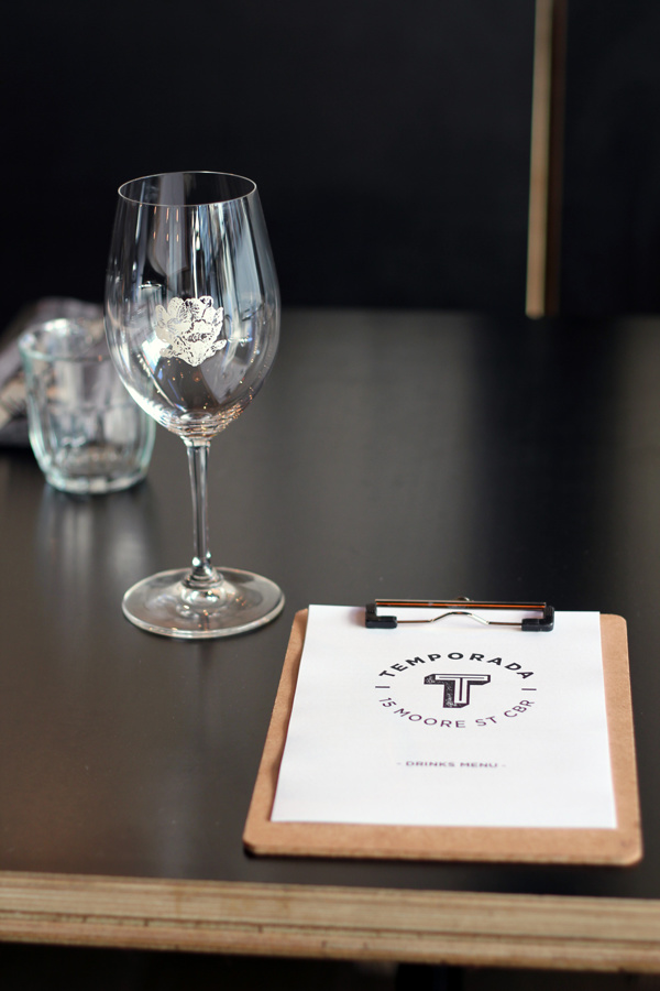
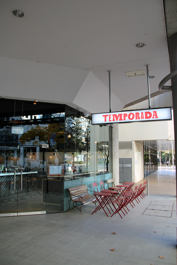
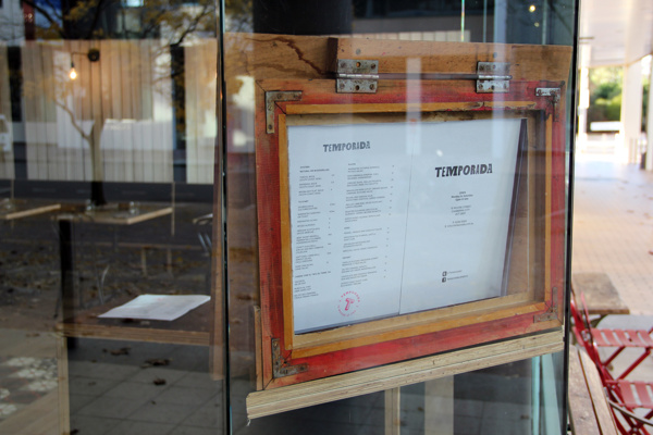
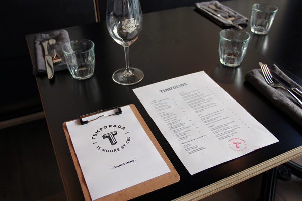
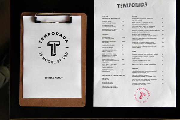
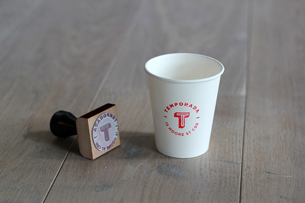
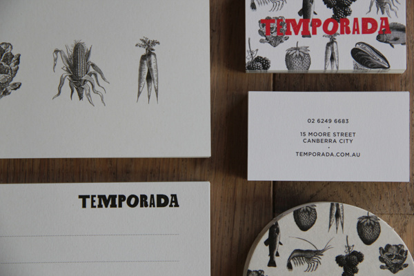
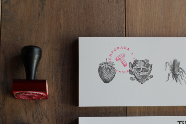
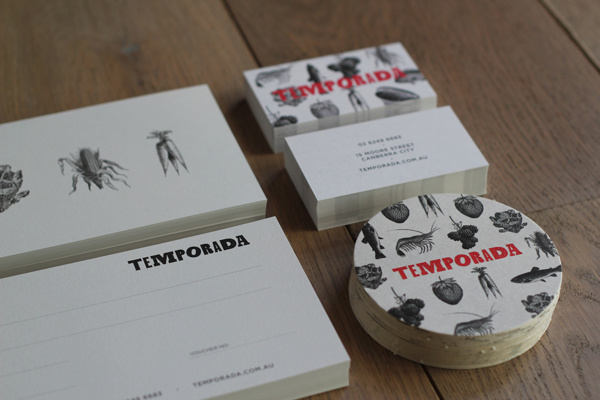
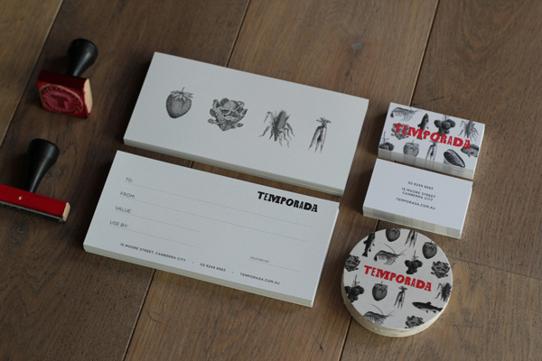
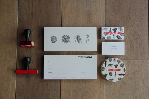
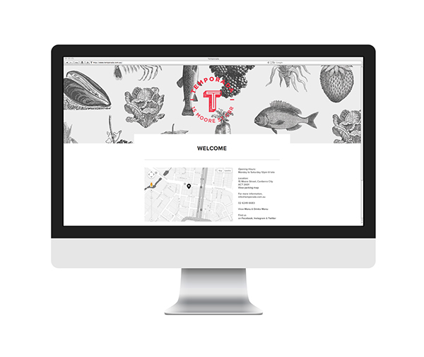
The brand identity for Temporada, a cafe in Australia, leverages a mix of pen and ink illustration with a pop of red color to create a strong, semi-minimalist look. The logo is two fold with a circular and a zany type treatment option for use on the touch points. They’re each applied with a rubber stamp where possible to create a crafted feeling.

Designed by Andrew Darragh.
90f828c8c812e9fe64041cf609a4ce1e

9e1d868ea4fd076efbb9dd0ce984d591

cc82c8880f544dbf3905d7605814e69e

1e70bb7dff8f73c351293e51df63b848

5f0407bb5aa91f62c0c8c074a020c259

80b48d256e725a16fbf9783f7319d05e

ba975b815185a50fd1d53d2c382ed8f1

93eb7a8a4387dfff141c99ba86b2352f

3eae012209ff1a21fe76e1a1221390a8

75d09875f581461722afa326b2e7a001

3e4867270d169d8429ea5d0424ced3f4 1f75236077eaa4a23b05cf75f4e7ead2

Discuss this Project

Leave a Reply

This site uses Akismet to reduce spam. Learn how your comment data is processed.

The Forktales Podcast™: Interviews with restaurant industry leaders and visionaries

Restaurant and advertising industry headlines and thinking

Reviews of restaurant experiences from around the globe 

Reviews of our favorite design, business, & restaurant books

Our favorite typography and fonts

Inspiration in your inbox

Get the latest inspiration in your inbox every Monday morning, for FREE!

"*" indicates required fields

This field is for validation purposes and should be left unchanged.

Delicious Bits in your Inbox!

Get the latest and greatest content delivered to your inbox for free!

"*" indicates required fields

This field is for validation purposes and should be left unchanged.