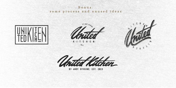
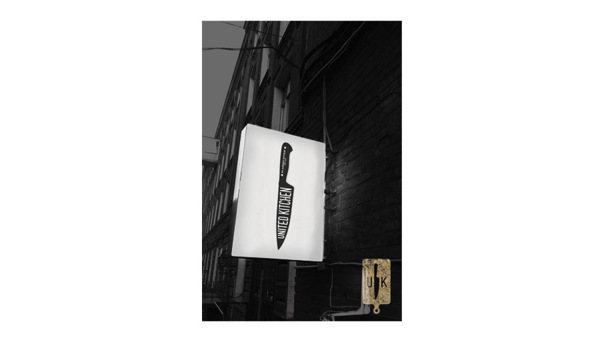
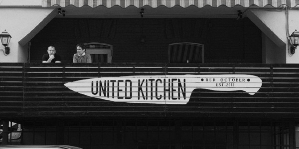
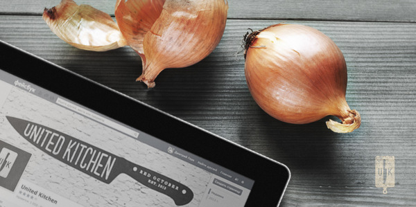
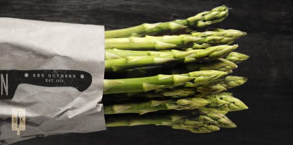
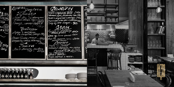
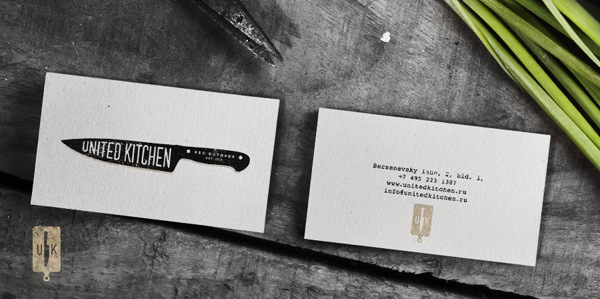
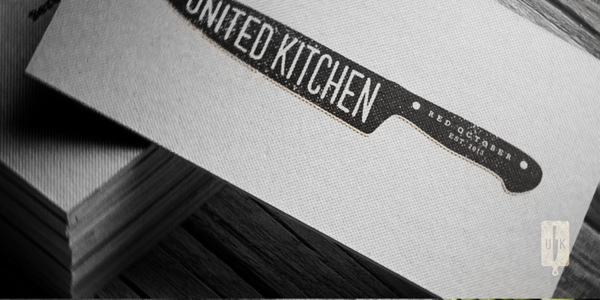
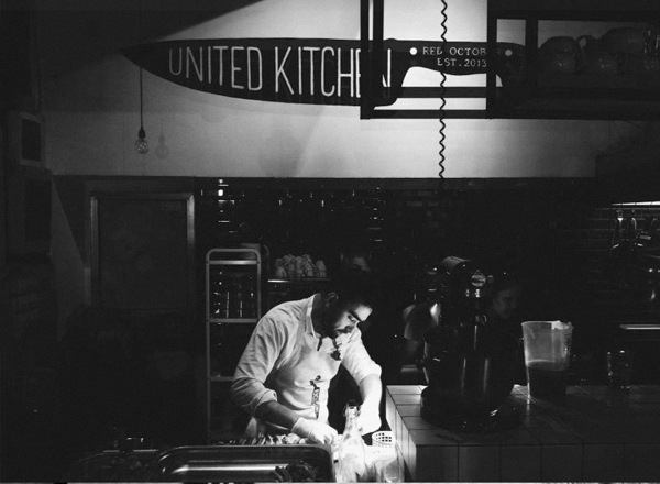
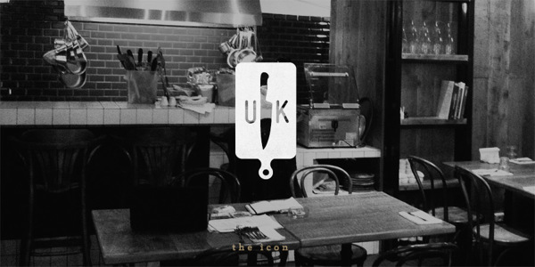
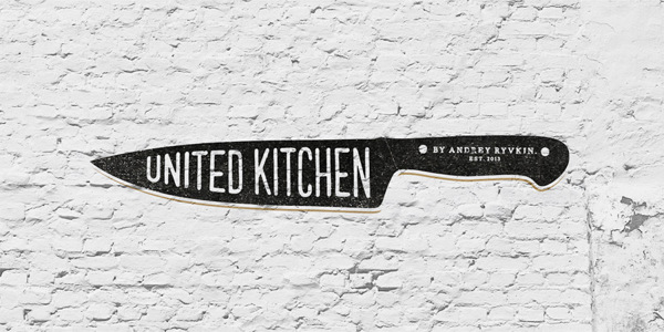
This uber-hipster style brand identity uses a strong graphic device to cut through the clutter. Dmitry Gerais, a Russian designer, leverages excellent typography with graphic element to create a minimal identity that has maximum effect. The core logo has an insignia option as well that uses a cutting board graphic device as it’s core image. Together they say “culinary” and “new.” Great stuff.
