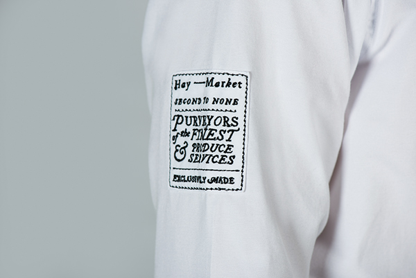
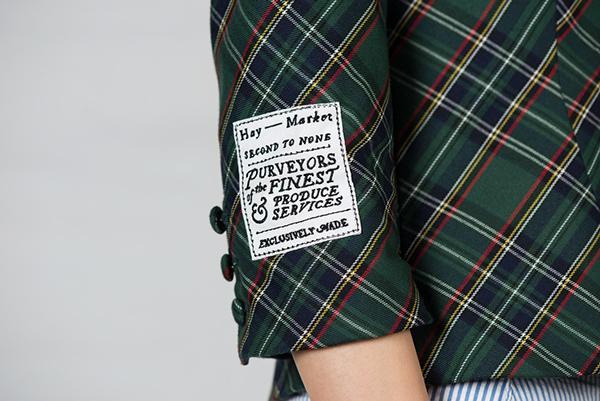
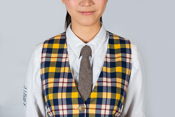
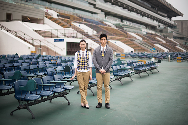
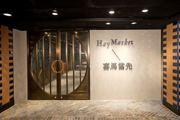
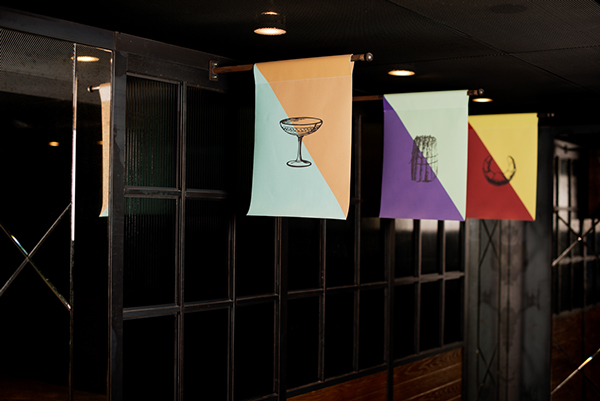
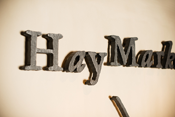
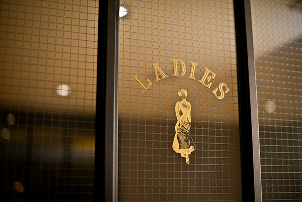
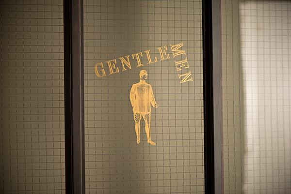
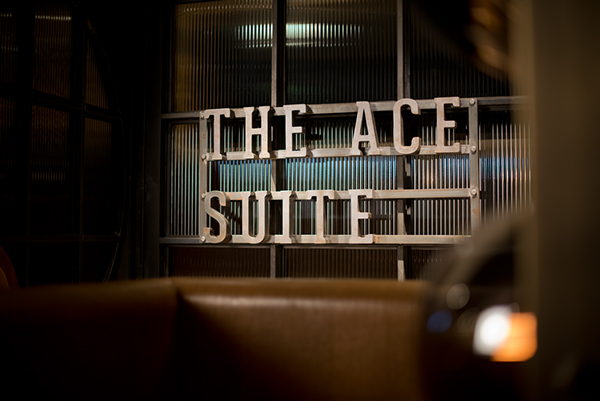
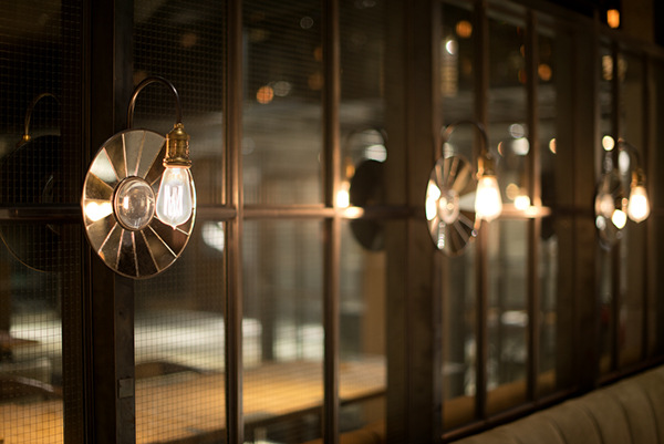
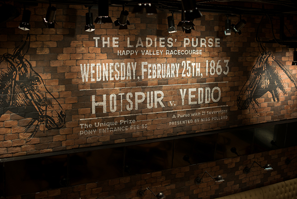
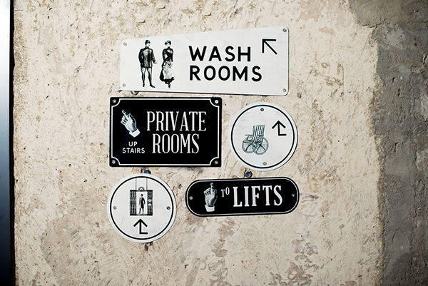
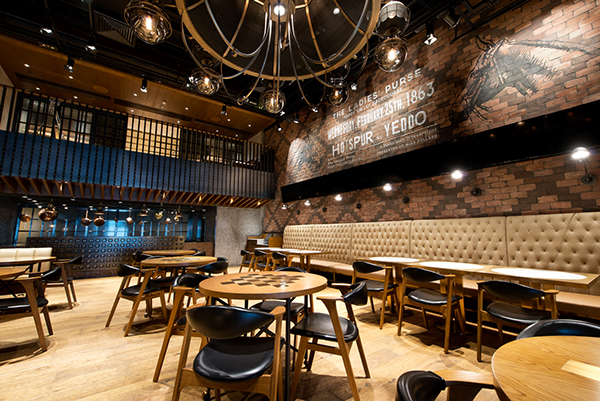
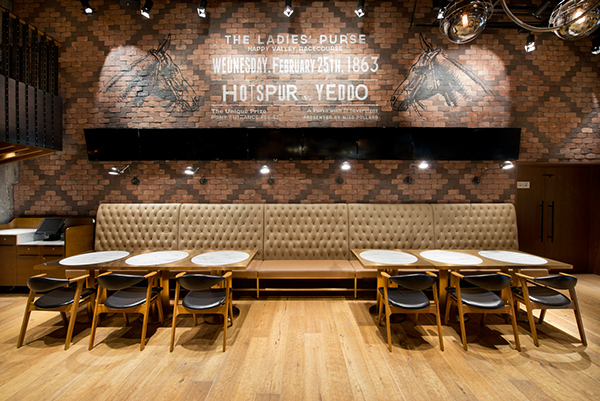
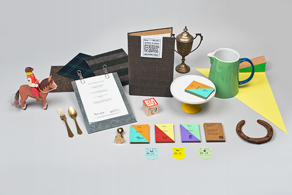
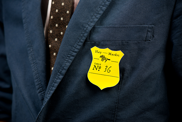
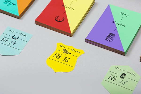
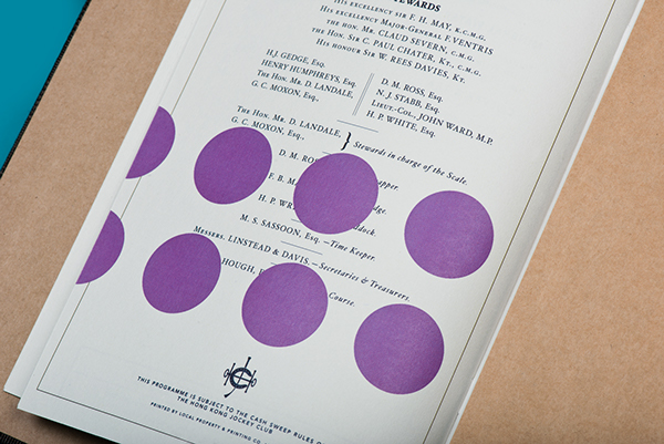
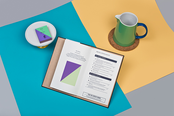
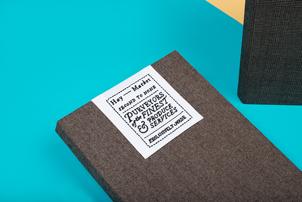
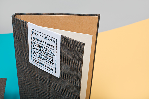
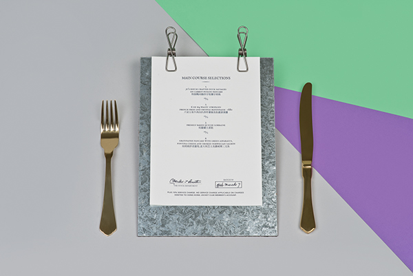
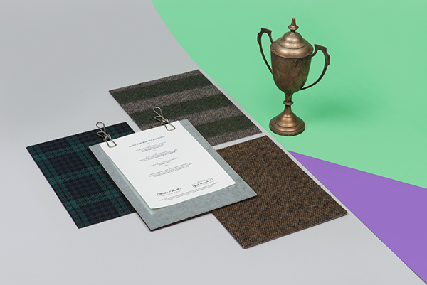
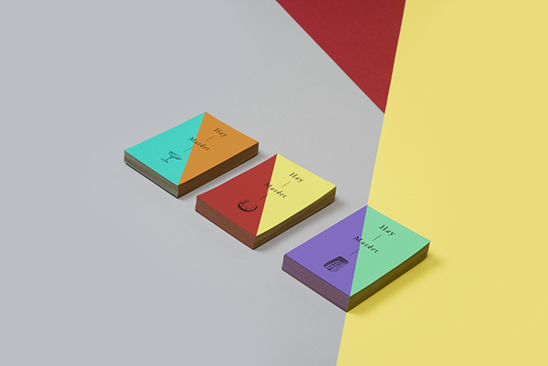
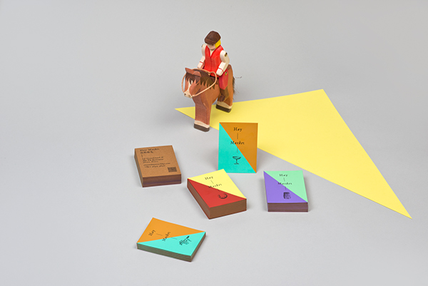
What I’m really enjoying about this restaurant’s brand identity is the extent to which is has been thought through. The apparel for each area of service is so well done and designed. The uniforms match the interiors perfectly which marries to the typography and general look seamlessly. The only thing I’m not 100% on is the color palette for the printed elements of the brand. I think with all the textures and colors used in the interiors and uniform design, the design team had plenty to leverage to complete the union between identity pieces. Much respect to Foreign Policy Design Group yet again.




2 Responses
Really? I thought the colors of the collaterals are really great !
Yeah. I just think they could match a little better, but that’s solely my opinion and I’d be the first to admit it’s purely subjective. I think the entire project is excellent. 😀