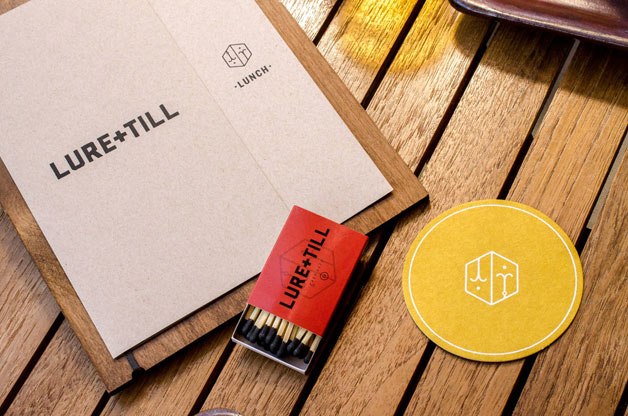
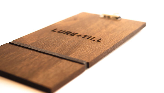
Despite the name falling into the now cliché Blank & Blank naming convention, the identity for Lure & Till is pretty on point. I like the idea of the name as it speaks to the origin of the food, and the design is simple and earthy tying up great communication. I wish there were more to show, but that’s all for now from Chen Design Associates.

L+T_splash

CDA_2894

CDA_4168-edit

Discuss this Project

Leave a Reply

This site uses Akismet to reduce spam. Learn how your comment data is processed.

The Forktales Podcast™: Interviews with restaurant industry leaders and visionaries

Restaurant and advertising industry headlines and thinking

Reviews of restaurant experiences from around the globe 

Reviews of our favorite design, business, & restaurant books

Our favorite typography and fonts

Inspiration in your inbox

Get the latest inspiration in your inbox every Monday morning, for FREE!

"*" indicates required fields

This field is for validation purposes and should be left unchanged.

Delicious Bits in your Inbox!

Get the latest and greatest content delivered to your inbox for free!

"*" indicates required fields

This field is for validation purposes and should be left unchanged.