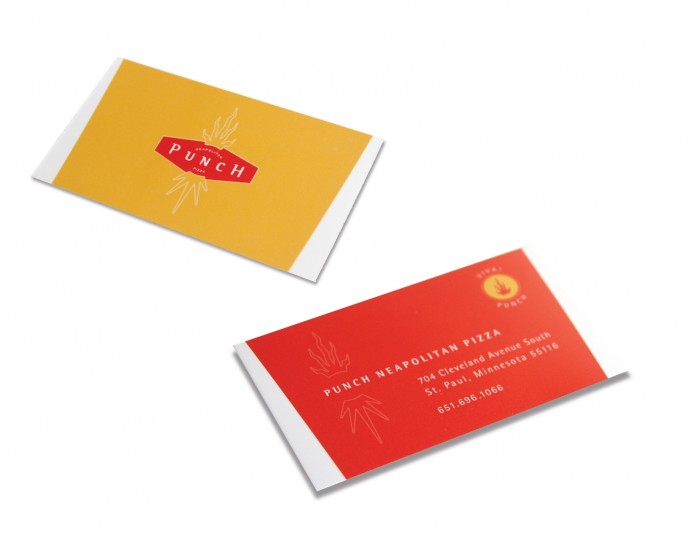
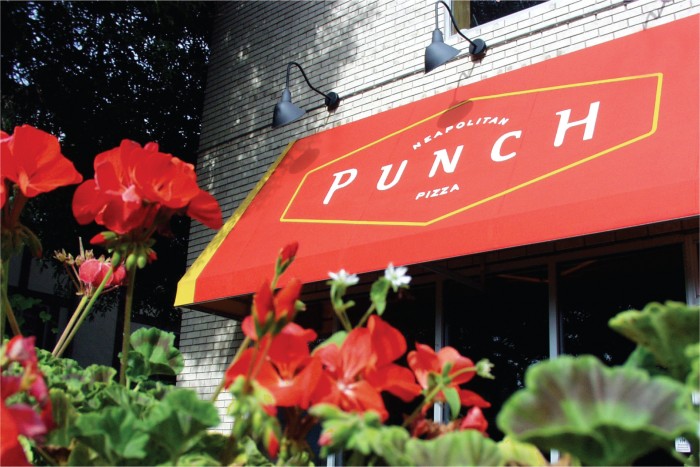
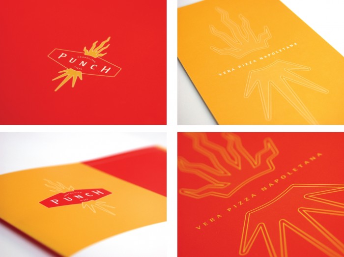
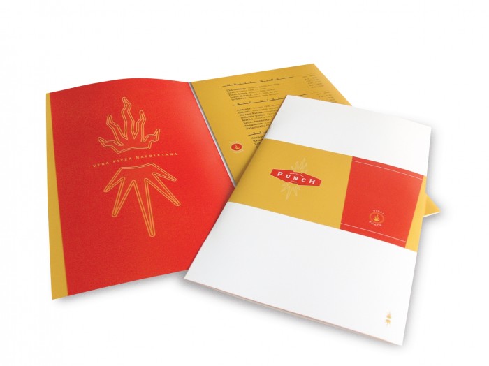
The kids at Capsule designed up this lovely restaurant brand identity for Punch Pizza. What I like about the design style is that it looks a bit 90s design. In these times of urban chic, industrial/shabby chic hipster over indulgence, it’s refreshing to see some quality design that’s tried and true. It’s actually different because it’s not going with the trends. Therefore a breath of fresh air. Good stuff!
