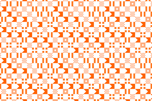
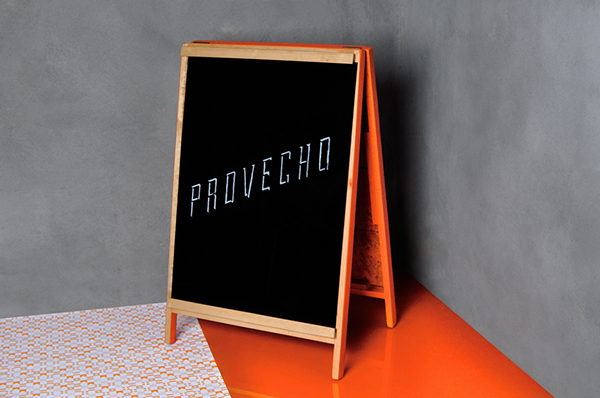
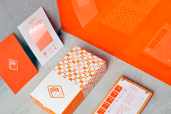
The color for Las Naciones is amazingly distinctive and memorable. It pops off every piece of this restaurant’s brand arsenal. The restaurant’s brand identity is diverse, but uses color and graphic treatments to create a visual glue. This is how the team at Firmalt, out of Mexico, describes the brand:
Inspired by how Las Naciones creates different dishes based on the cuisine in different regions around the world, we based the visuals for the brand on international communication methods and signage. This means using typographic and graphical elements from airports, flags, and maritime signal flags; where clarity and straight-forwardness are crucial. The logotype takes from the most recognizable international identification method: the flag. Its five stars reference the restaurant’s first five creations, from five different countries.


