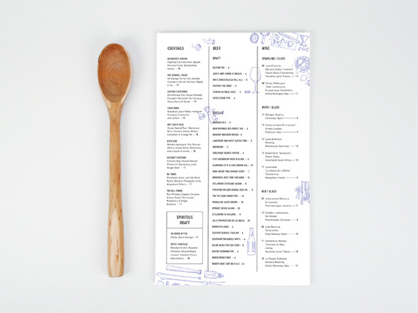
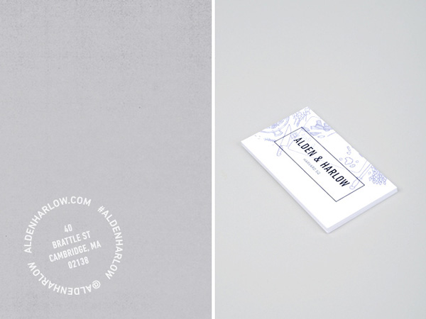
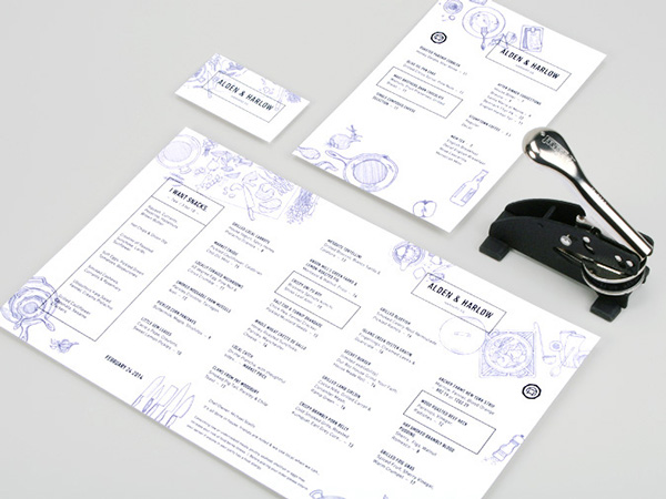
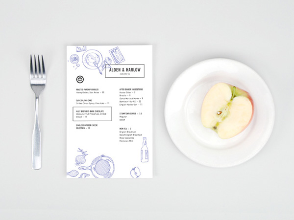
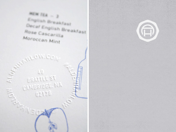
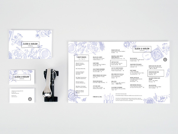
Oat‘s brand identity design for Alden & Harlow is an ultra reserved style with little jabs of fun. The semi-stuffy look about the identity is disrupted by fun ball point pen style doodles – the kind one would find in textbooks. It’s a great way to inject that hand made feel without succumbing to trends.

2c6210d11dbe6eea96595c4abe9d6d21

844a5801c3f5981b463132ca0a2b019c

7103f1925ee4730df898a5a12248e3d2

a748bbd05cd39fd877b4eafe516ebdad

acd095bd3b41842f6f41dd86563abb4a

e5813388ce5c64cbc862f09a66caef81

ef65fa9cc03356f86d10cb38ed23a078

Discuss this Project

Leave a Reply

This site uses Akismet to reduce spam. Learn how your comment data is processed.