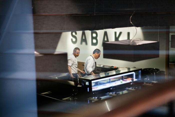
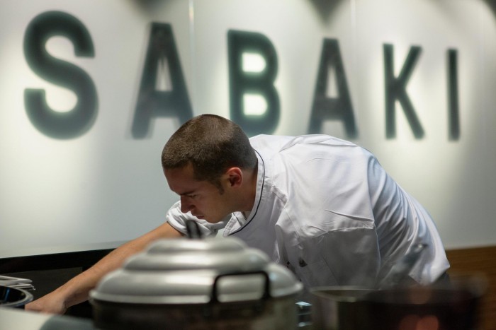
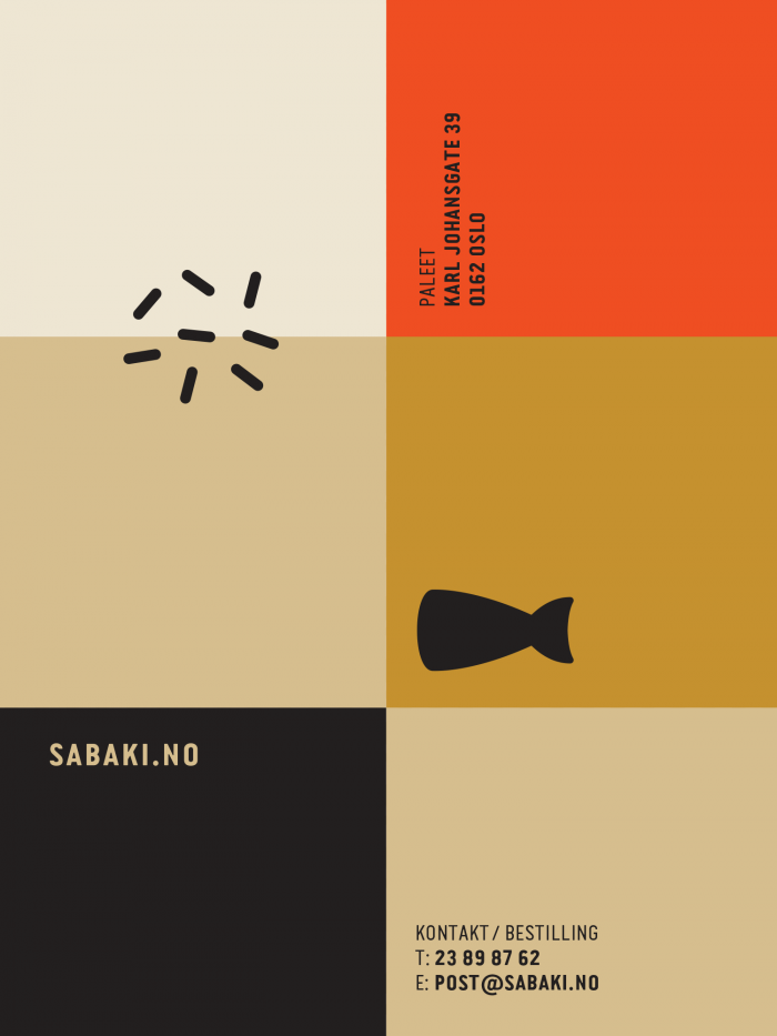
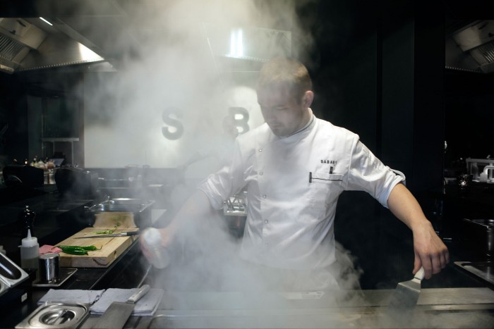
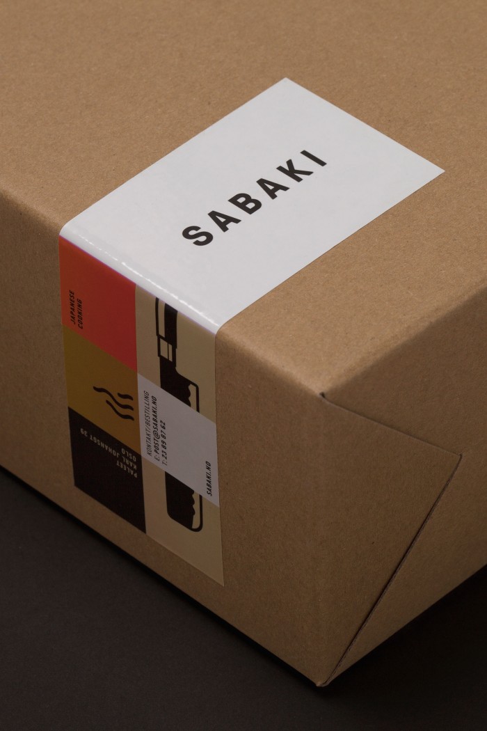
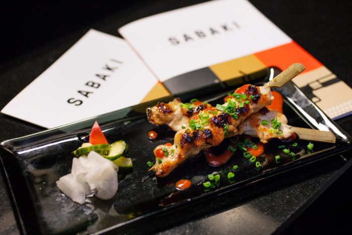
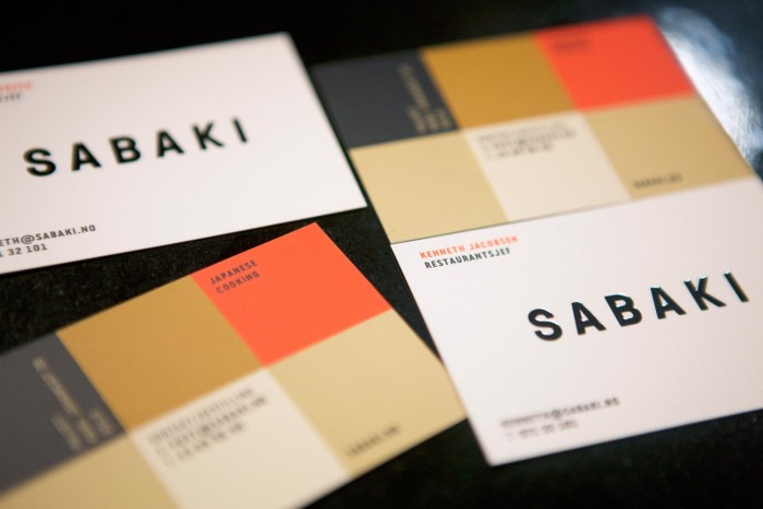
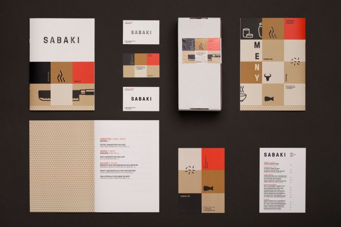
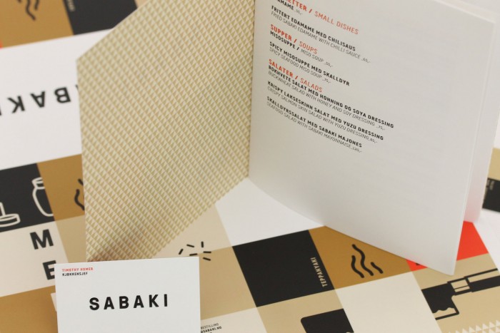
The team at Metric in Norway have their fun with geometric shapes and unique visual effects for this japanese restaurant brand identity. The color palette uses an expected black, white and red combination, but twists it a bit in a unique way by adding in some warmth to all three included a beige/gold addition. This pulls it away from a cliche selection making for an interesting take on the expected. The strong geometry hints at the restaurant’s focus on precision and craft. Something you’d want in a Japanese tappenyaki experience.

391-20141007125612000000000

419-20141021063940000000000

351-20141006213155000000000

352-20141006213156000000000

393-20141007125615000000000

355-20141006213525000000000

486-20150221202950000000000

354-20141006213523000000000

353-20141006213444000000000

484-20150221202206000000000

485-20150221202539000000000

Discuss this Project

Leave a Reply

This site uses Akismet to reduce spam. Learn how your comment data is processed.

The Forktales Podcast™: Interviews with restaurant industry leaders and visionaries

Restaurant and advertising industry headlines and thinking

Reviews of restaurant experiences from around the globe 

Reviews of our favorite design, business, & restaurant books

Our favorite typography and fonts

Inspiration in your inbox

Get the latest inspiration in your inbox every Monday morning, for FREE!

"*" indicates required fields

This field is for validation purposes and should be left unchanged.

Delicious Bits in your Inbox!

Get the latest and greatest content delivered to your inbox for free!

"*" indicates required fields

This field is for validation purposes and should be left unchanged.