Libertine liquor bar restaurant branding

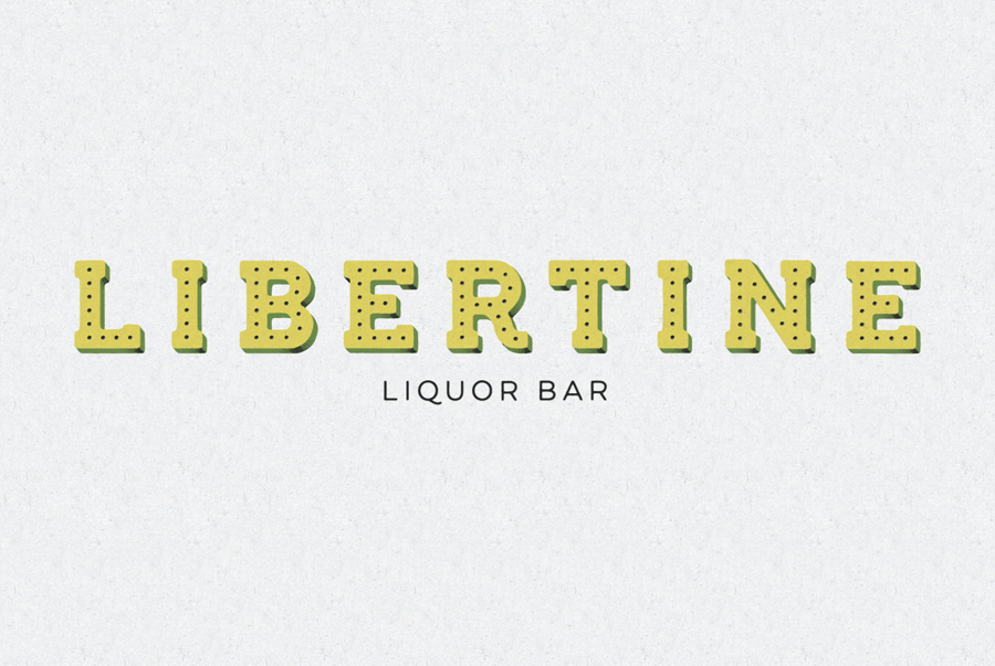
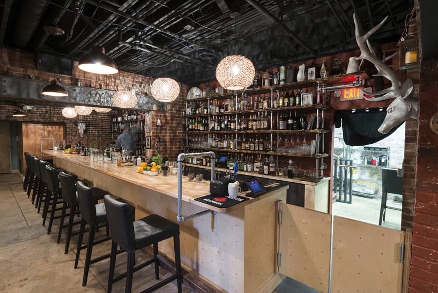
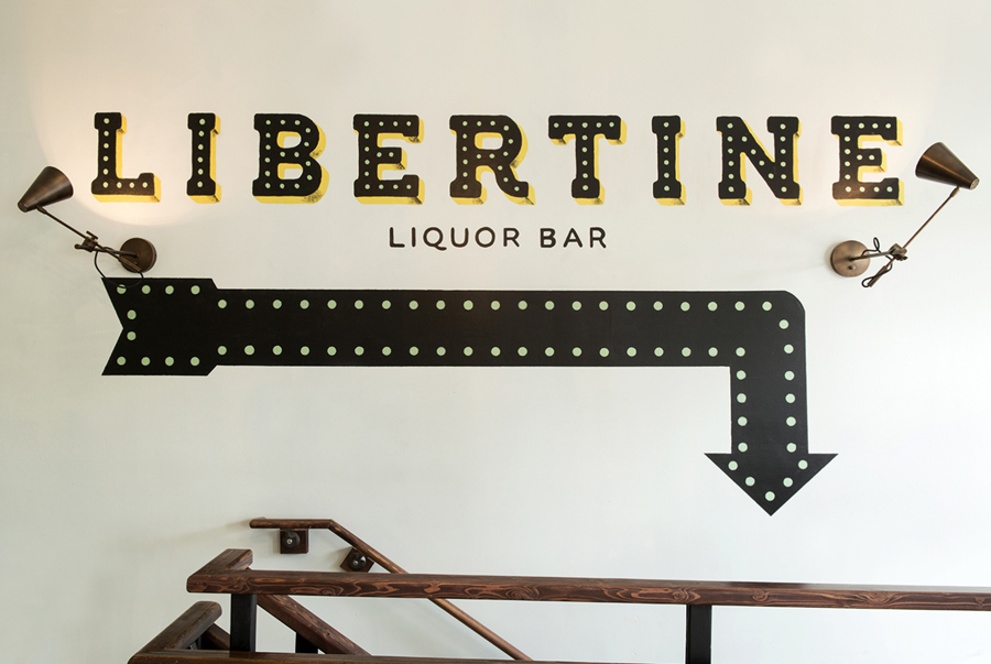
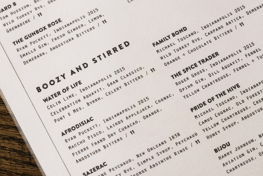
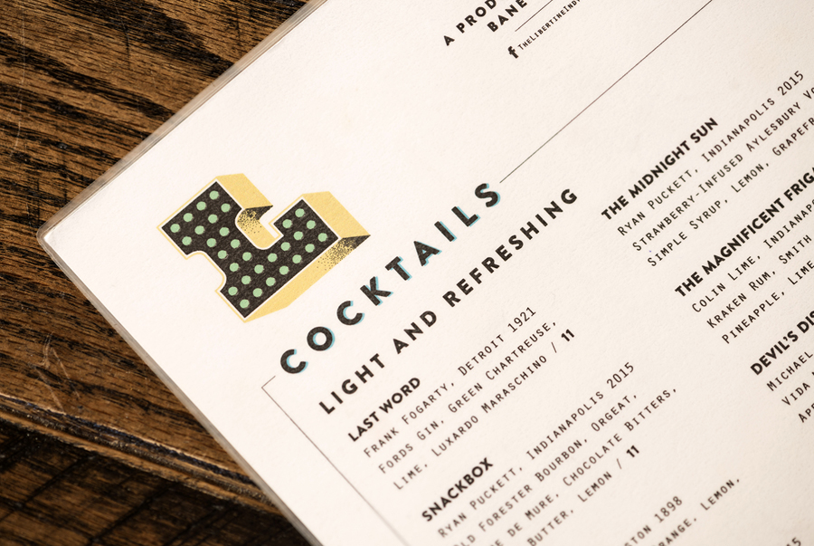
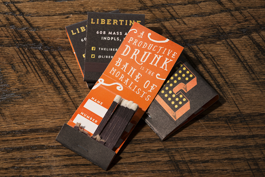
What’s not to love about this brand refresh of Libertine by the team at CODO? The original design relied heavily on old-school, classic pen and ink illustrations with a muted, drab color palette. Although excellent in the design, it doesn’t hold a candle to this update by the same team. The typographical treatment for the brand logotype is a nod to classic art deco signage. It’s well done, and not over the top. The kerning is perfect and the effects are used tastefully. The color palette really brings this brand identity to life with many options to choose from creating a fluid, flexible restaurant brand.

06-Libertine-Liquor-Bar-Logotype

09-Libertine-Liquor-Bar-Menu-Design

03-Libertine-Liquor-Bar-Menu-Design

08-Libertine-Liquor-Bar-Matchbooks

02-Libertine-Liquor-Bar-Logo

01-Libertine-Liquor-Bar-Logotype

07-Libertine-Liquor-Bar


The Forktales Podcast™: Interviews with restaurant industry leaders and visionaries

Restaurant and advertising industry headlines and thinking

Reviews of restaurant experiences from around the globe 

Reviews of our favorite design, business, & restaurant books

Our favorite typography and fonts

Inspiration in your inbox

Get the latest inspiration in your inbox every Monday morning, for FREE!

"*" indicates required fields

This field is for validation purposes and should be left unchanged.

Delicious Bits in your Inbox!

Get the latest and greatest content delivered to your inbox for free!

"*" indicates required fields

This field is for validation purposes and should be left unchanged.