Clerigos restaurant branding

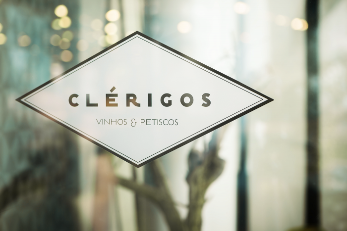
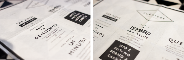
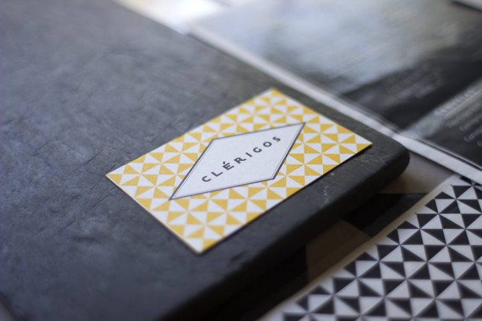
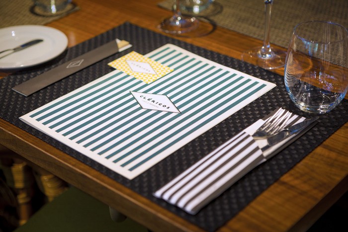
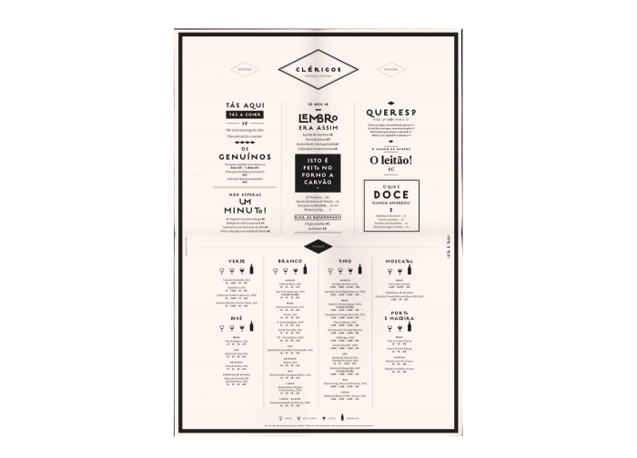
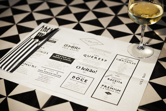
White Studio has designed this simple, modern restaurant brand identity using classic graphic treatments with a semi-playful san-serif type family as the identifying elements. The simple diamond shape draws the eye into the strong typography where a note of whimsy is present, but doesn’t get too campy. This keeps the experience elevated, but approachable. The supporting brand elements explore patterns, and reserved use of color that keeps things in the same vibe. Great work overall.

551fccfd3336544bded8afc7cfaa35fb

96df65a9bbf5a87f1120cc2625feaaa1

abcc4e9ff73c73936a7228bed87a9727

a80bbe1c1d43fa8e95671159ee2f5ec9

dc6ec49c5435493eeebb12187cf87499

8a31bad45ae01b9f30c788bddbb3b74a

The Forktales Podcast™: Interviews with restaurant industry leaders and visionaries

Restaurant and advertising industry headlines and thinking

Reviews of restaurant experiences from around the globe 

Reviews of our favorite design, business, & restaurant books

Our favorite typography and fonts

Inspiration in your inbox

Get the latest inspiration in your inbox every Monday morning, for FREE!

"*" indicates required fields

This field is for validation purposes and should be left unchanged.

Delicious Bits in your Inbox!

Get the latest and greatest content delivered to your inbox for free!

"*" indicates required fields

This field is for validation purposes and should be left unchanged.