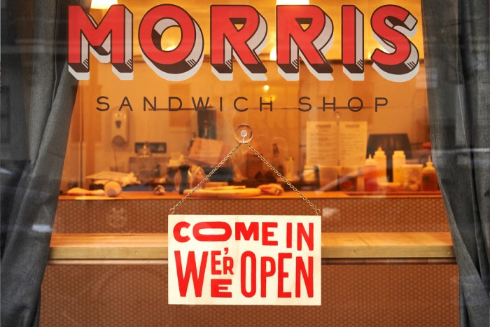
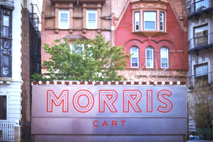
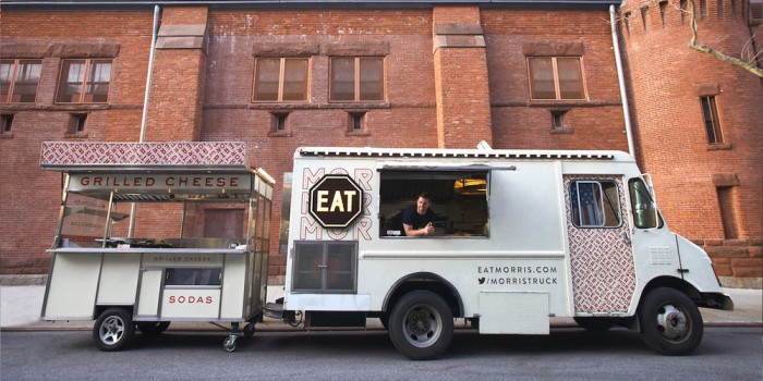
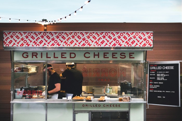
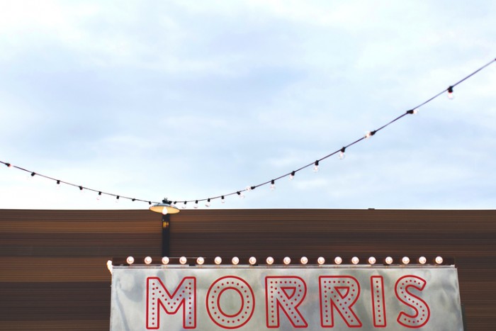
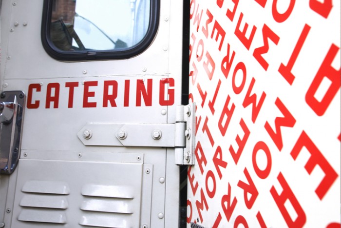
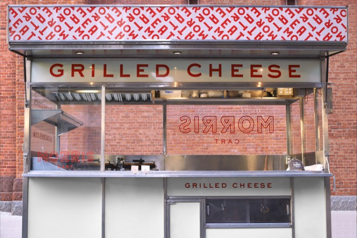
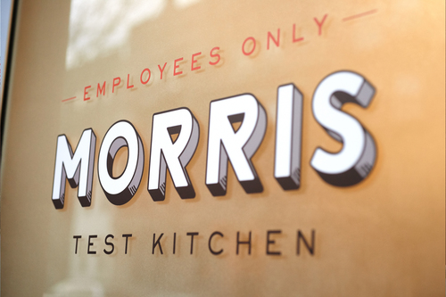
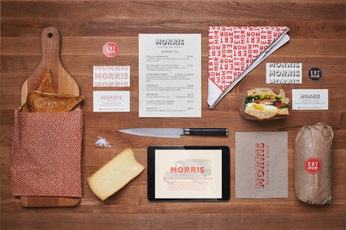
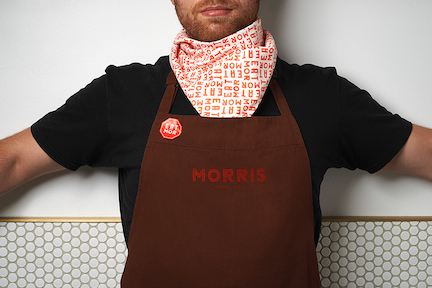
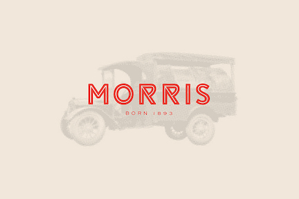
The design for Morris Sandwich Shop’s brand is a mix of Art Deco type treatments with modern elements. What really stood out to me about the logotype was the tails on the “R” letterforms. Super interesting to look at and quite memorable. The 3 dimensional effect put on the core type is well done. I’m usually not a huge fan of mimicking 3D effects, but the Pearlfisher team pulls it off well. What I’m really liking int he typographical pattern as found on the truck and cart. It’s used with tact and not overdone. It also makes a pretty rad scarf.