Bay City Burrito restaurant branding

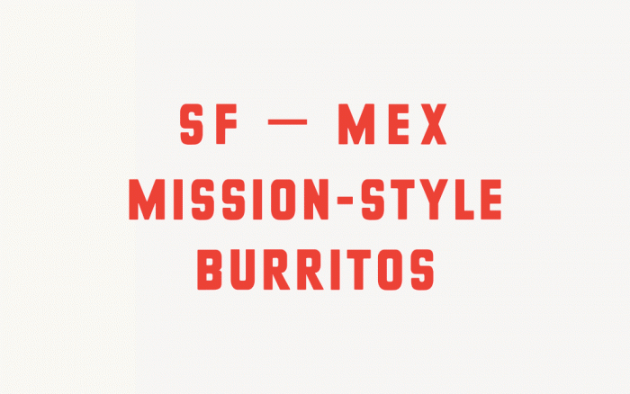
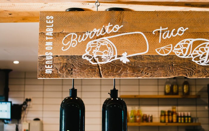
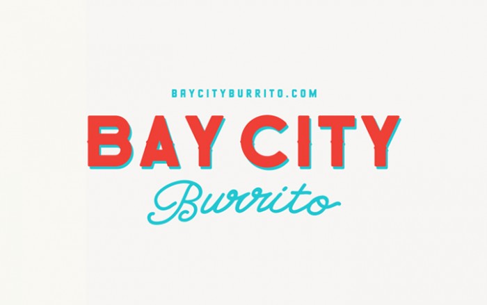
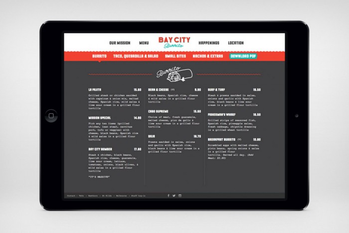
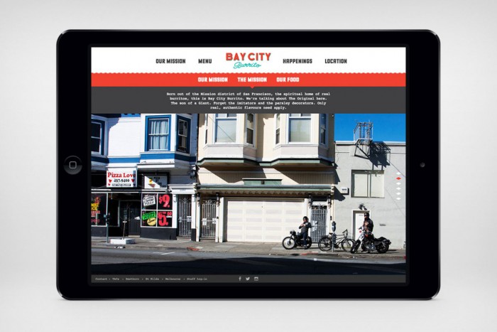
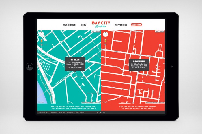
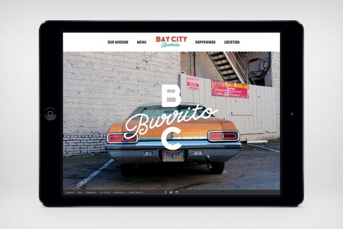
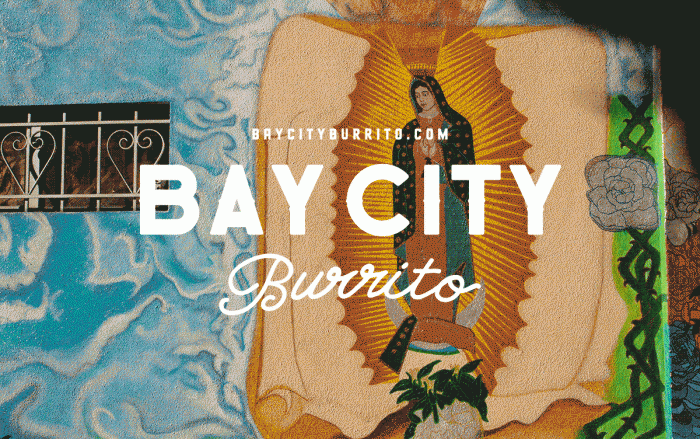
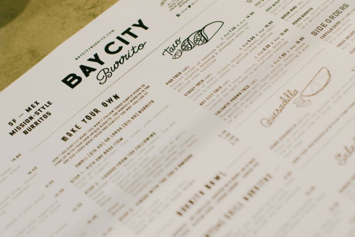
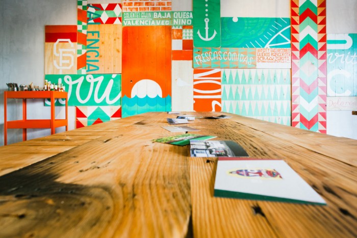
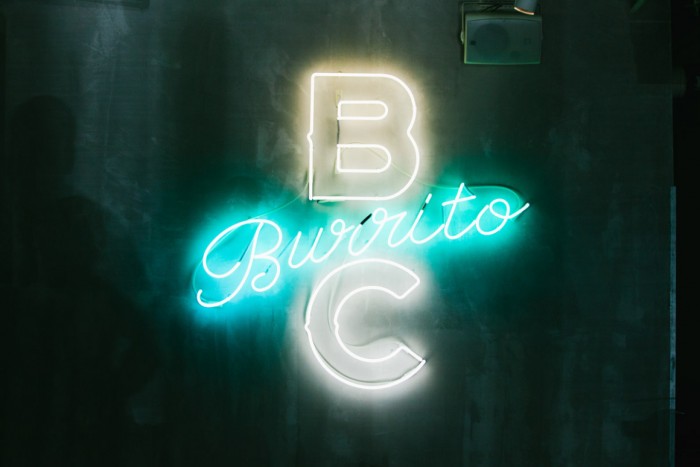
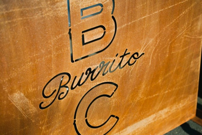
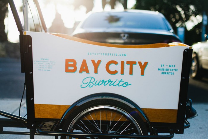
Bay City Burrito‘s brand identity design takes the angle of low-brow, hand drawn style that’s been trending currently. It’s all about imperfect letterforms and breaking classic, rigid design rules. Simple line art illustrations and script type overlay with fat, chunky compressed sans-serif type. Colors clash and what shouldn’t work, absolutely does. It’s an awesome style and perfect for this brand that’s all about keeping it on the streets.

Designed by South Southwest

BAYCITYELEMENTS2

2014bay-portrait-03

2014bay-portrait-02

2014bay-portrait-01

2014bay-landscape-ipad-04-1160x775

2014bay-landscape-ipad-03-1160x775

2014bay-landscape-ipad-01-1160x775

2014bay-landscape-ipad-00-1160x775

2014bay-landscape-animated

2014bay-landscape-05-1160x775

2014bay-landscape-04-1160x775

2014bay-landscape-03-1160x775

2014bay-landscape-02-1160x775

2014bay-landscape-01-1160x7752014bay-landscape-01-1160x775 2014bay-landscape-02-1160x775 2014bay-landscape-03-1160x775 2014bay-landscape-04-1160x775 2014bay-landscape-05-1160x775 2014bay-landscape-animated 2014bay-landscape-ipad-00-1160x775 2014bay-landscape-ipad-01-1160x775 2014bay-landscape-ipad-03-1160x775 2014bay-landscape-ipad-04-1160x775 2014bay-portrait-01 2014bay-portrait-02 2014bay-portrait-03 BAYCITYELEMENTS2

The Forktales Podcast™: Interviews with restaurant industry leaders and visionaries

Restaurant and advertising industry headlines and thinking

Reviews of restaurant experiences from around the globe 

Reviews of our favorite design, business, & restaurant books

Our favorite typography and fonts

Inspiration in your inbox

Get the latest inspiration in your inbox every Monday morning, for FREE!

"*" indicates required fields

This field is for validation purposes and should be left unchanged.

Delicious Bits in your Inbox!

Get the latest and greatest content delivered to your inbox for free!

"*" indicates required fields

This field is for validation purposes and should be left unchanged.