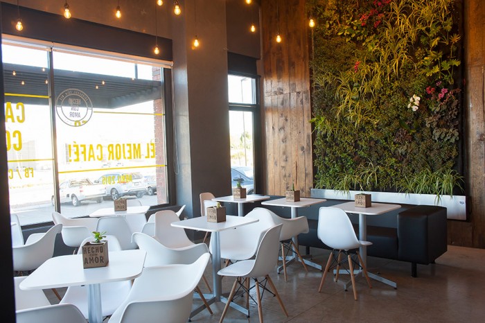
Personally, I dislike the color green. For some reason I just never took to it. So when a designer uses green, and makes me dig it, I know they did something right.
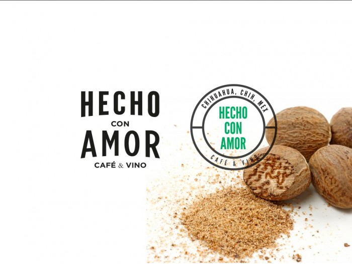
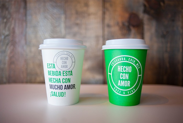
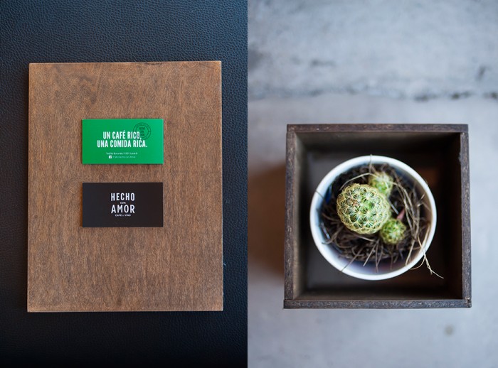
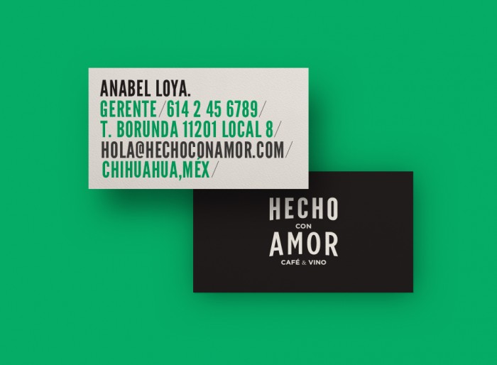
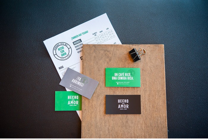
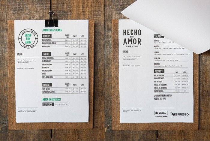
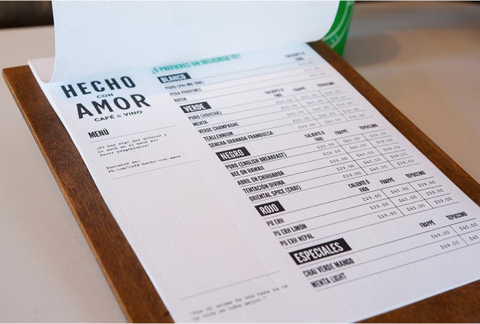
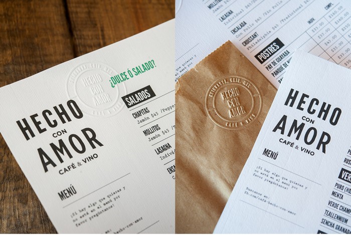
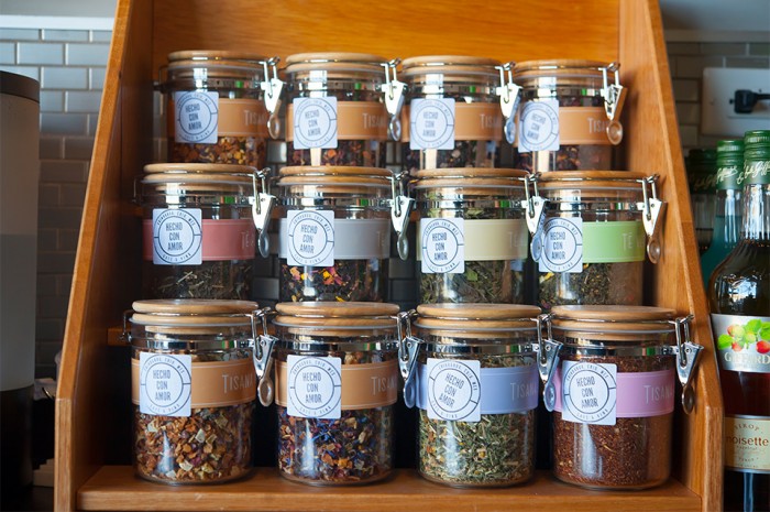
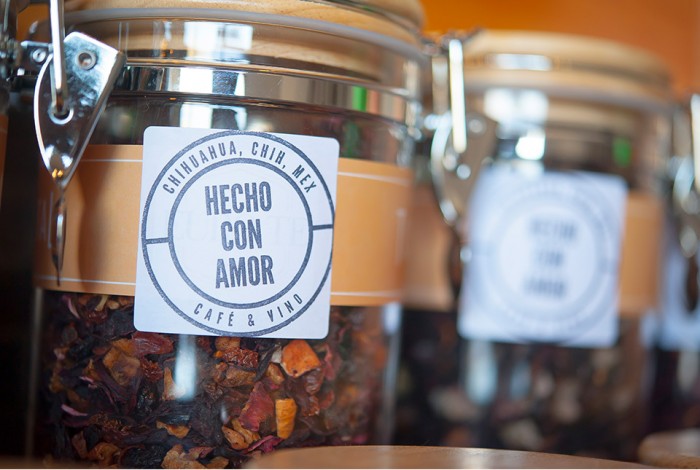
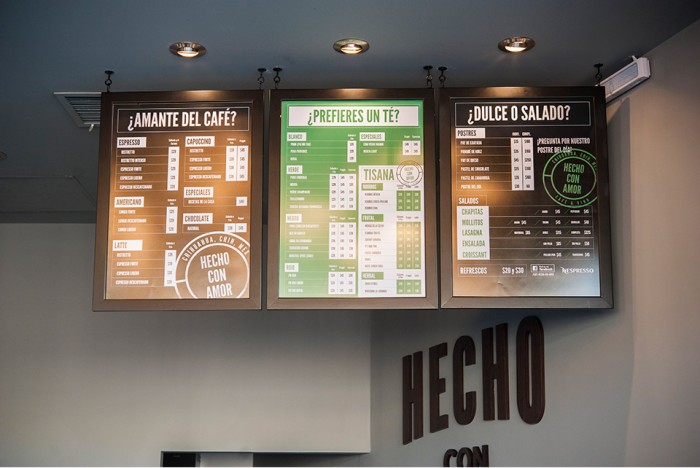
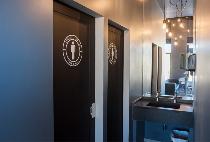
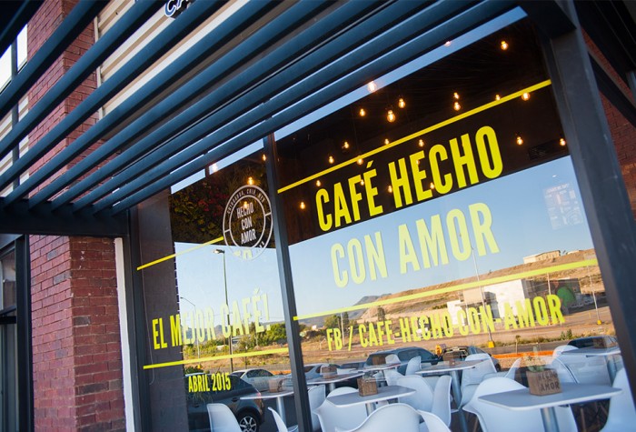
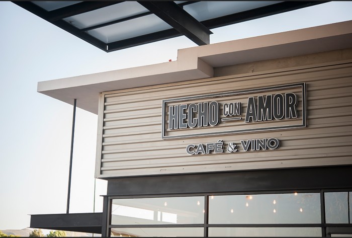
The brand identity design for the cafe uses strong compressed typography that follows a natural arch. A stamp version accompanies the core logo and adds the option for giving a handcrafted feel to certain touch points – as seen on the menus. The core colors – green, white, black – compliment each other quite nicely on the menu systems and packaging design.
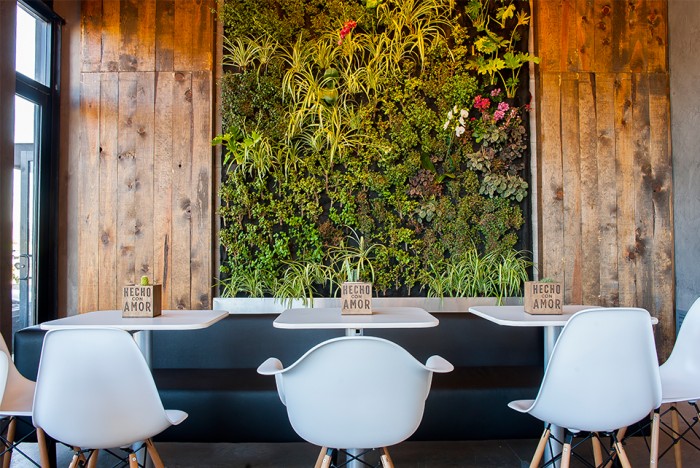
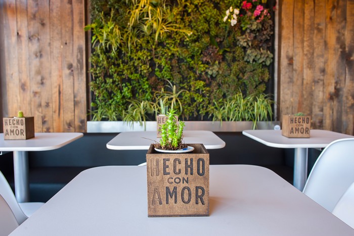
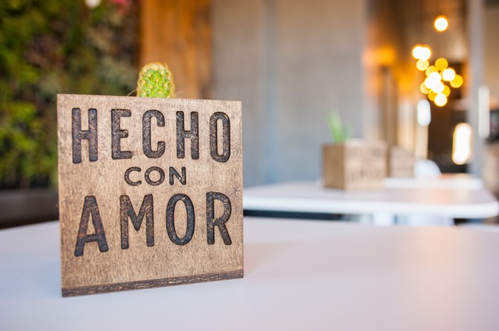
The cafe’s name translates to “made with love” and you can see the design team at Folklore did just that for their part.
