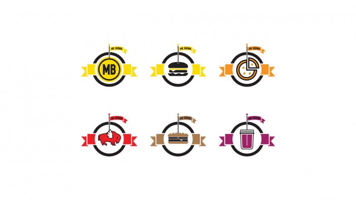
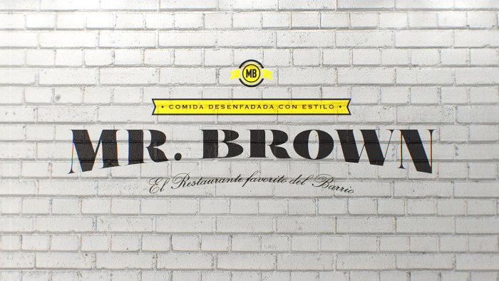
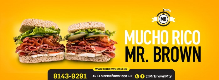
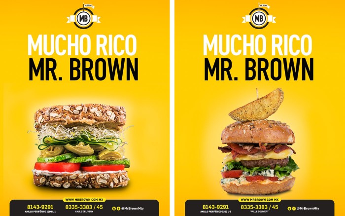
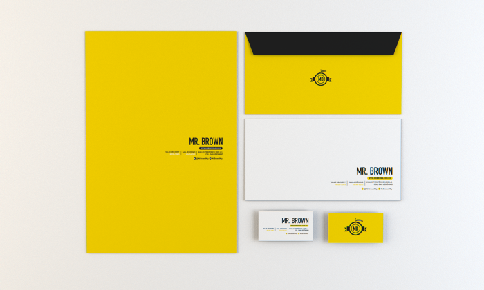
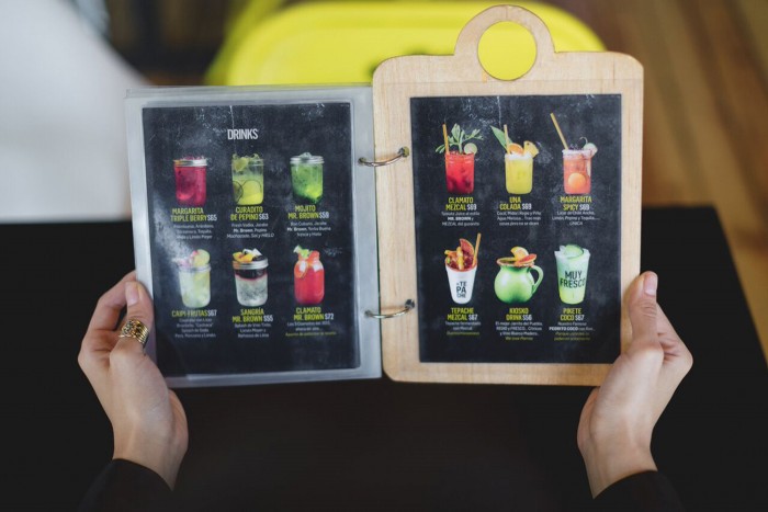
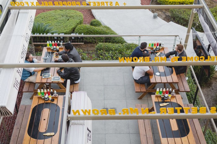
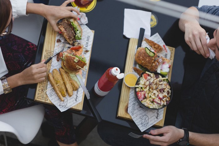
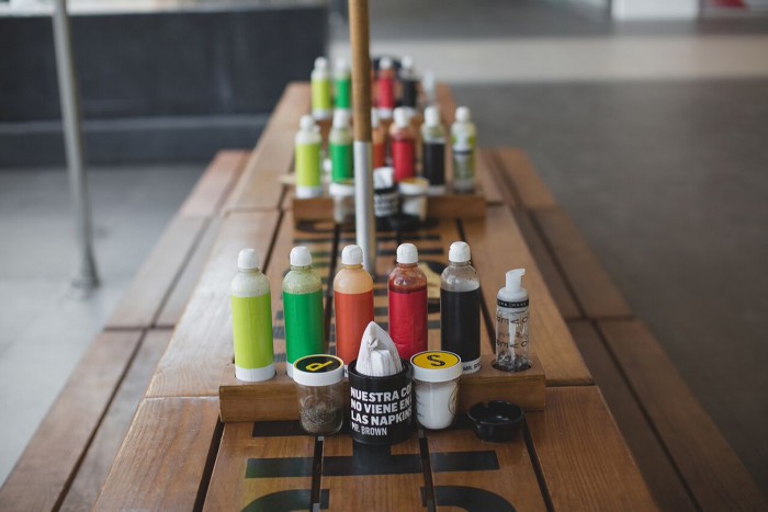
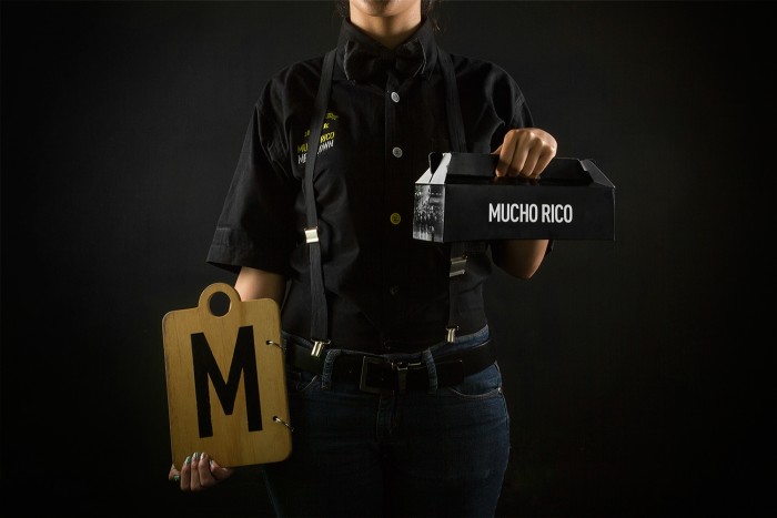
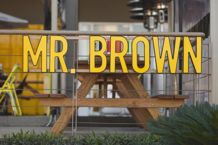
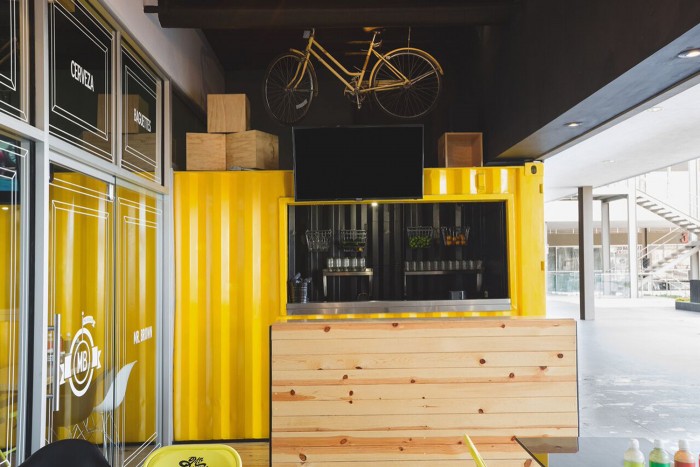
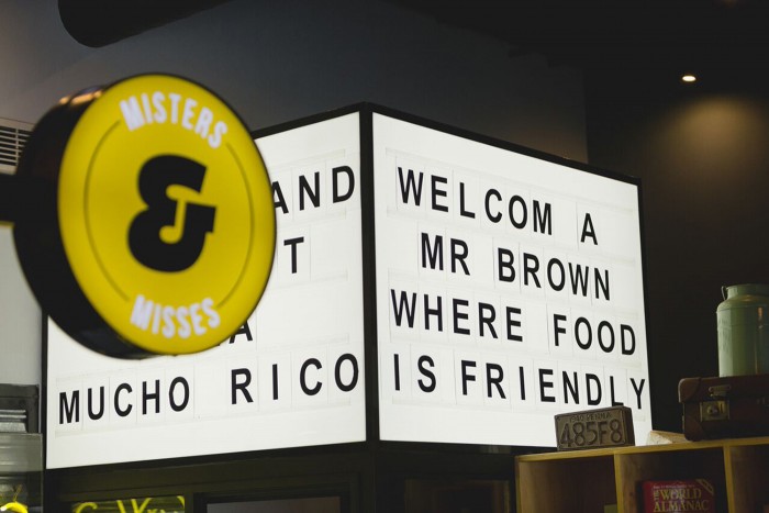
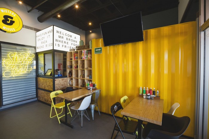
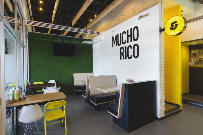
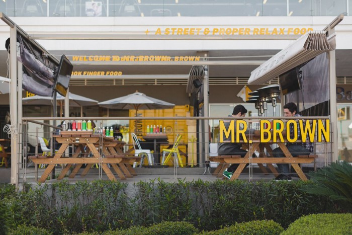
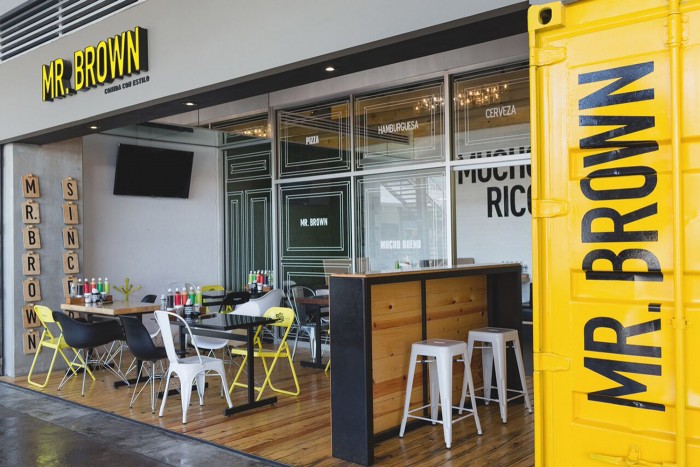
The identity for Mr Brown, a restaurant in Monterrey Mexico, crosses many touch points from interiors through print and digital. There is an attitude to the design that serves as the unifying element keeping things in the same visual language. I really enjoy the way the team uses basic needs like menus and chairs, but bakes them into the interior space in new ways. Here’s a snippet from the Jerome & Zimmerman website:
Our proposal was to use high impact elements on the restaurant. Creating a menu that is an element of the interior design. Put things and objects in irregular places. All this, hand in hand with a communication campaign that sells the deliciousness of their products without letting the coolness go unnoticed. Using a fresh and urban style, Mr. Brown continues his trips and consolidating his expansion.
Jerome & Zimmerman
Alan Guzmán – Lettering (Street Food)
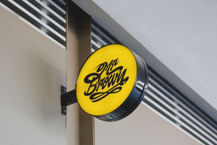
Netoplasma – Lettering (Mr Brown)
