Seis Chiles Mexican Restaurant Branding


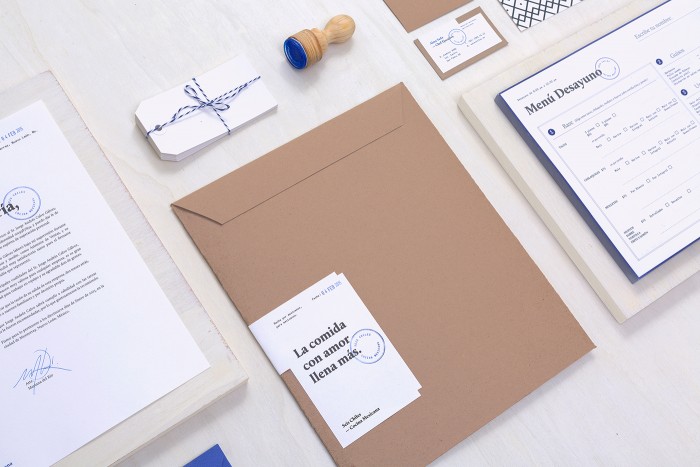
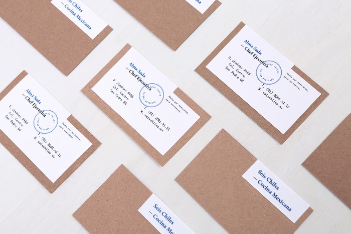
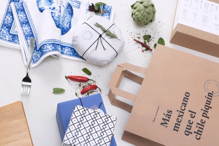
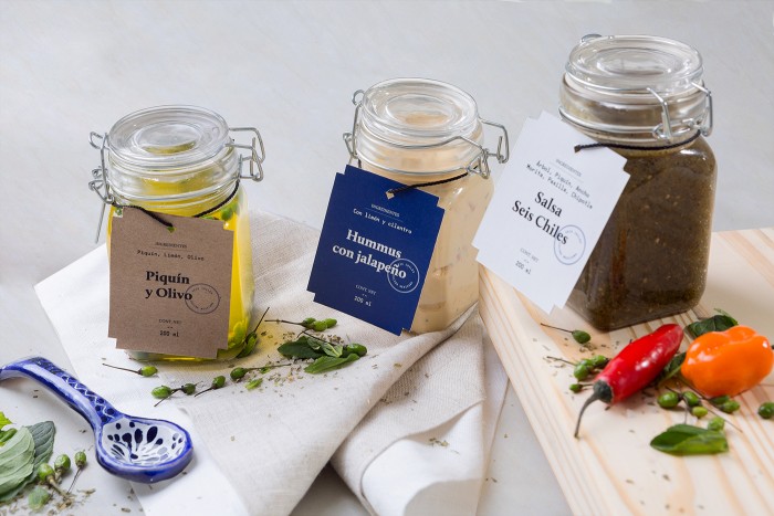
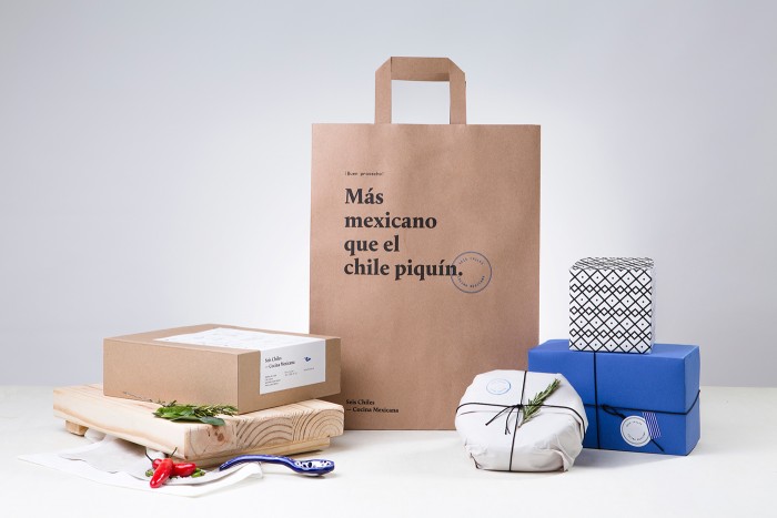
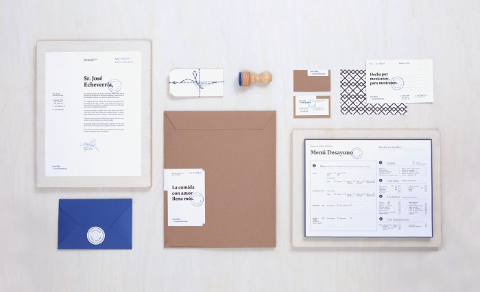
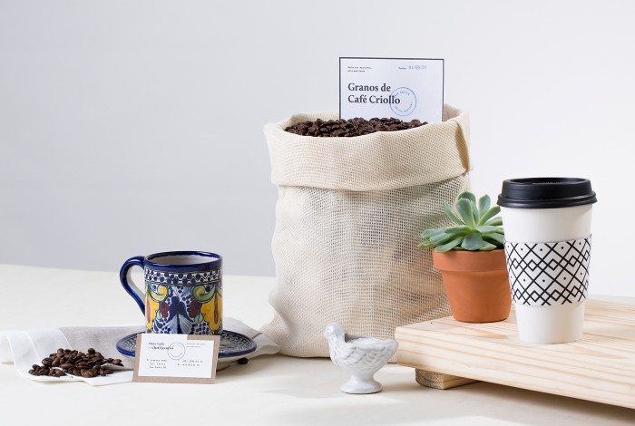
The team at Sabbath approached the brand identity design for Seis Chiles, a mexican grab-and-go restaurant in Monterrey Mexico, with a simple, upscale approach. The use of strong grid structures, reserved typography, and post production techniques gives the brand an air of confidence. The color palette is minimal which allows for the grid structure and typography to create the hierarchy in the design. I especially enjoy the cobalt blue’s interaction with craft paper texture and color.

Designed by Sabbath
2c35f0528fe559b793bb6b4b6d14d284

26ab1091ee6118868165fab123fc9b90

69d8f2965def29403a16f1d11b017971

25470c8f7a633855a1bc3b3eb278eca2

a137ac69245a8c5349c43e83eabaab5f

b49c0f0db0e639ea9a60ad6c254a7a3e

c4f698c9b47bdf5b8614a4836907e329

cb672c31c859315f5f87f765a4230c12

dd4a74884e2c0eff555c120d9331ca73

The Forktales Podcast™: Interviews with restaurant industry leaders and visionaries

Restaurant and advertising industry headlines and thinking

Reviews of restaurant experiences from around the globe 

Reviews of our favorite design, business, & restaurant books

Our favorite typography and fonts

Inspiration in your inbox

Get the latest inspiration in your inbox every Monday morning, for FREE!

"*" indicates required fields

This field is for validation purposes and should be left unchanged.

Delicious Bits in your Inbox!

Get the latest and greatest content delivered to your inbox for free!

"*" indicates required fields

This field is for validation purposes and should be left unchanged.