Spreyton Cider Company branding and packaging design

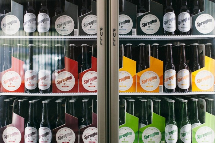
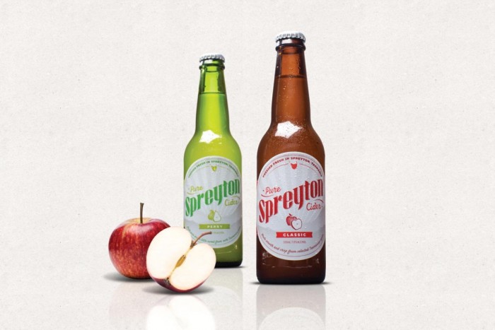
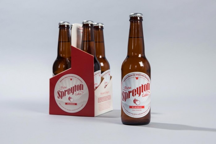
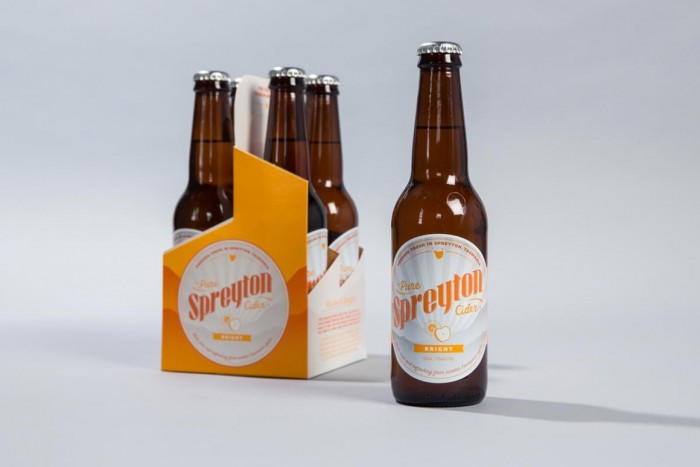
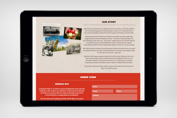
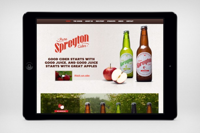
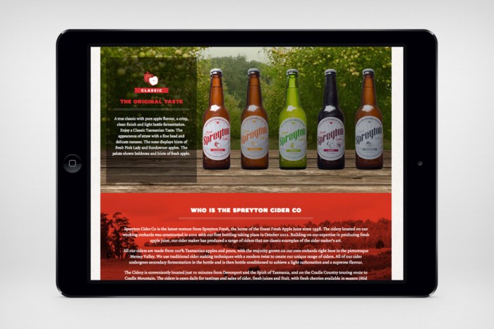
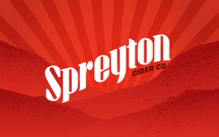
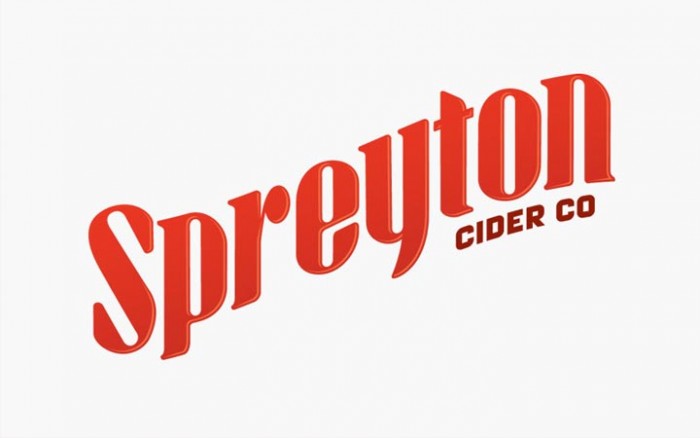
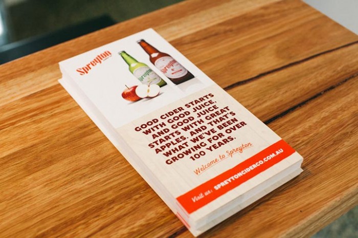
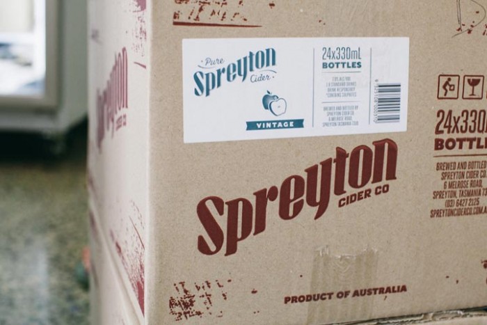
Through our research for an upcoming Vigor beverage branding and package design project, we came across this awesome design work for Spreyton Cider Company by the people at Southwest. The design is heroed (probably not a word) by an excellent custom typeface set on a wave baseline. It harkens to a style used in classic design back in the days of the snake oil salesman. That classic feel is pushed into the new with bright colors denoting each style of cider, as well as simple, yet strong typography. The team also injects more neo-retro style into the design with illustrations that are one part classic, and one part modern with clean lines that are given a distressed texture.

Enjoy.
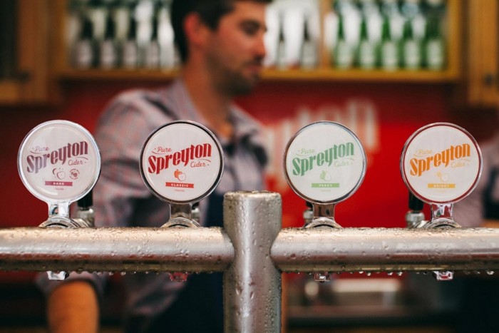
Spreyton-carousel-01-1160x775

Spreyton-carousel-02-1160x775

Spreyton-carousel-03-1160x775

Spreyton-carousel-04-1160x775

Spreyton-carousel-05-1160x775

Spreyton-ipad-01-1160x775

Spreyton-ipad-02-1160x775

Spreyton-ipad-03-1160x775

Spreyton-landscape-01

Spreyton-portrait-01

Spreyton-portrait-02

Spreyton-portrait-05

Spreyton-portrait-07


The Forktales Podcast™: Interviews with restaurant industry leaders and visionaries

Restaurant and advertising industry headlines and thinking

Reviews of restaurant experiences from around the globe 

Reviews of our favorite design, business, & restaurant books

Our favorite typography and fonts

Inspiration in your inbox

Get the latest inspiration in your inbox every Monday morning, for FREE!

"*" indicates required fields

This field is for validation purposes and should be left unchanged.

Delicious Bits in your Inbox!

Get the latest and greatest content delivered to your inbox for free!

"*" indicates required fields

This field is for validation purposes and should be left unchanged.