Dirty Blonde restaurant branding

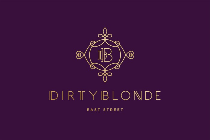
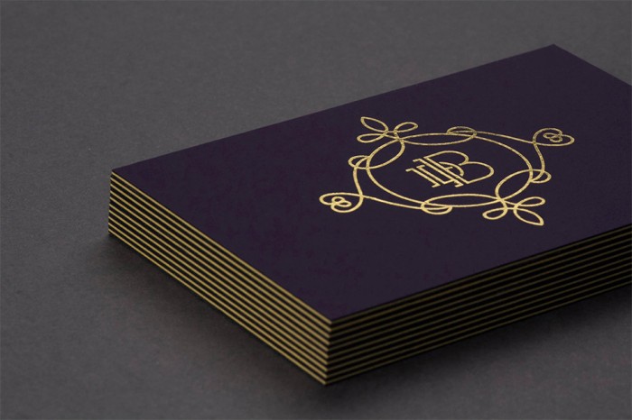
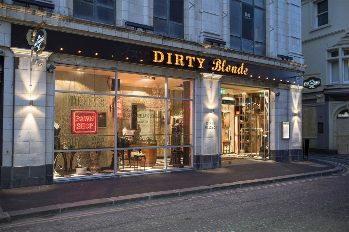
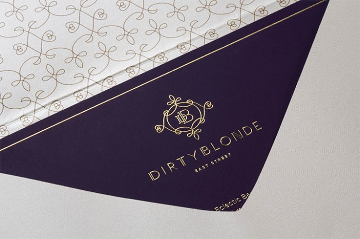
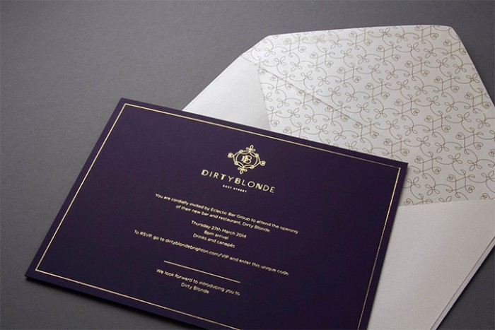
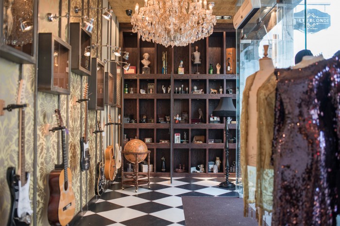
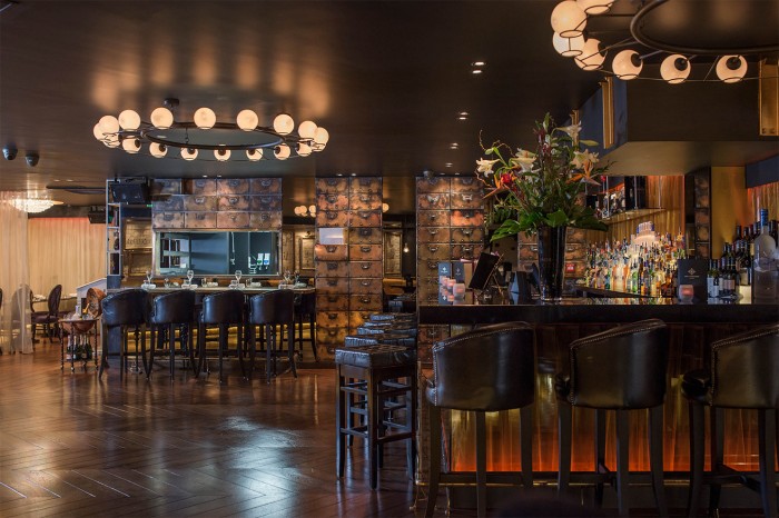
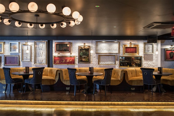
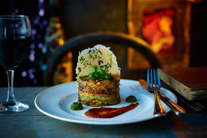
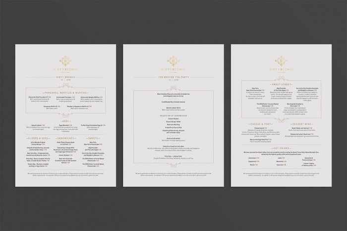
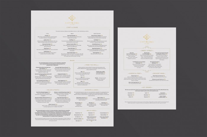
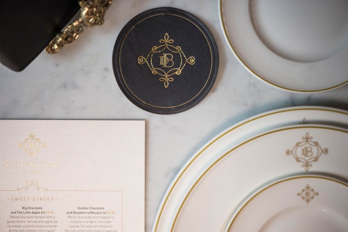
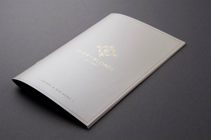
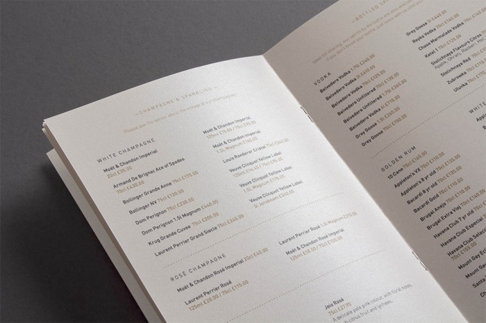
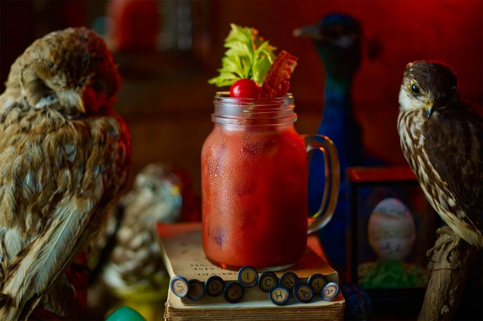
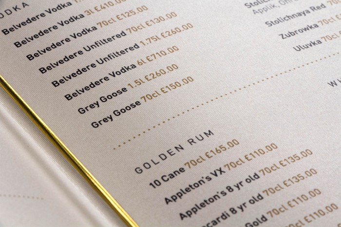
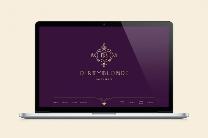
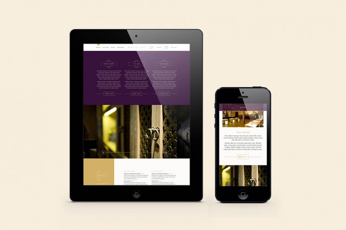
First, the name. It’s awesome. It’s memorable. It brings forth a cheeky smile. Now, onto the identity. The restaurant’s identity takes cues from classic, luxury design accoutrements. It’s historic with its flourishes, but begins leaning towards the modern with the letterforms in the insignia and logo type. The restaurant’s brand identity hits its stride in the print production with gold foil stamping that sets the bar high for the level of luxury. The photography of this work is quite stellar as well.

Designed by Salad Creative.

DB

DB2

DB4

DB5

DB6

DB7

DB8

DB9

DB10

DB13

DB14

DB15


DB17

DB18

DB20

DB21

DB24

DB26

DB27

The Forktales Podcast™: Interviews with restaurant industry leaders and visionaries

Restaurant and advertising industry headlines and thinking

Reviews of restaurant experiences from around the globe 

Reviews of our favorite design, business, & restaurant books

Our favorite typography and fonts

Inspiration in your inbox

Get the latest inspiration in your inbox every Monday morning, for FREE!

"*" indicates required fields

This field is for validation purposes and should be left unchanged.

Delicious Bits in your Inbox!

Get the latest and greatest content delivered to your inbox for free!

"*" indicates required fields

This field is for validation purposes and should be left unchanged.