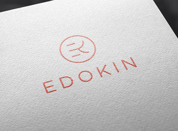
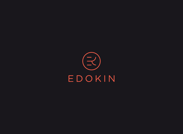
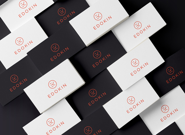
I’ve been quite fascinated with the forms of characters not within the Latin alphabet. I think what’s really fascinating about the Asian countries is their “alphabet” is actually syllabic as opposed to English which is primarily phonetic. The forms have so much meaning in their construction. I personally like to find congruencies in the forms between Latin letters and Hanzi symbols, even if there are no direct correlations. That’s exactly what Lucas Gil-Turner has done with the logo for Edokin, a japanese restaurant in Bratislavia, Slovakia.
The brand mark is an exploration of the core Latin letterforms E and K, rendered in a way that’s reminiscent of the Japanese syllabary alphabet characters.
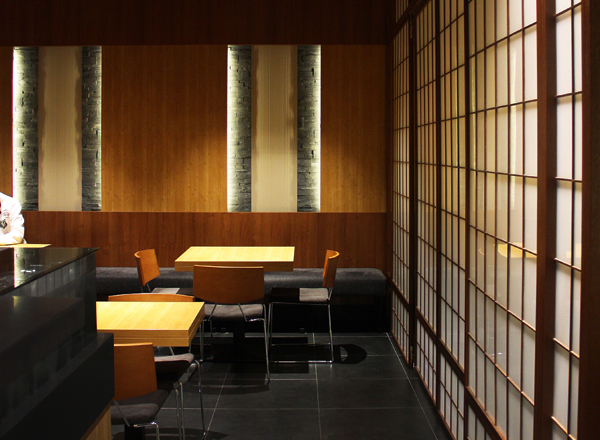
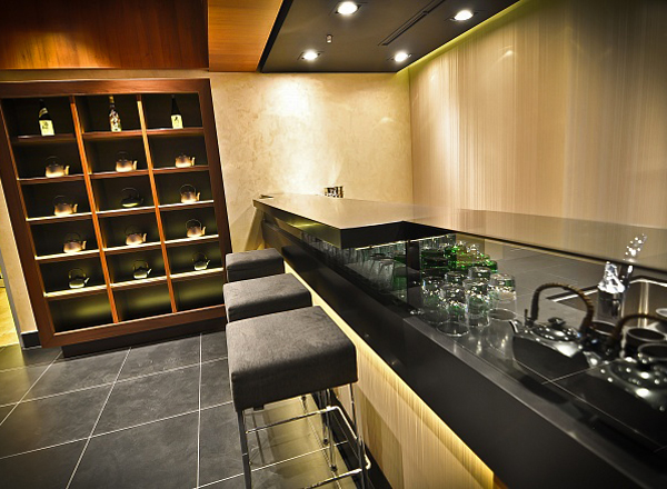
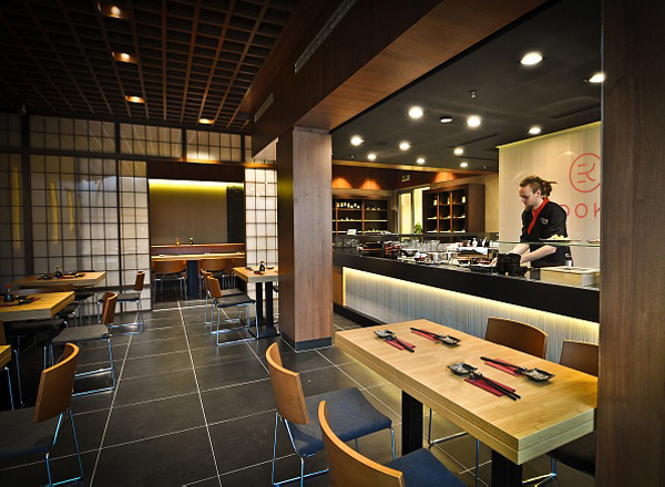
Interiors: Cesar Fernández Bravo
Brand Identity: Lucas Gil-Turner
