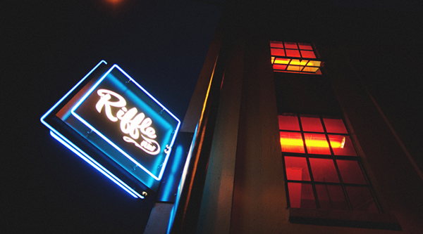
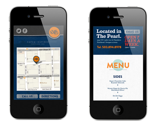
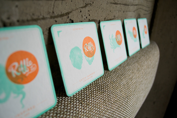
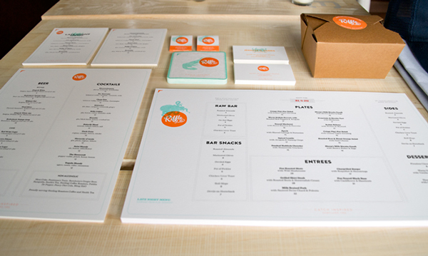
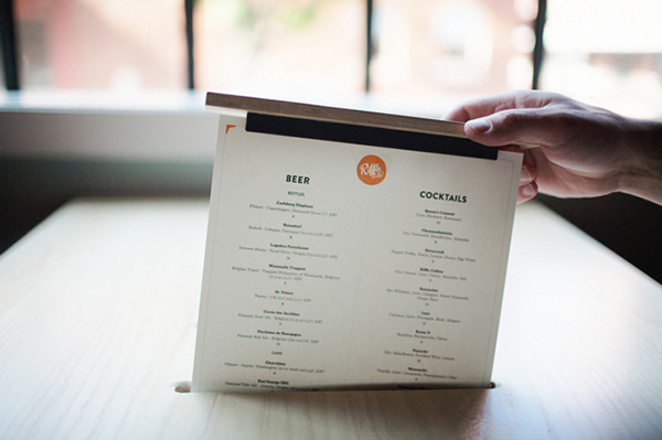
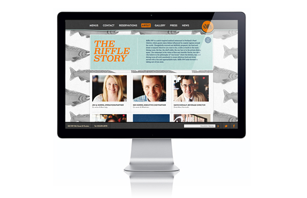
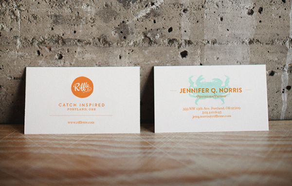
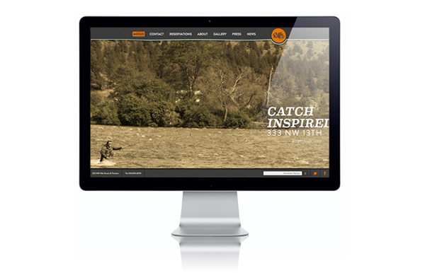
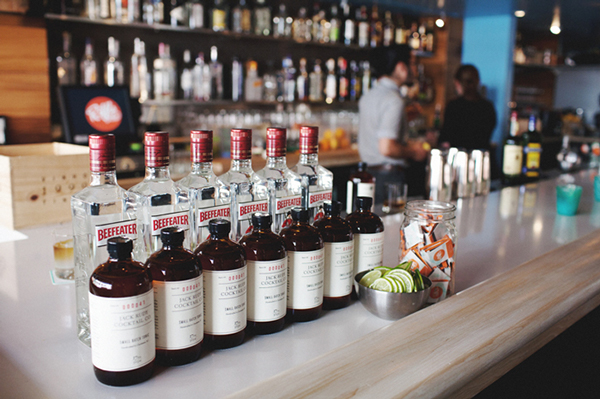
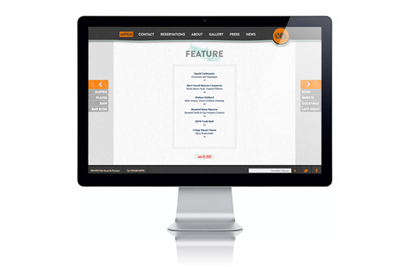
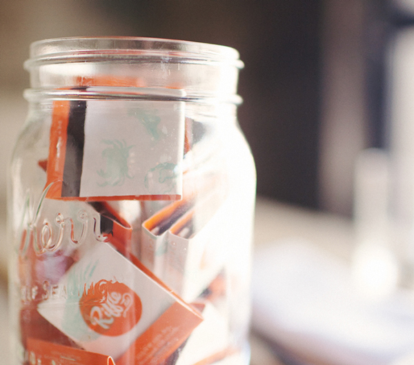
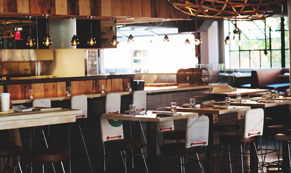
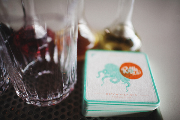
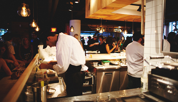
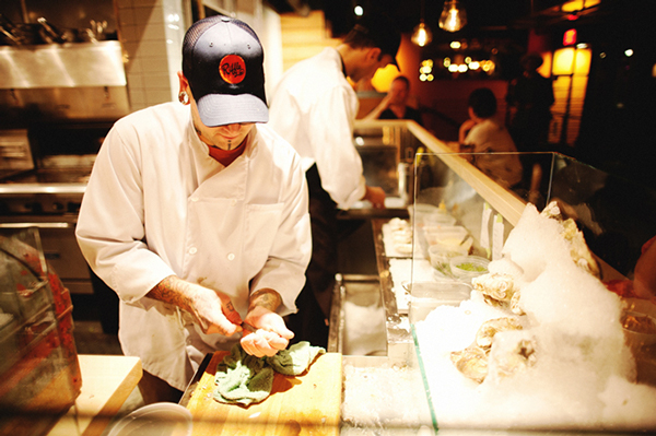
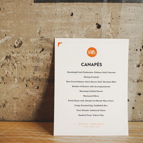
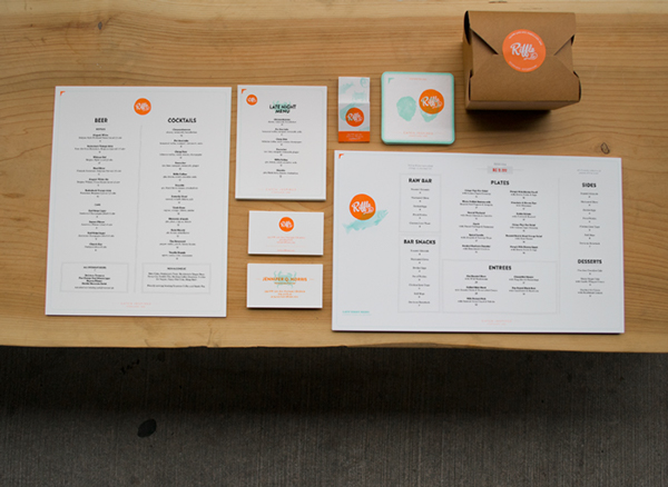
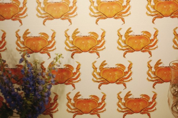
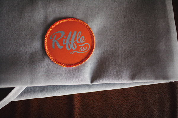
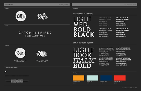
Riffle’s brand identity sets a visual standard that communicates the restaurant’s dedication to sourcing and artisanship. The unique color palette features light orange, teal and deep blues that mirror the colors found in the fruits of the ocean. This creates a direct correlation to the food in a subliminal way. The main typeface is hand rendered script which is supported by a beautiful serif type family. Combined the type reinforces that level of craft one should find within the four walls. The touch points all work in unison to support the brand’s angle while building a full, rich unique look.
Designed by Hovercraft Studio.
