Tartares & Co restaurant branding

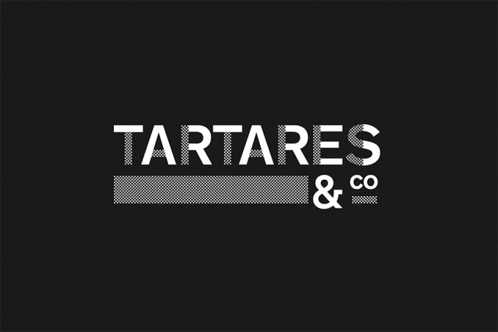
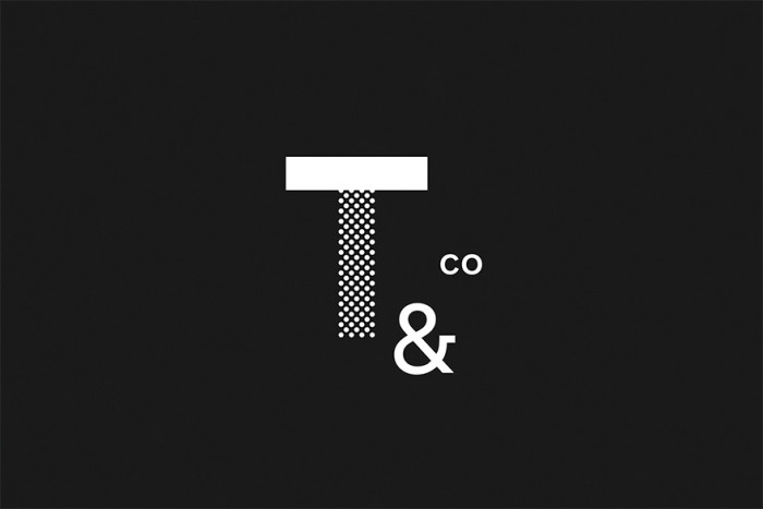
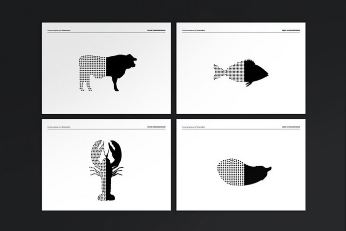
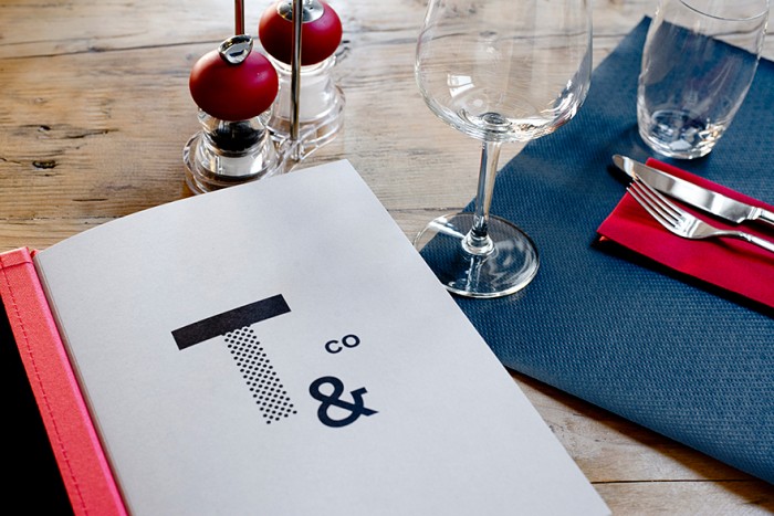
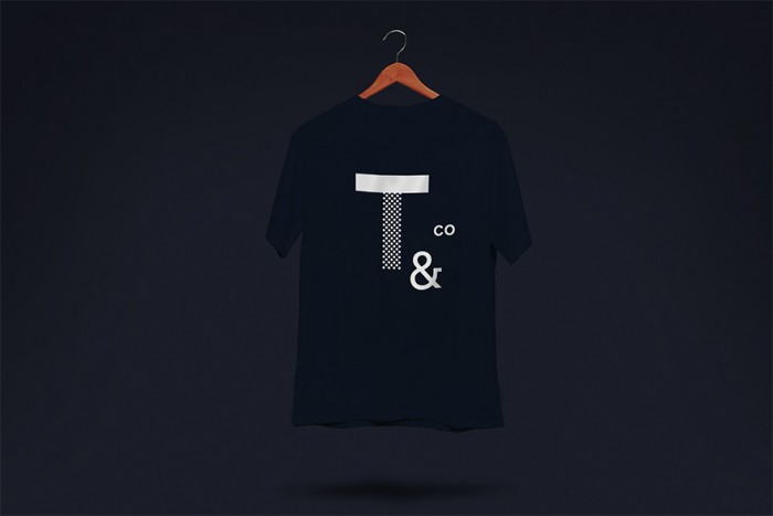
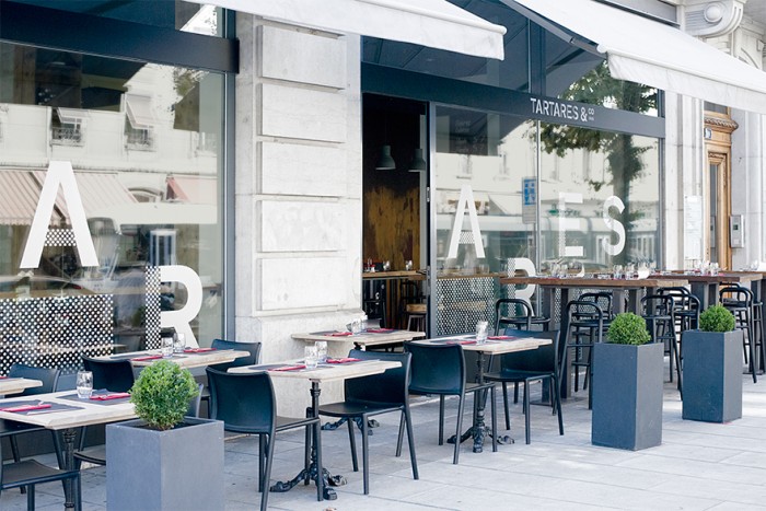
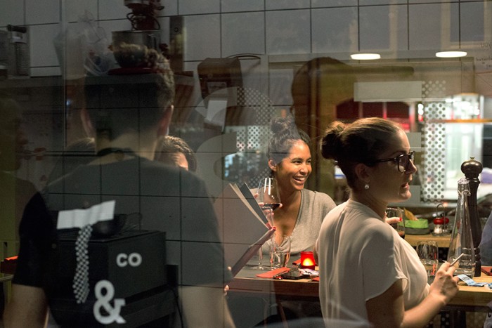
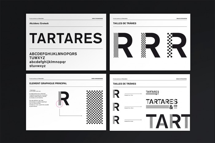
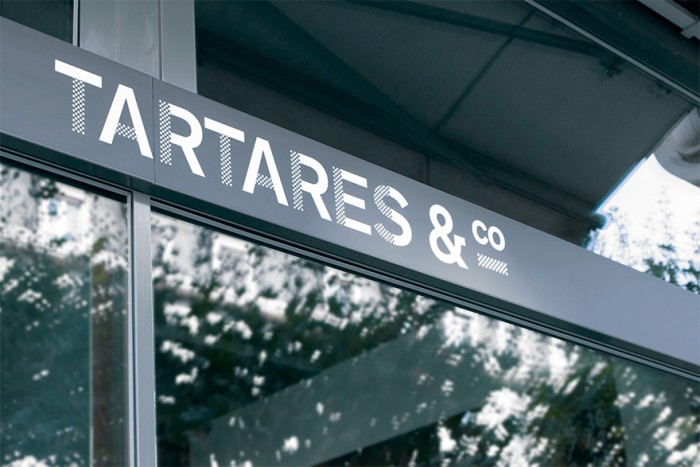
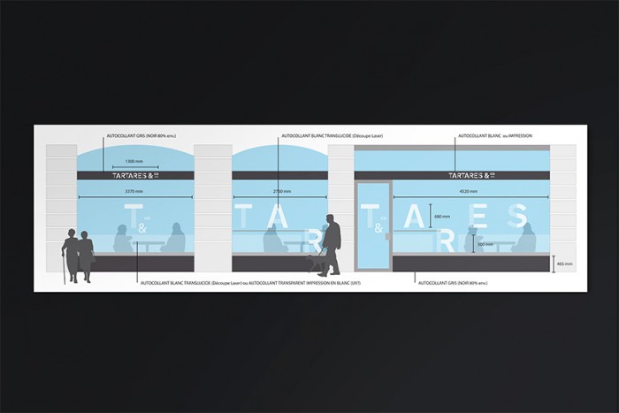
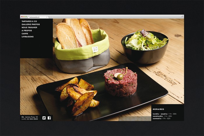
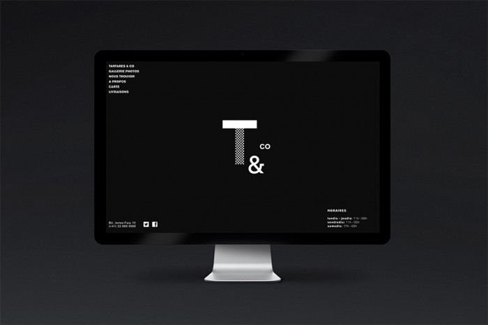
Simple, minimal, and highly modern describe the brand identity for Tartares & Co restaurant and bar. The restaurant’s brand is defined by the high contrast black and white palette and the highly geometric design that melds shapes and patterns into a distinguishing look and feel. The graphic elements take their cues from the brand identity creating a unique look that’s completely ownable by Tartares & Co. I especially appreciate the window treatment design and how the brand really pops there.

Designed by Studio Gambetta.
3be69328571813.560e2e7d2b37e

3d2dd728571813.55c7595b3bf98

6c2d8828571813.55c7595b3aa6d

7ad9d428571813.560e6b3f1ce62

7c5d2328571813.560e2e7d2d655

7c7f0128571813.55c7595b40da3

494f5828571813.55c7595b3e472

863b4328571813.55c7595b4207f

18972c28571813.560e2e7d2c3b3

99248f28571813.55c7595b3fab0

a74e9a28571813.55c7595b3d263

e28d3428571813.55c7595b443b3

The Forktales Podcast™: Interviews with restaurant industry leaders and visionaries

Restaurant and advertising industry headlines and thinking

Reviews of restaurant experiences from around the globe 

Reviews of our favorite design, business, & restaurant books

Our favorite typography and fonts

Inspiration in your inbox

Get the latest inspiration in your inbox every Monday morning, for FREE!

"*" indicates required fields

This field is for validation purposes and should be left unchanged.

Delicious Bits in your Inbox!

Get the latest and greatest content delivered to your inbox for free!

"*" indicates required fields

This field is for validation purposes and should be left unchanged.