If you haven’t visited the Bronx, the upper part of New York City, it’s an interesting mix with a mostly industrial atmosphere. In this borough you’ll find a stellar little craft brewery ironically named Bronx Brewery.
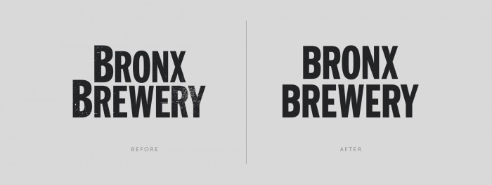
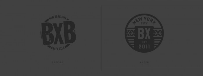
[Bronx Brewery] built their company from the ground up crafting premium pale ales, kicking ass, and taking names. Unfortunately the brand didn’t tell that story at all. So, BB tapped the creative genius at Tag Collective to create an emblematic brand that captures both the spirit of the brewery and its community.
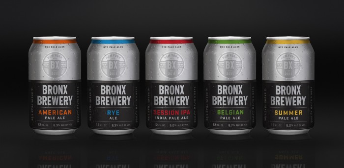
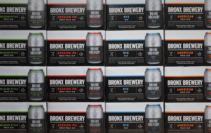
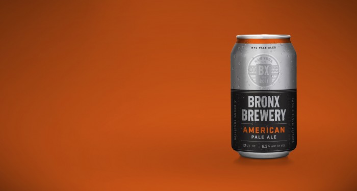
The result is a clean-cut, straightforward, no-nonsense brand identity that utilizes colors to denote each of their beers. As a family they are perfect and individually they have a hard-nosed, badass feel. Here’s what the team at Tag Collective says about their approach and thinking:
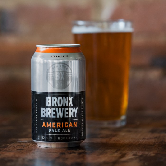
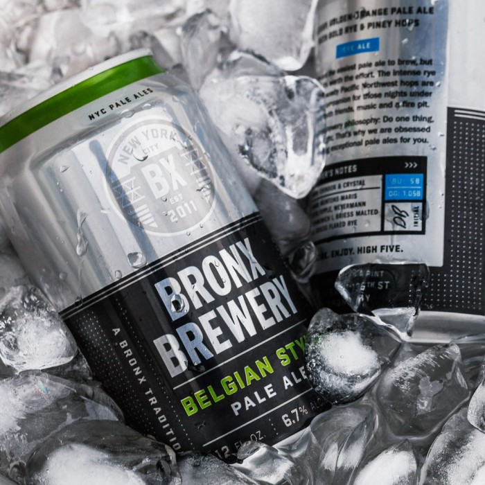
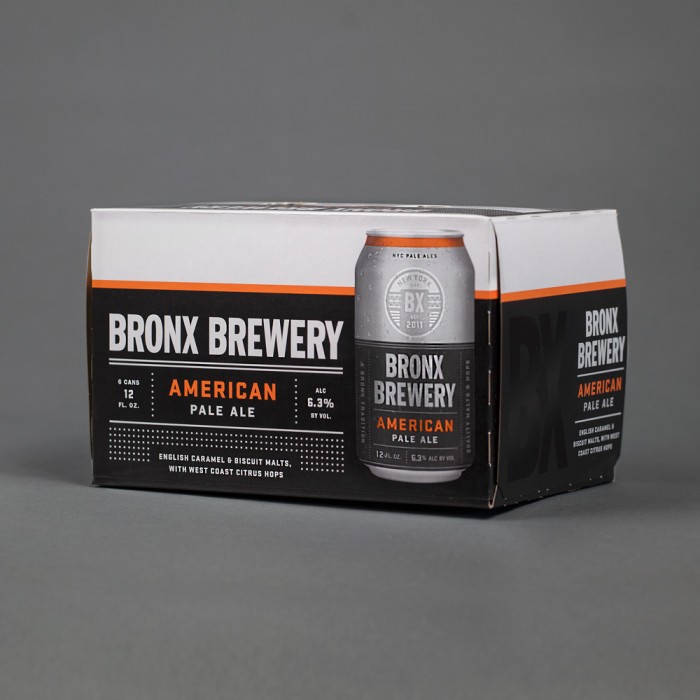
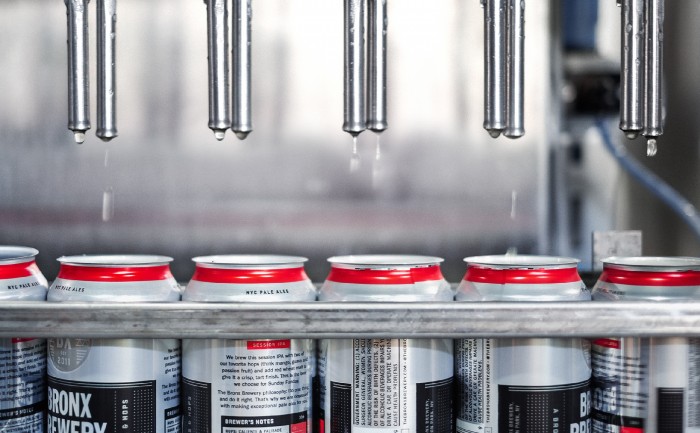
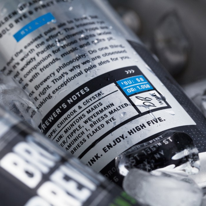
We rebranded and redesigned the packaging, creating an updated industrial look with fine details that add a crisp, polished feel. We also focused on what makes each beer unique by listing the hops and grains used by the brewer—giving beer lovers everywhere something to geek out on. After all, this is a craft beer. The brand now tells the story of both the Bronx Brewery’s premium beer and the borough from which it was born.
Designed by Tag Collective
Creative Directors: Becca Eley and Jason Punches
Copywriter: Michael Sendrow
Photography: Becca Eley
