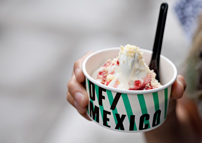
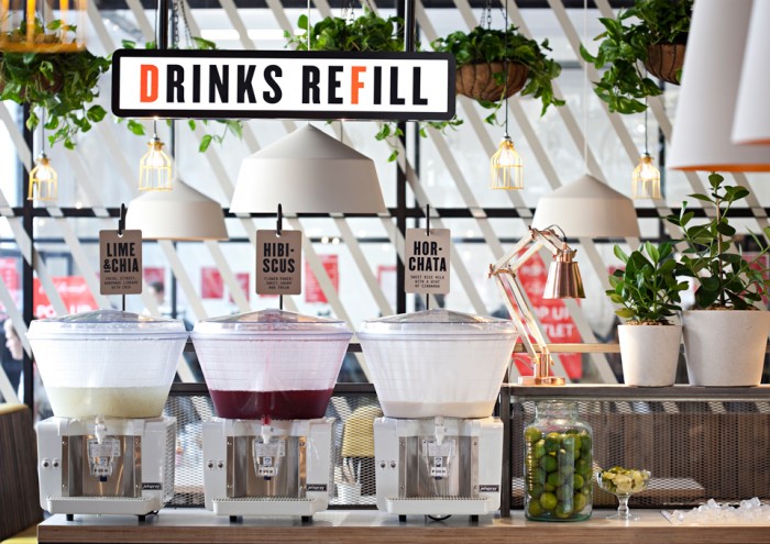
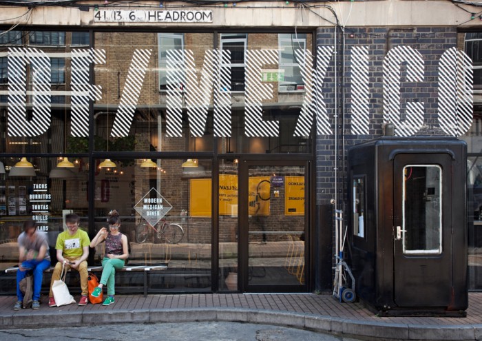
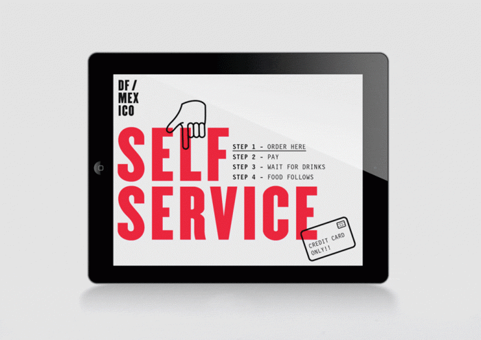
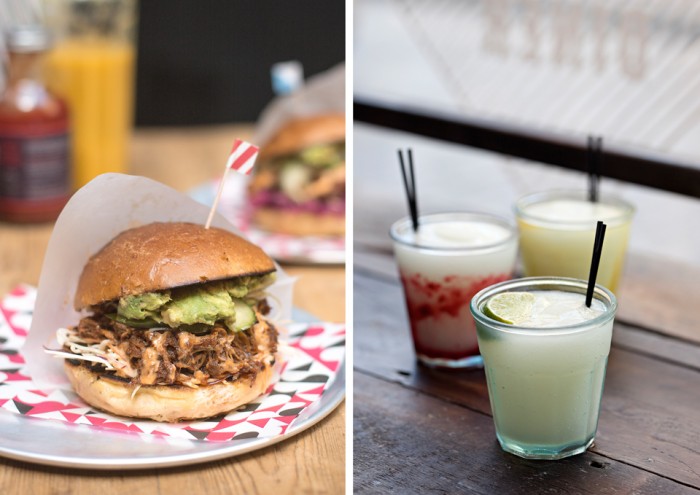
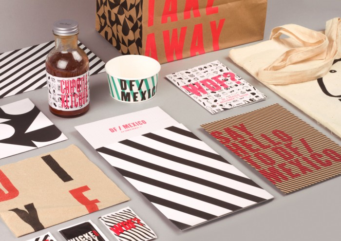
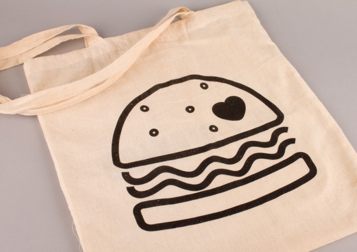
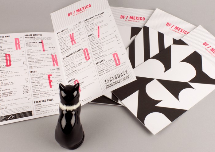
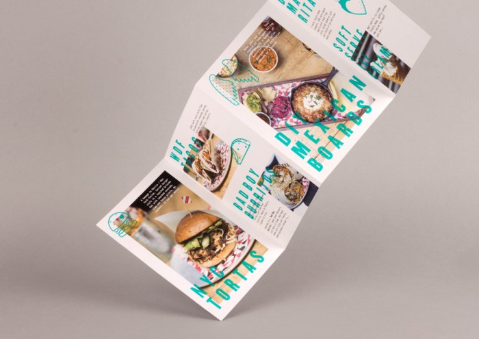
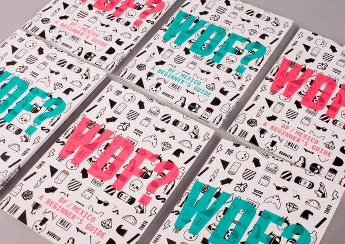
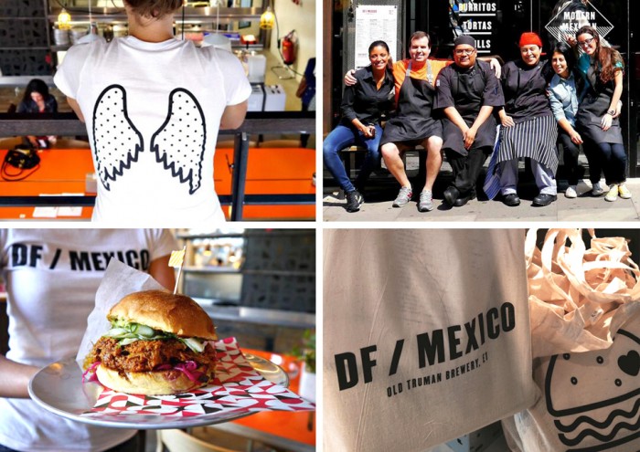
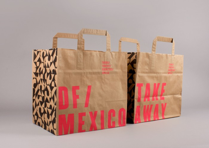
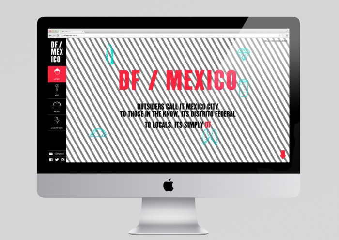
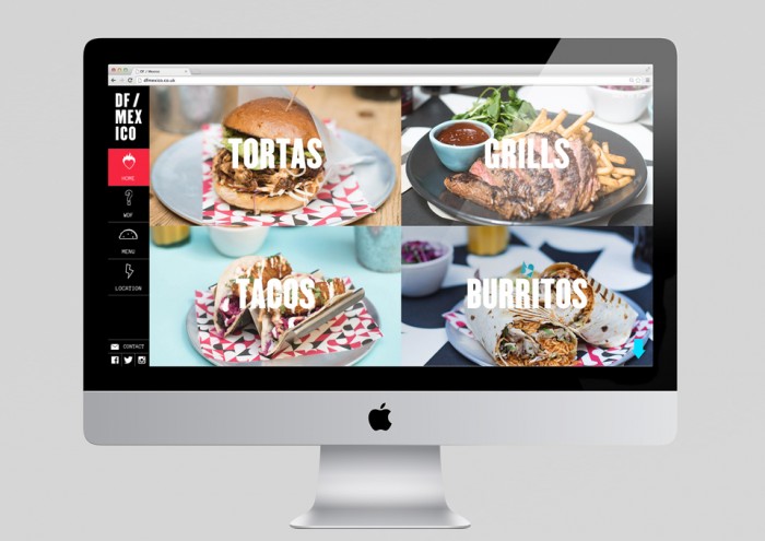
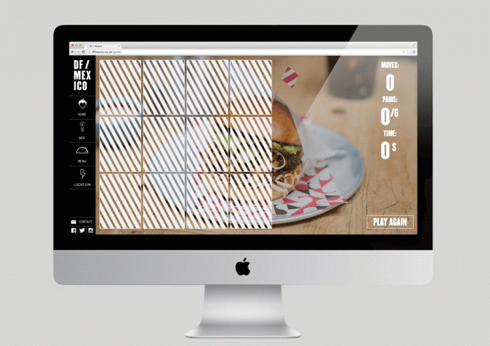
To those in the know Mexico City is known as Distrito Federal. To locals it’s called DF for short. This new restaurant brand takes the brilliance of the DF streets, mixes it with modern American influence and delivers a diner-style, fast food experience. Buro Creative, out of the UK, crafted this cutting-edge brand identity system for the restaurant which features patterns, modern line art illustrations and pops of neon colors.
DF is an urban animal, influenced by the fast food and service culture from across the border. With a stripped-back palette and confident patterns, DF/Mexico is a crash course in Mexico City.
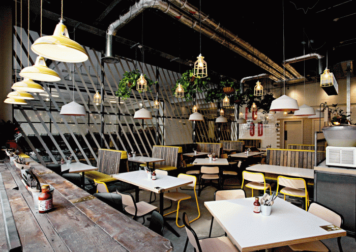
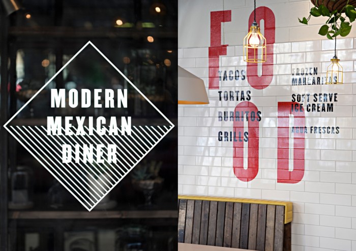
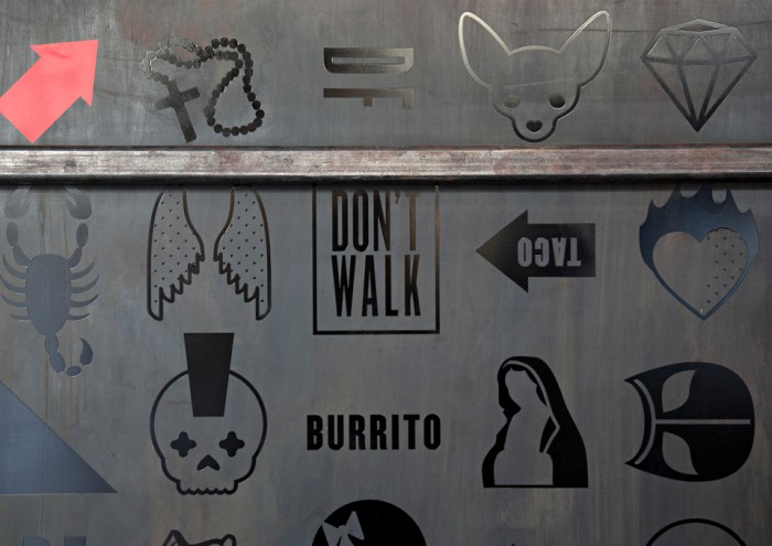
The Buro team accomplished their goal of disrupting the restaurant identity scene with their fresh direction for DF. With pops of bold typographical treatments and graphic elements throughout the interior space, the industrial feel is met with modern Mexican vibes. The urbanesque iconography pokes fun of cliché Mexican imagery from Chihuahua’s to the Blessed Mother. All designed in a fresh, unexpected way.
The culmination of the brand looks almost like a Bizarro Taco Bell who’s found itself in a Mexican alley. It’s fun, fresh, and a totally new look in the London food scene.
Designed by Buro Creative
Interiors by Softroom Architects
![]()
