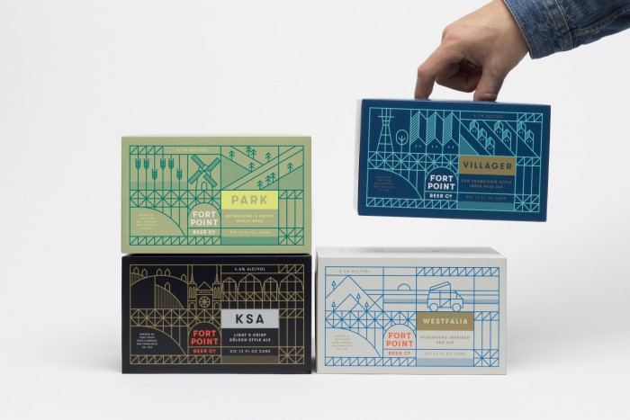
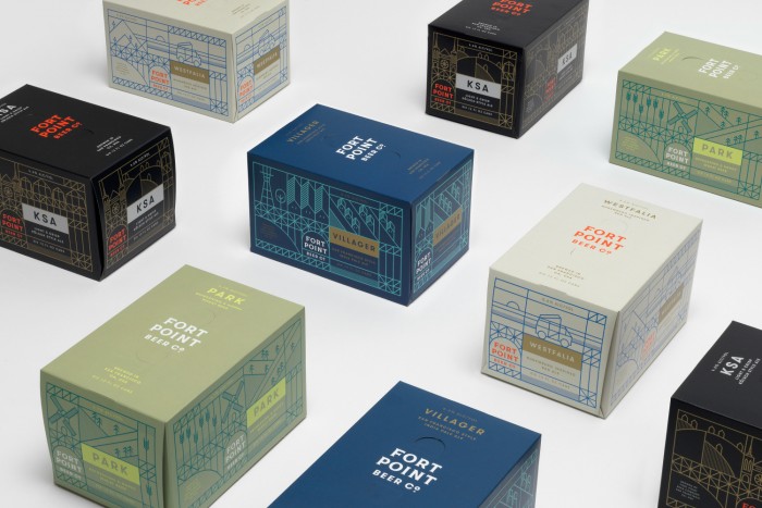
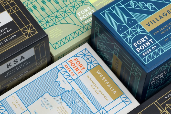
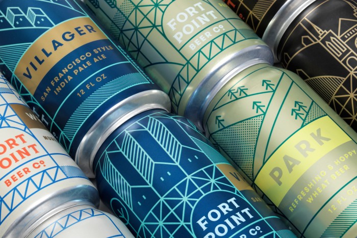
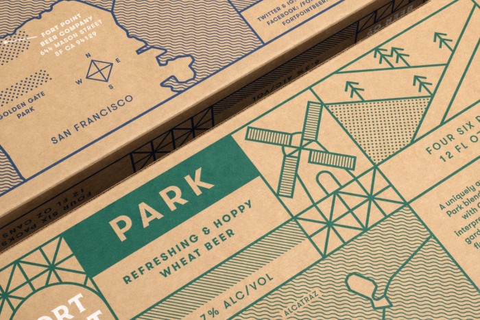
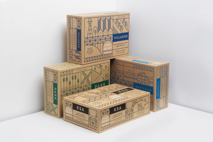
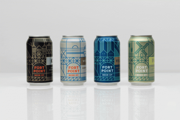
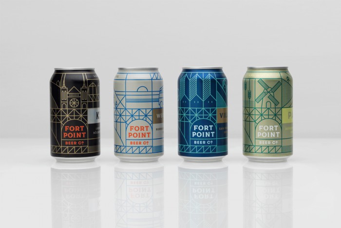
This beauty has been popping up everywhere this week, and with great reason. It’s awesome. From the super geometric line illustration through the color palette, the brand identity design and packaging for Fort Point Beer Co pushes the boundaries of what’s expected in the craft beer world. Manual Creative does an excellent job of crafting the landscapes and atmospheres of the Fort Point world that locals can immediately identify with. Here’s what the team at Manual says about the work:
The brewery resides in a historic Presidio building that was formerly used as an Army motor pool. Their iconic location—close to both the Golden Gate Bridge and the Fort Point National Historic Site—provided inspiration for a modular, illustrative brand identity. In packaging, the illustration incorporates elements of city landmarks and Bay Area culture to create a unique and authentic sense of place.
Designed by Manual Creative
