Cue up the calliope music, this circus has broken loose. KFC released images of its new store design created by the team at FRCH Design Worldwide. Although the first encounter may set off gut reactions, I think it begs to be picked apart with a little more objective scrutiny than an article riddled with snark. Let’s dig in.
The Good
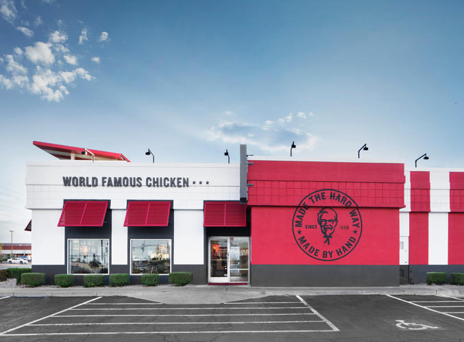
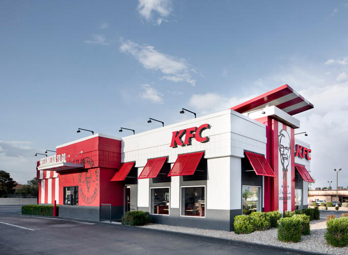
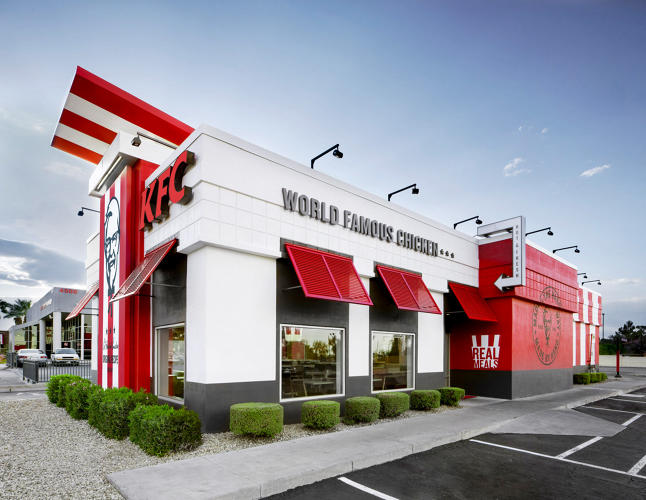
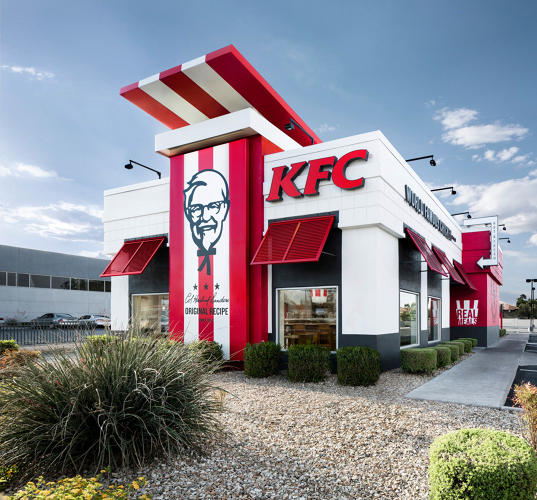
It’s unique and inherently heritage KFC. The outside is bold, strong, and distinctive. Despite any criticisms I actually think the exterior of the new design is quite well done. So many other restaurants have played the uber-modern, safe look and end up looking like nondescript bank buildings. This is an aggressive industry people, make a stand!
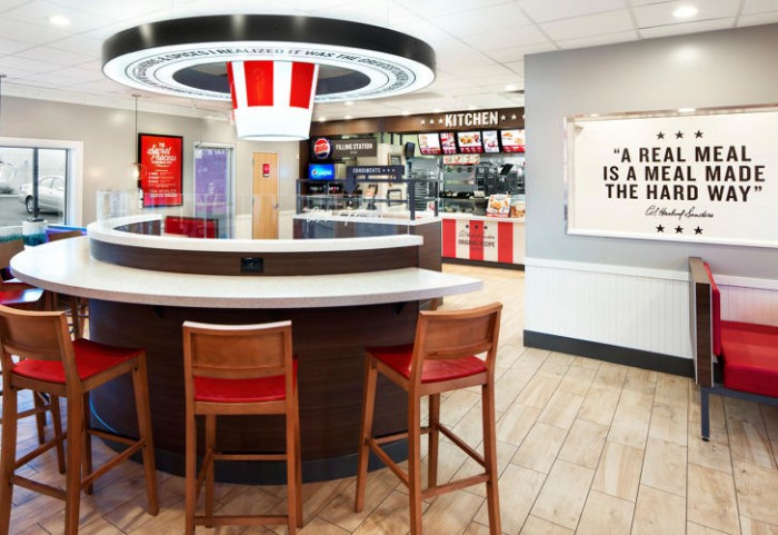
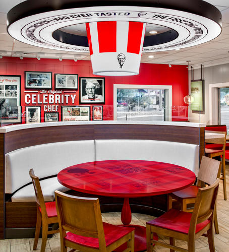
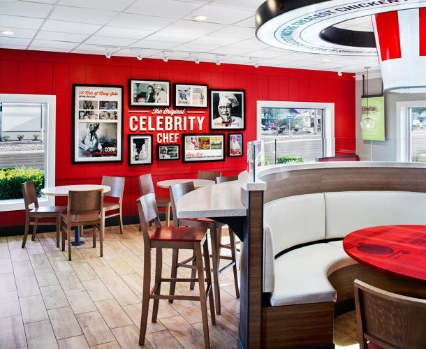
The interiors are bright and contain many micro-moments in varying design elements. Guests have options with the type of experience they want to have if they’re dining in, from communal to one on one.
The design isn’t for everyone, but neither is KFC. So, Mr. Hipster who’s dead set on being unique and ironically deep, please move along.
The Bad
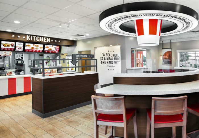
The interiors are trying hard, but missing the mark. For instance, you’ll be hard pressed to try to sell “real food” to people when, as Mark Wilson over at Fast Co. aid, you’re processing 23 million chickens a year.
It’s clear KFC is trying to latch on to its heritage while simultaneously bringing it into the future. Unfortunately for them it doesn’t quite jive. It reminds me of Back to the Future II. It’s almost a parody just like the terrible Norm MacDonald commercials that insult the Colonel himself.
The interiors are overwhelming. They seems to be screaming multiple different messages all at the same time. “We have history!”, “We’re fresh!”, “We do things the right way!” Add in the cold white, super bright lighting and toss in a terrible fried chicken bucket light and you have what looks more like a circus, Americana nightmare.
The Ugly
Can we talk about the chicken bucket light? I think it’s a joke that went too far.
And to top it off, the colonel’s face is everywhere… staring… looking… seeing all.