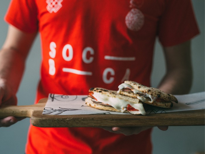
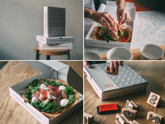
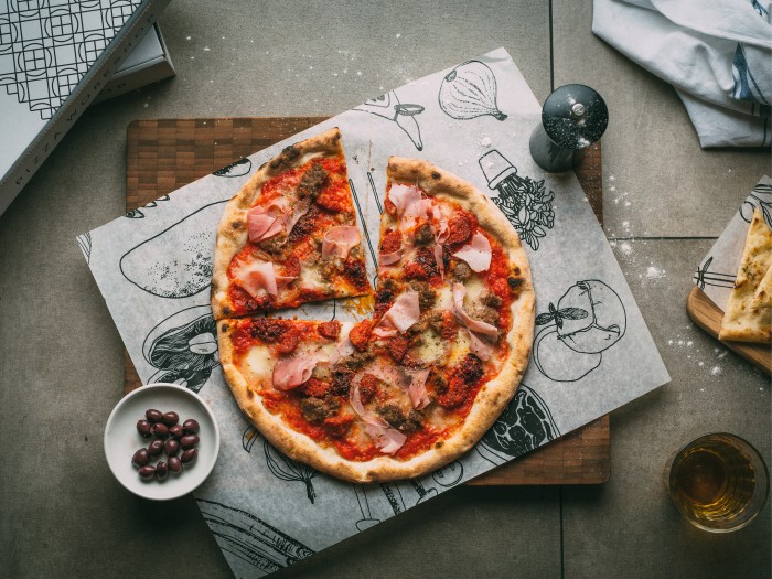
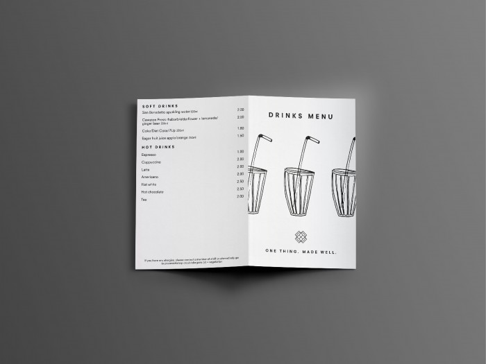
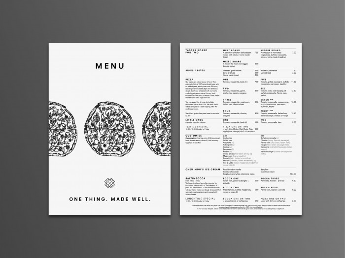
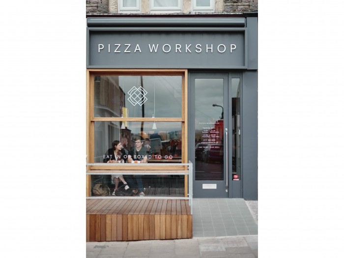
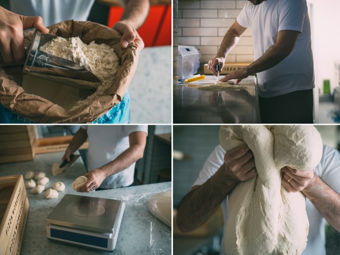
The team at Moon submitted their latest project: Pizza Workshop. This is an example of a complete, true restaurant brand development project. As they say, “from the edge of the pavement to the service door at the back,” every part of the experience has been considered, designed, and executed with the brand in mind. Pizza Workshop’s identity is highly modern in its look with accoutrements that pay homage to classic style (see the pattern.) Using a modern sans-serif type family as the primary identity element, the brand comes across confident, clean, and fresh. Other touch points make use of pen and ink illustrations as a means to imply craft.
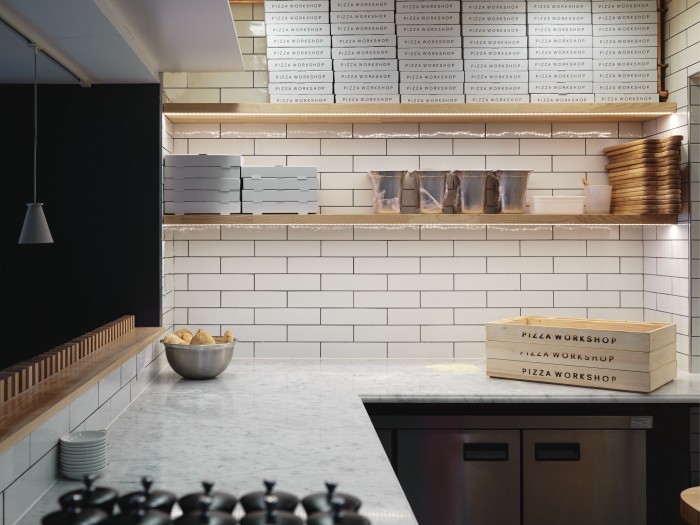
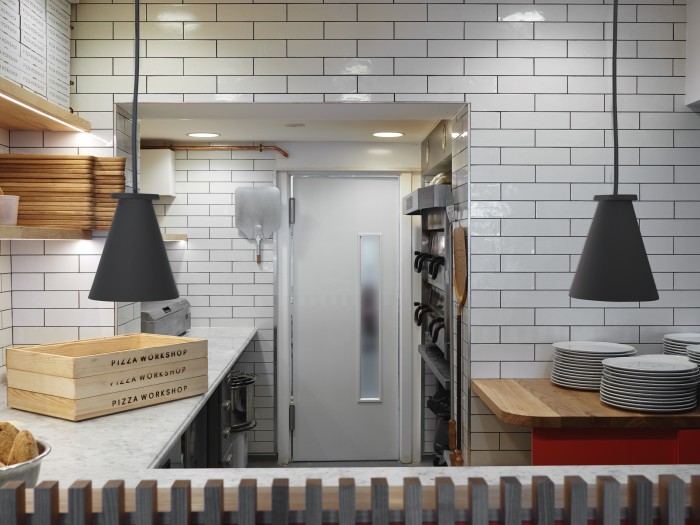
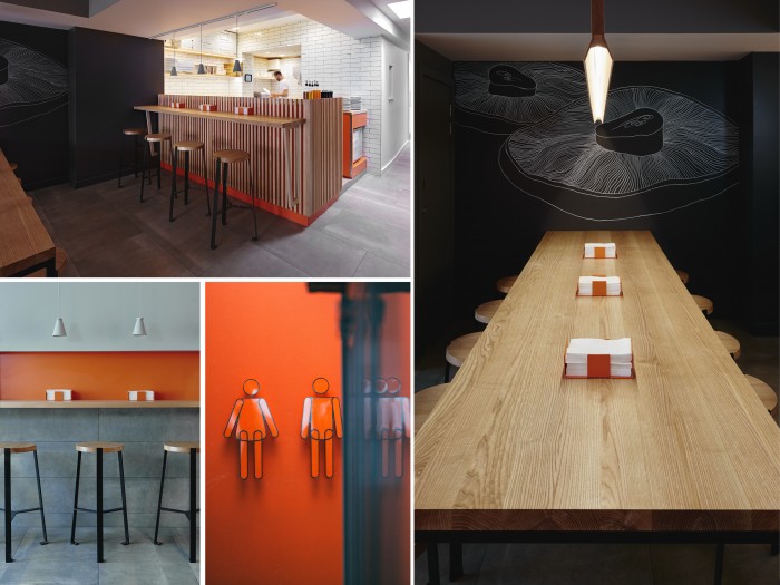
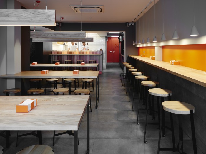
The interiors carry the modern style torch with clean lines, and smoothly refined surfaces and textures. The use of a muted palette and raw texture colors set a foundation to introduce this brand’s primary brand color with a pop. That reddish orange jumps out in all the right ways. As they have written, the result of their work is “a brand [that] is perfectly aligned with the look and feel of the restaurant and the type of food [that] is served. It is both modern and fresh.”
Designed by Moon Design & Build
