Hellstrom Aquavit branding & packaging

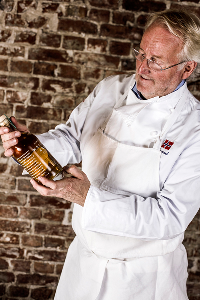
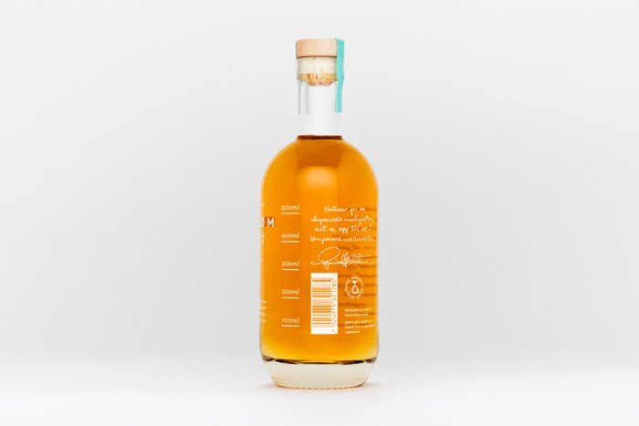
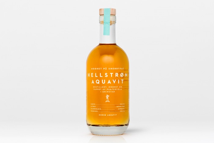
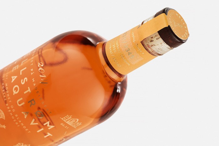
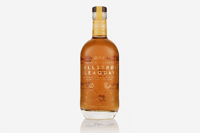
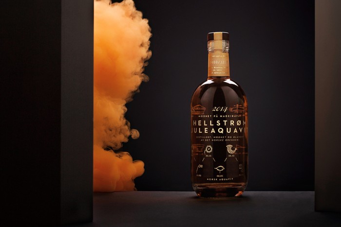
I have a love for Scandinavian design aesthetic. It’s simple. It’s direct. It let’s materials speak without intrusion. All of those features are present in the packaging and brand design for Hellstrom Aquavit. For those that don’t know, aquavit is a flavored spirit predominantly made and found in Scandinavian countries. Its distinctive flavors are dervied from spices and herbs. The main spice is usually caraway or dill.

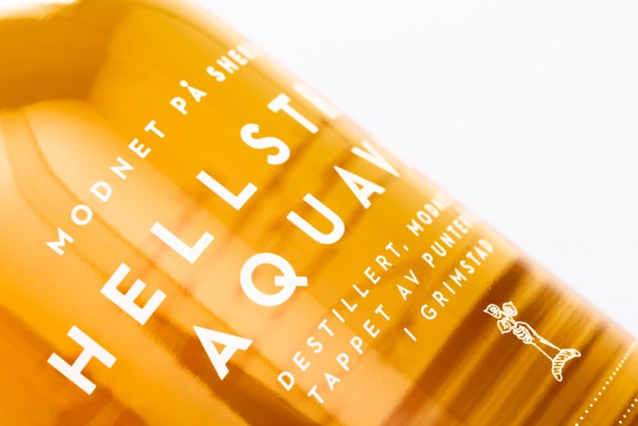
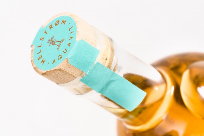
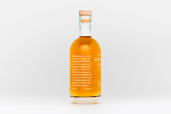
Olson Barbieri’s design for Hellstrom’s aquavit is an exercise in modern minimalism. It’s spearheaded by a art deco inspired typeface set in white over top transparent glass to let the color of the aquavit shine. The rest of the composition mixes in hand-lettering and a dedication to the grid to create a distinctive look for this brand of spirit.

Designed by Olson Barbieri
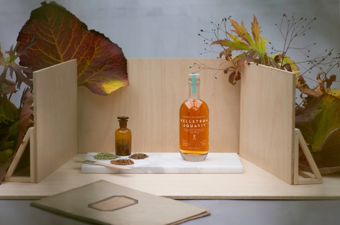
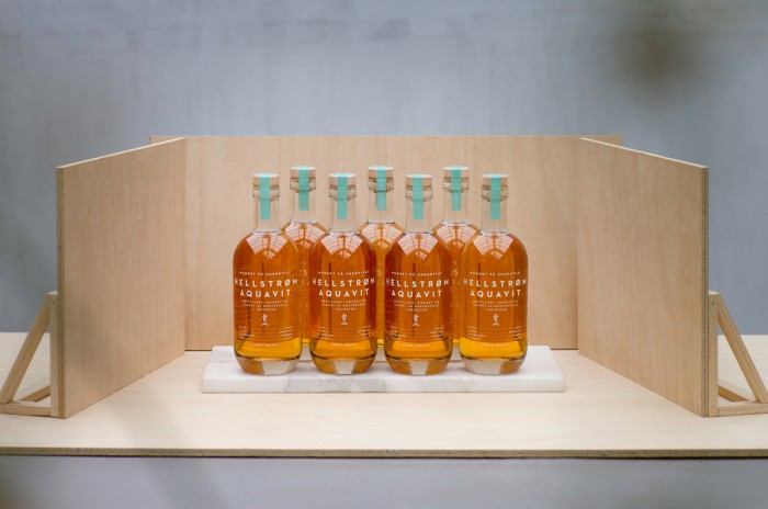
Photography by Sigve Aspelund

af408b9002935.560c6c136beeb

6b840f9002935.560c6ba01e9e4

eb2c0b9002935.560c6b5dedea1

eede0e9002935.560c6de1a8979

7e64179002935.560c6b5d844e4

bf74cd9002935.560c6d0f23992

995ab59002935.560c6d115719f

87eb519002935.560c6c11f3ead

HellstromJuleaquavit3_900

HellstromJuleaquavit1_900

HellstromJuleaquavit4_900


The Forktales Podcast™: Interviews with restaurant industry leaders and visionaries

Restaurant and advertising industry headlines and thinking

Reviews of restaurant experiences from around the globe 

Reviews of our favorite design, business, & restaurant books

Our favorite typography and fonts

Inspiration in your inbox

Get the latest inspiration in your inbox every Monday morning, for FREE!

"*" indicates required fields

This field is for validation purposes and should be left unchanged.

Delicious Bits in your Inbox!

Get the latest and greatest content delivered to your inbox for free!

"*" indicates required fields

This field is for validation purposes and should be left unchanged.