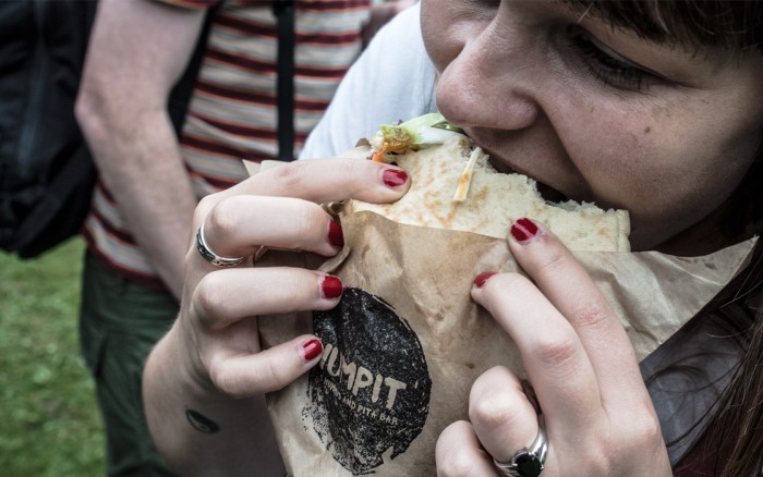
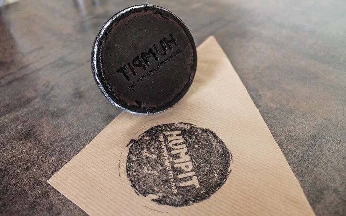
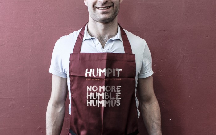
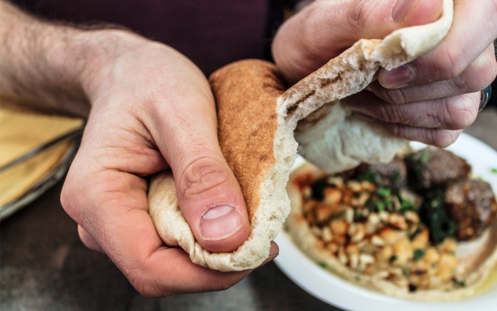
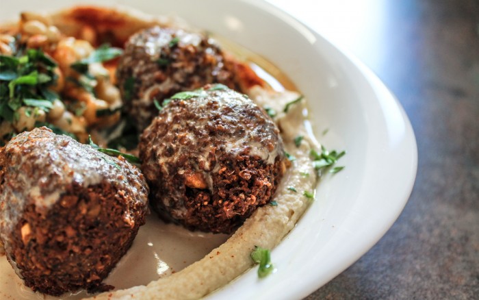
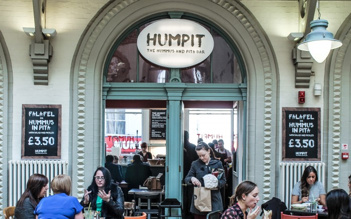
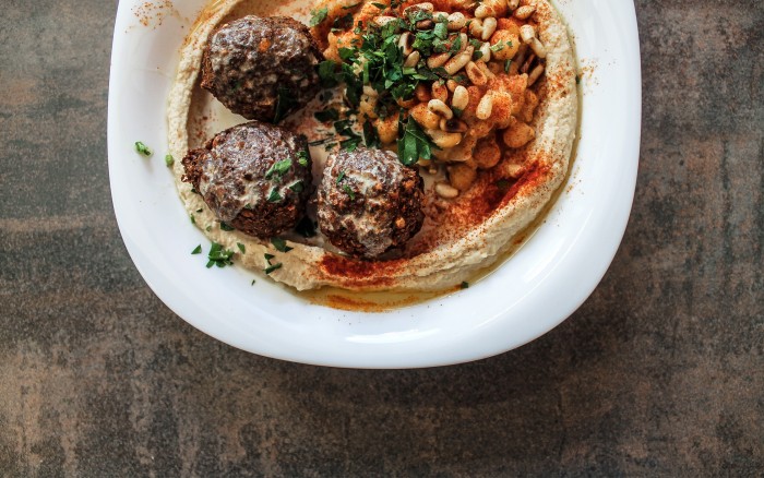
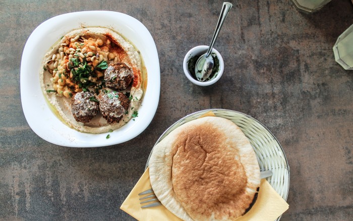
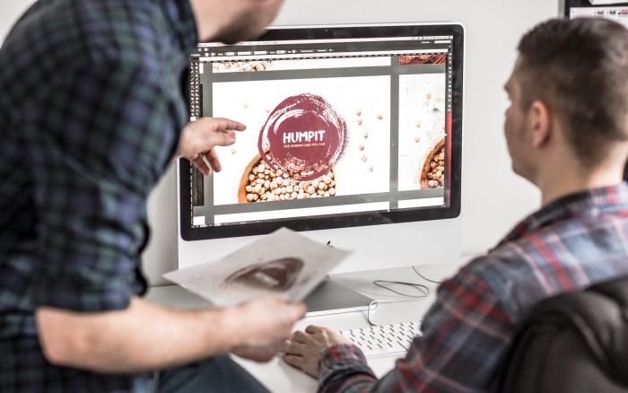
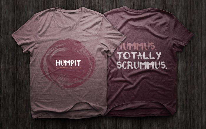
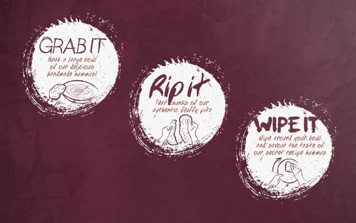
I’ll admit off the bat that I’m not a big fan of the name. It’s a bit clunky to pronounce, however, it’s a bit cheeky and that lends itself quite well to the overall look and feel of the brand identity. The Humpit brand identity is an extensive exploration of rough, gritty dry brush textures. Instead of a dry brush this texture is created with the food. Humpit’s only rule is “no cutlery allowed.” You have to tear a piece of pita and mop up the hummus. Just the way you should.
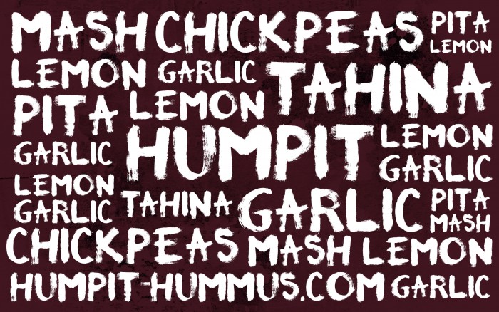
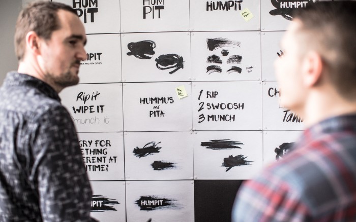
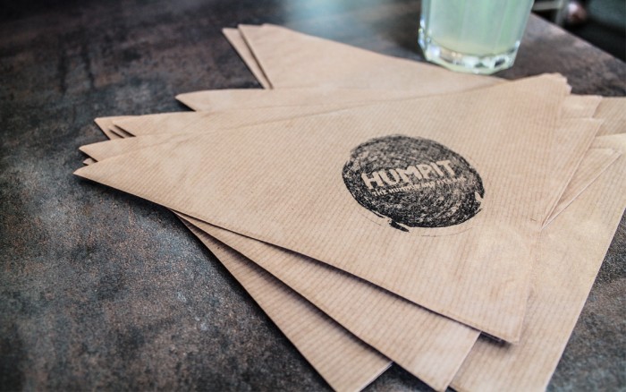
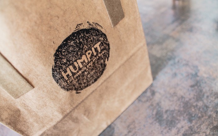
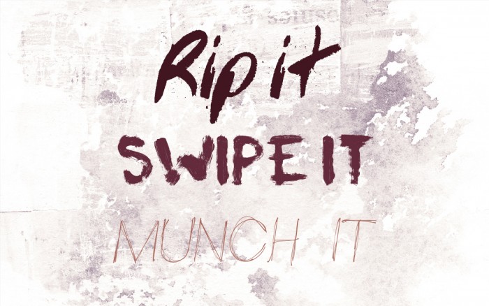
Inspired by the hands-on eating style, we used brush strokes and graphic wipes to create a rough and ready feel throughout the brand – from logo and typography to illustrations and stamps.
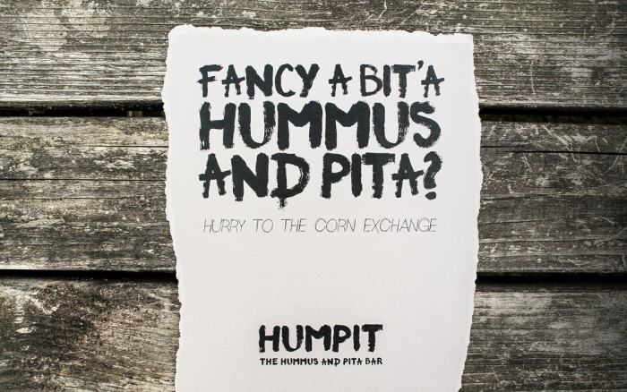
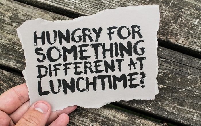
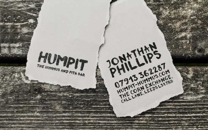
With a lot of our reference points being stony, stripped-back Middle Eastern eateries, our chosen colours and textures seemed to fit perfectly. And if Humpit’s pita breads are meant to be torn, we thought their business cards and flyers should be too!
Designed by ALLGOOD
