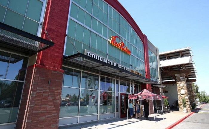
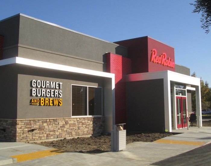
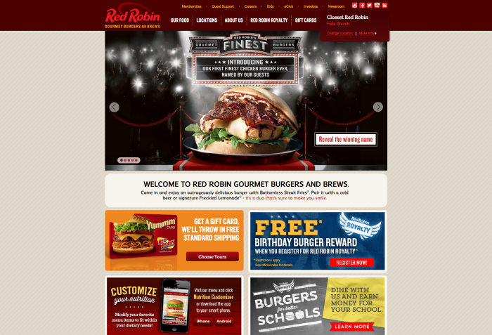
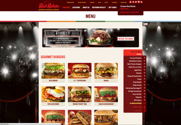
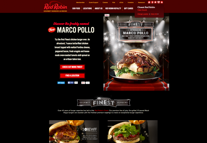
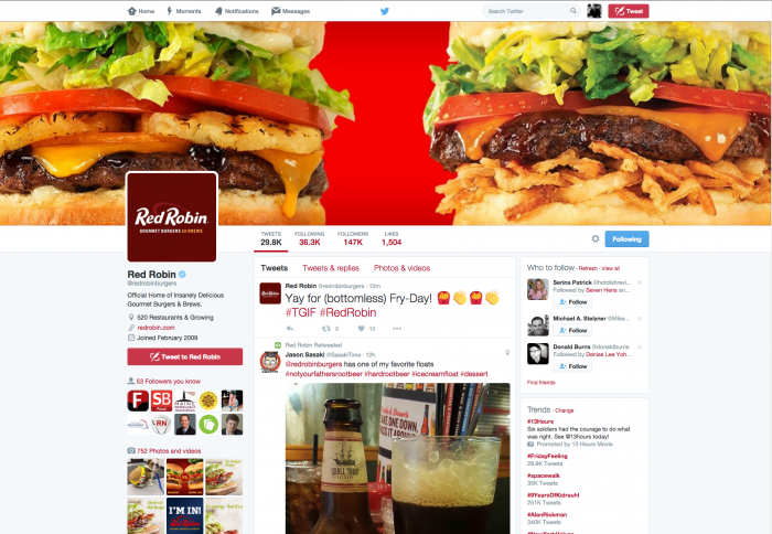
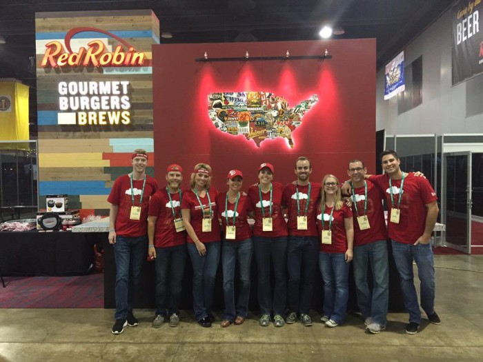
For those keeping their eyes open on these kinds of things you may have noticed a shift in the look of Red Robin. The brand has been undergoing a brand change up which is best seen in their website and new locations.
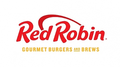
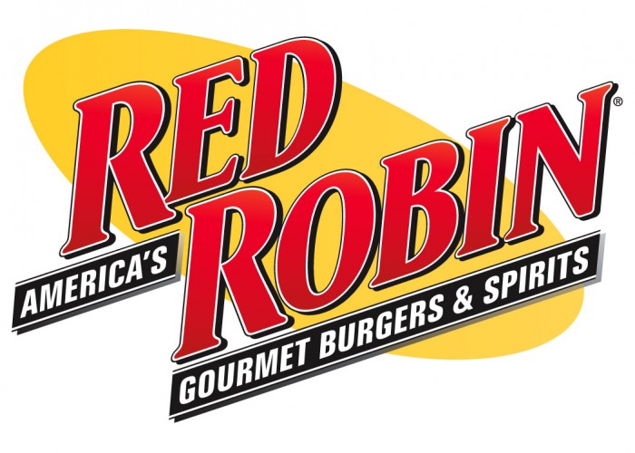
The updated look features reclaimed wood, moddier lighting, and a step away from the campy look of the past. They’ve traded in their longstanding Seifeld-esque logo, for a more refined one. The new logo features a custom typeface that’s a rounded off, semi-script italic sans-serif. It’s so close to committing to many directions, but never quite does leaving it looking incomplete and sophomoric. The graphic device used is none other than our friend the ellipse. Banal, overused and superfluous. What’s good is the logo is simplified and cleaner which follows suit with the brand’s upgraded interior design experience and marketing/advertising direction.
Unfortunately I couldn’t find who was behind the effort, but I did pull select images and posts found around the web of the new look.
