Barrio bar & restaurant branding

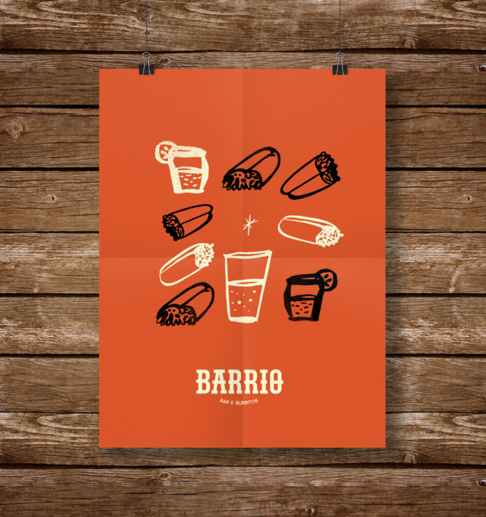
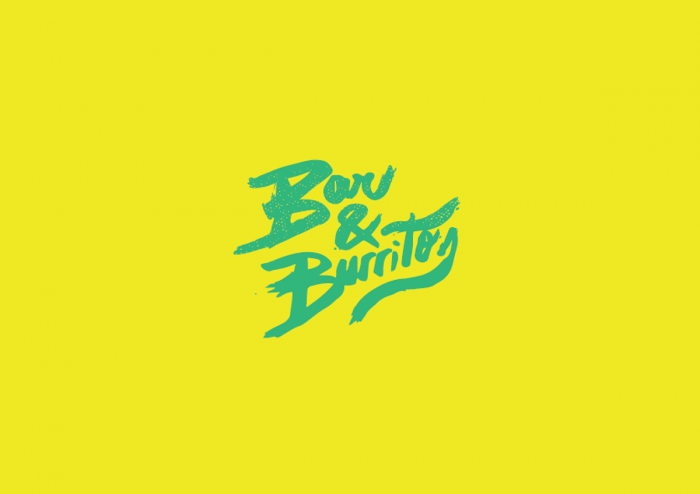
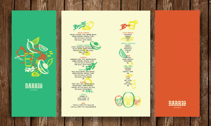
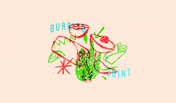
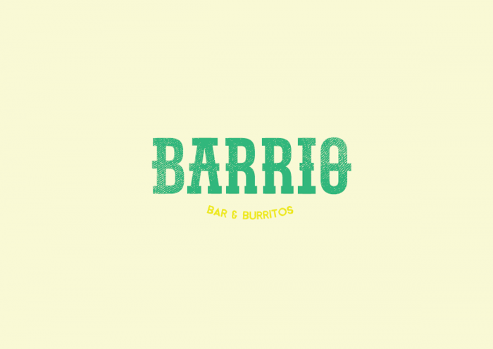
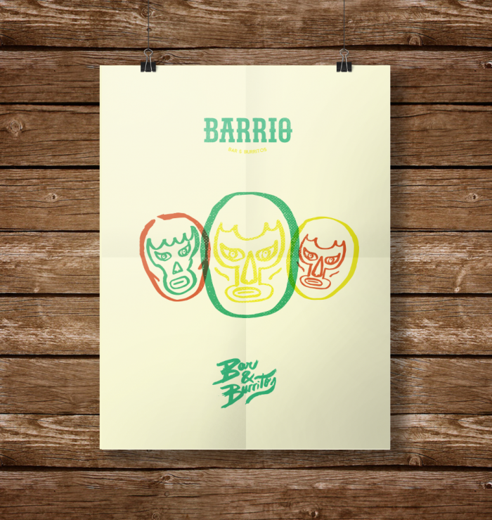
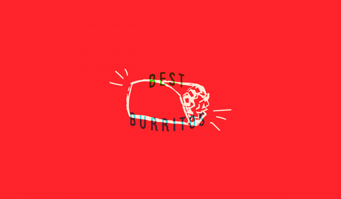
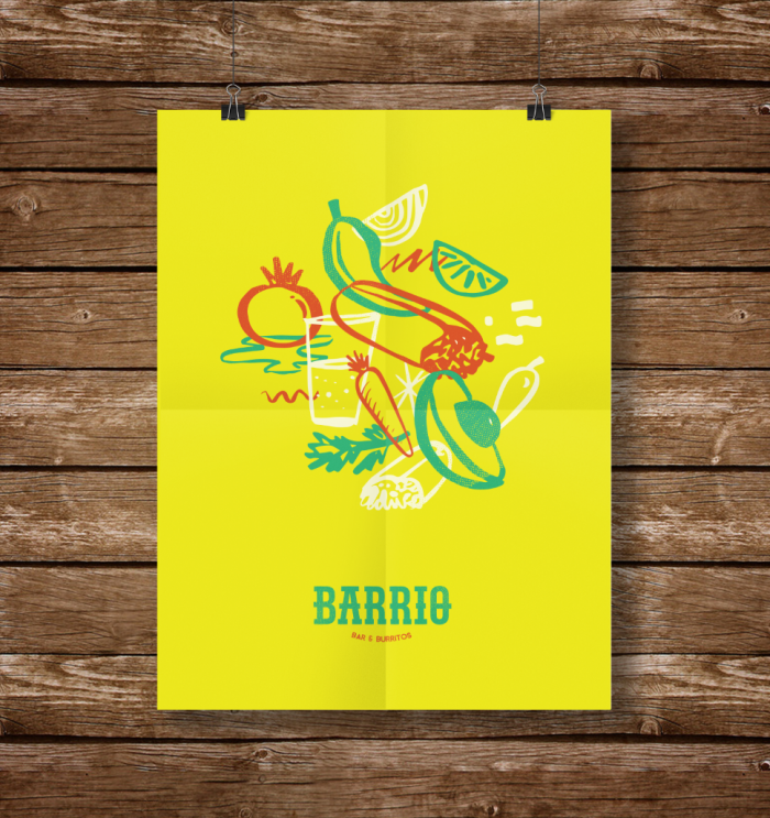
If there is one thing the brand identity for Barrio is not, is subtle. Bright popping fluorescent colors with hand sketched illustrations overlayed in a visual collage. The illustrations communicate a cantina, street style experience that’s fun and upbeat. It screams the preconceived notions of a Buenos Aires vibe. This is a nice look for a burrito bar.

Designed by Hola Bosque
02fb1628489393.55c272ef9ca5f

08abcd28489393.55c272ef9b998

9d425628489393.55c272ef9ed97

64b98428489393.55c272ef9999a

332fa428489393.55c272efa01cb

51554728489393.55c272efa11bb

a3b66728489393.55c272ef9a9b3

dee31628489393.55c272efa213e

e133b428489393.55c272f50becc

The Forktales Podcast™: Interviews with restaurant industry leaders and visionaries

Restaurant and advertising industry headlines and thinking

Reviews of restaurant experiences from around the globe 

Reviews of our favorite design, business, & restaurant books

Our favorite typography and fonts

Inspiration in your inbox

Get the latest inspiration in your inbox every Monday morning, for FREE!

"*" indicates required fields

This field is for validation purposes and should be left unchanged.

Delicious Bits in your Inbox!

Get the latest and greatest content delivered to your inbox for free!

"*" indicates required fields

This field is for validation purposes and should be left unchanged.