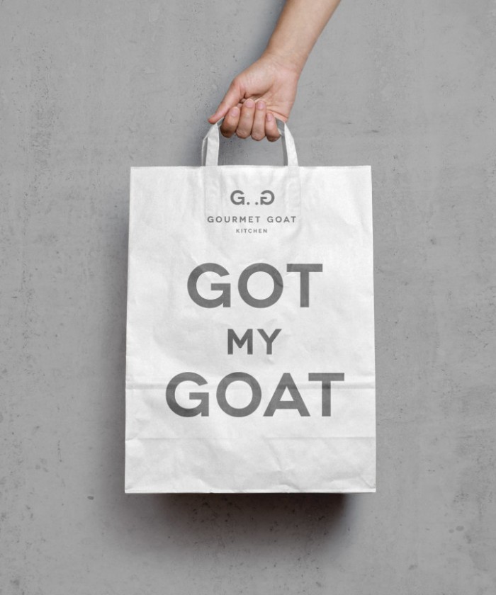
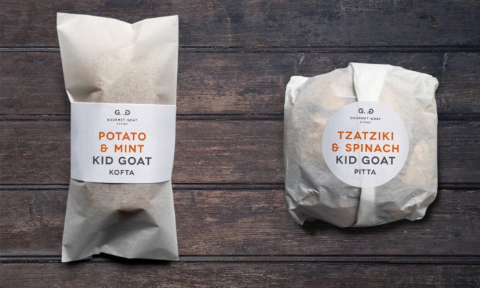
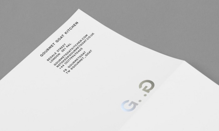
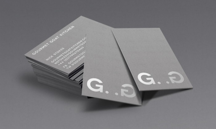
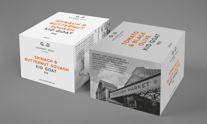
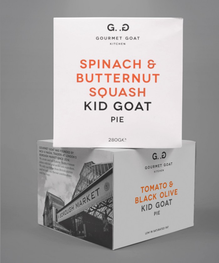
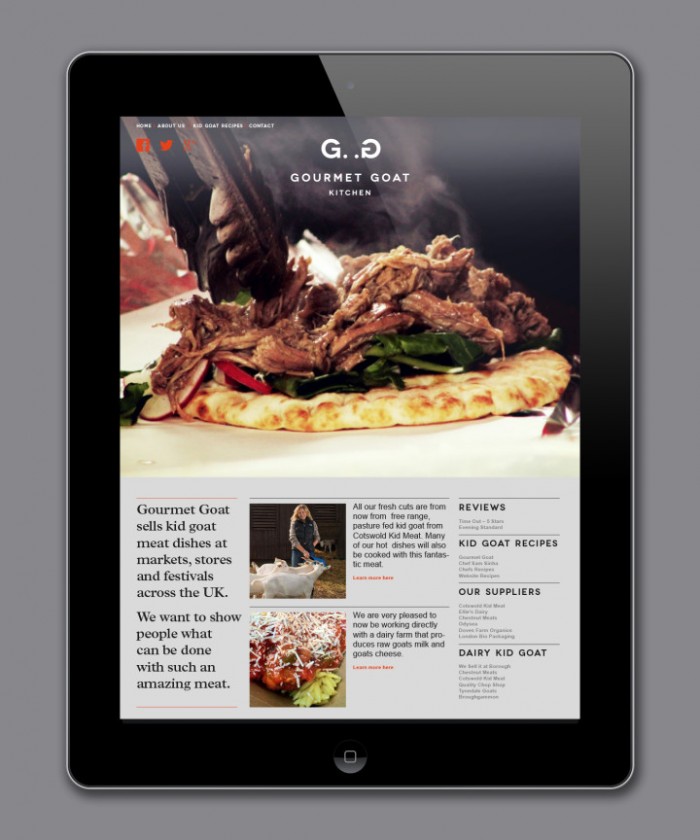
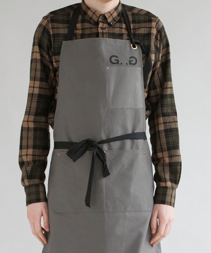
Gourmet Goat’s brand identity is simple, modern and confident. With a strong sans-serif typeface as the hero of the design, the restaurant’s feel is upscale, but approachable. The logo uses the typeface’s natural letterforms to create a goat-like icon. It’s a bit of a stretch, but the idea is a strong one. I’d would’ve like to have seen it explored further so it’s more easily recognized. The design team uses a muted grayscale color palette as the foundation for the brand. This sets the stage for adding a pop of color effectively as you can see in the food packaging design elements.
The restaurant brand creates and sells high end Eastern Mediterranean dishes with kid goat as the core ingredient. The Interabang team describes their approach:
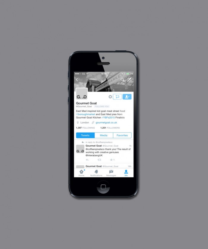
They needed a brand that would help their move into the retail sector, whilst reflecting their passion and position as the UK’s kid goat experts. Our solution was to avoid obvious cultural references, and instead take our cues from the language of premium cuisine. The inherent playfulness in the company name is found in the monogram we created, which takes on a life of its own across the brand touchpoints.
Designed by Interabang
