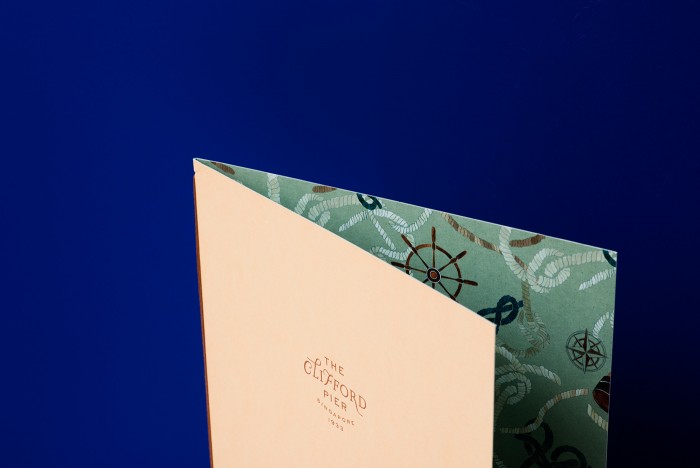
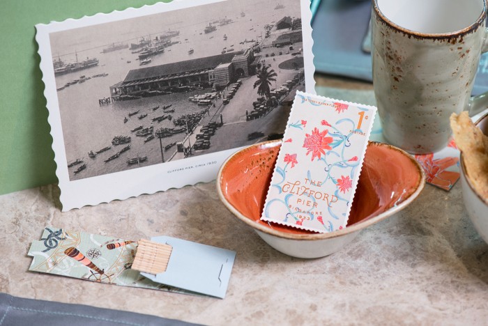
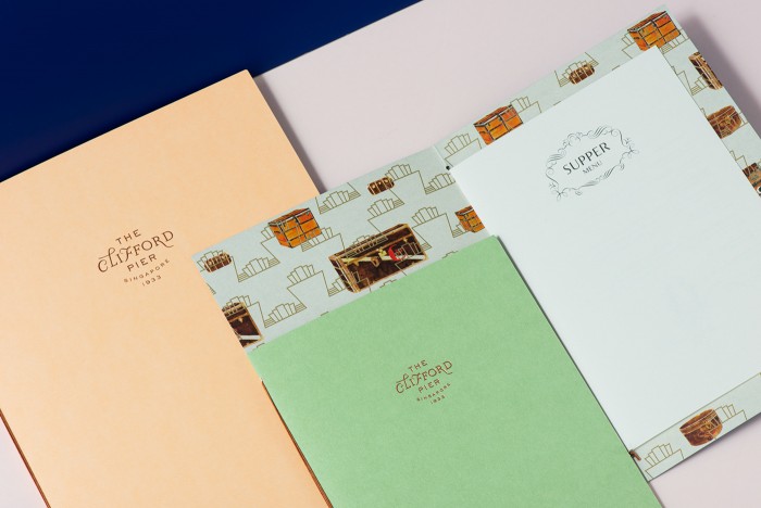
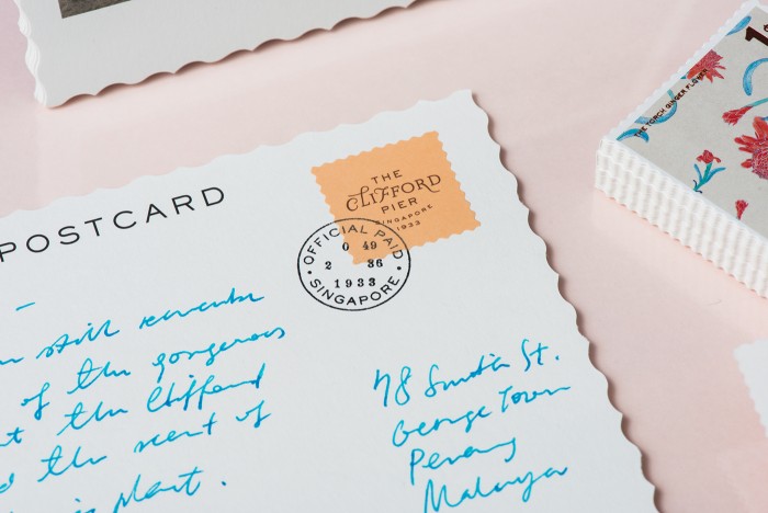
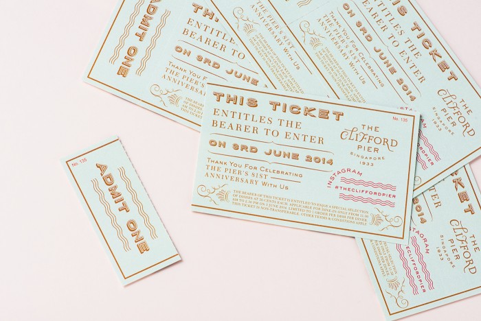
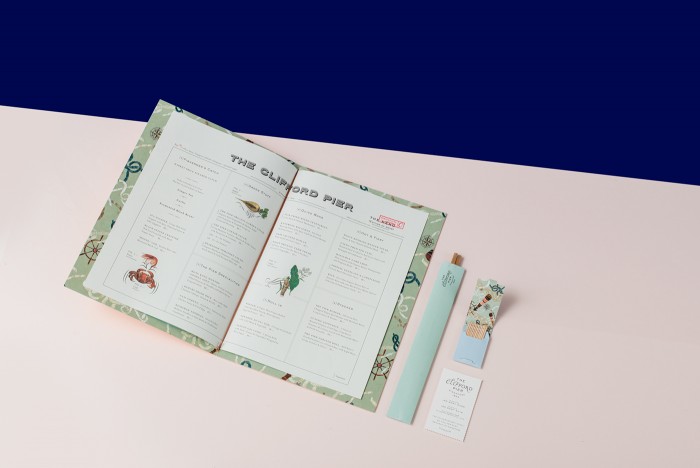
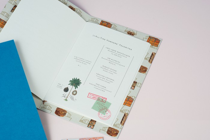
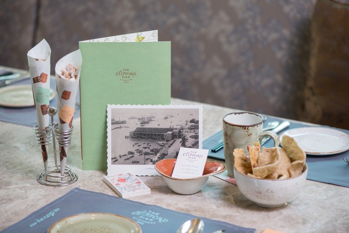
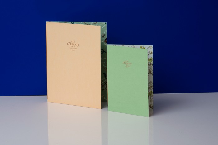
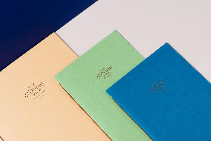
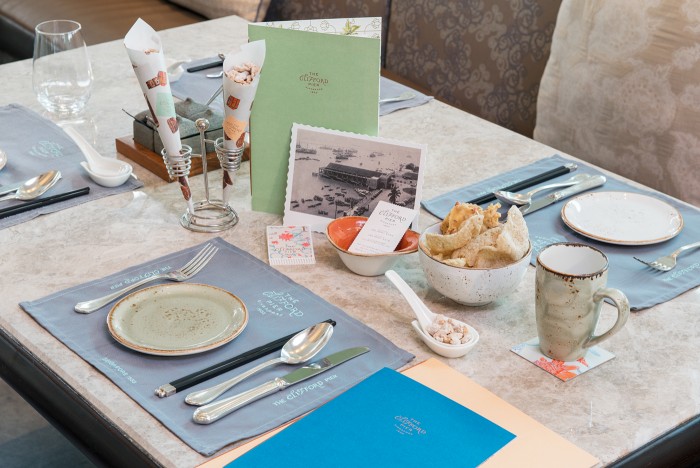
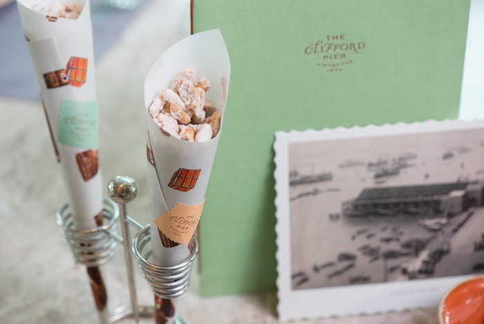
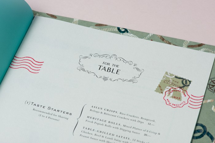
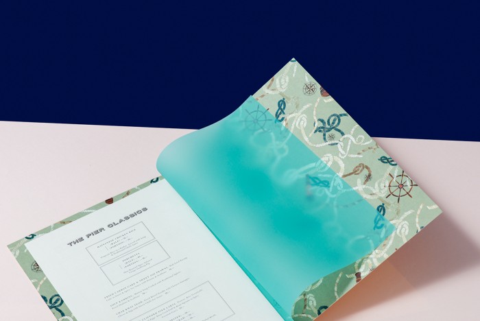
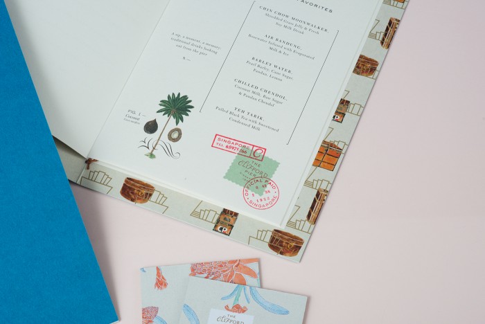
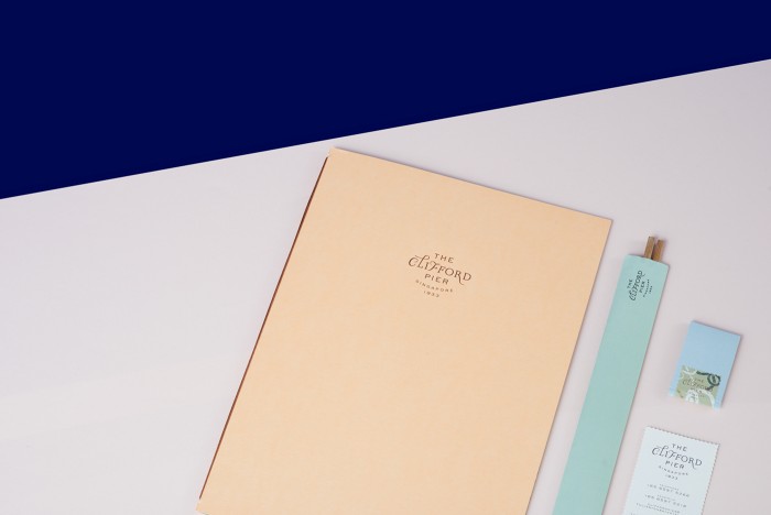
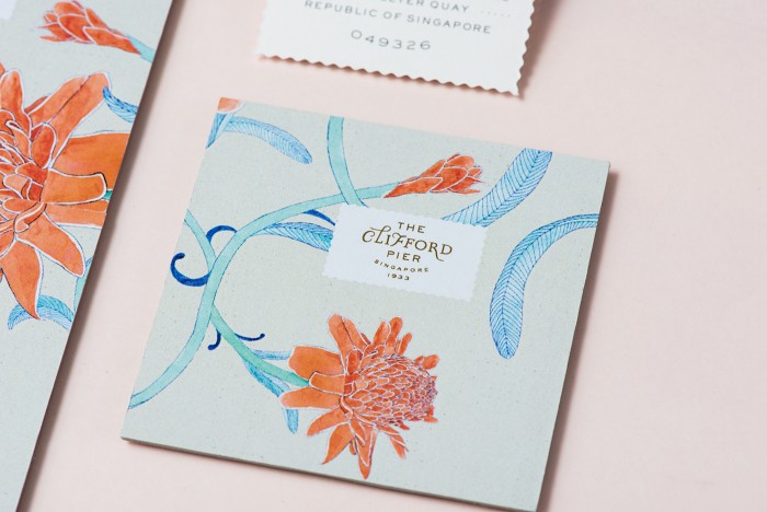
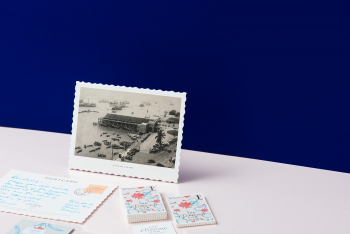
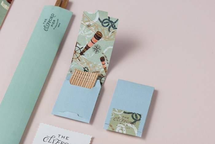
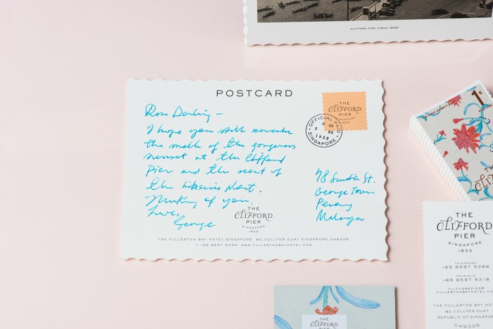
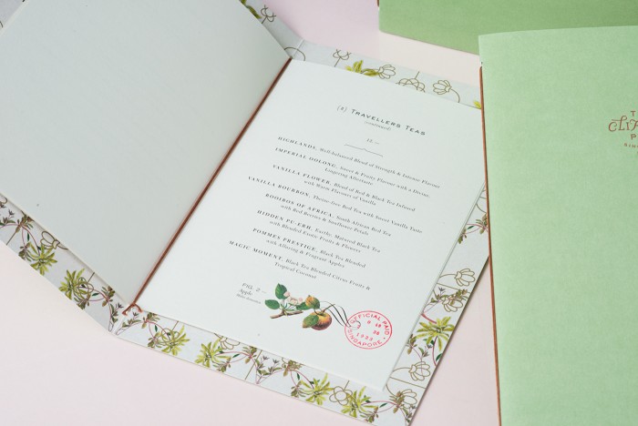
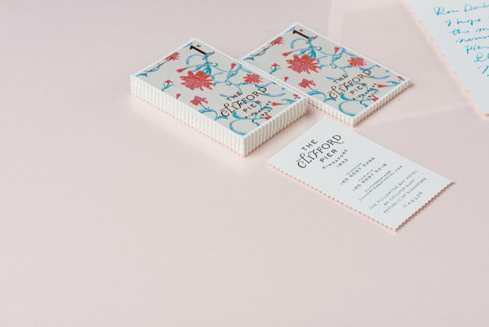
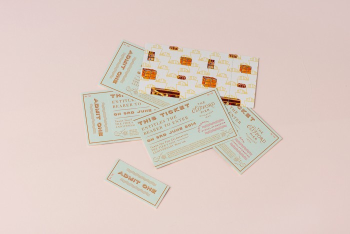
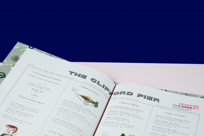
You have to love Foreign Policy Design’s aesthetic. They have a way of pulling in nostalgic, vintage elements then graciously updating them to fit into the now. Their work for Clifford Pier restaurant is case in point. The team leverages classic photography and wallpaper-esque patterns to create micro-moments of nostalgia and charm. From the dichotomy created between the simple flat planes of color and the uber-busy nautical patterns in the menu design, to the simple vintage postcard look, the team establishes a heritage look for Clifford Pier. Here is the firm’s inspiration from their portfolio page:
Sharing an entity with its heritage, The Clifford Pier draws from its legacy as a bustling port in Singapore during the 1930s. Ginger flower motifs pay homage to William Farquhar who was fascinated with local botany during his time on the island. Collaterals with color palette in sea-foam, coral and caspian blue; classic postage stamps accented with tropical flora and fauna, along with architectural elements, are reminiscent of the glorious voyages that set sail from this historical landmark.
Designed by Foreign Policy Design Group
