Bar Ginger branding

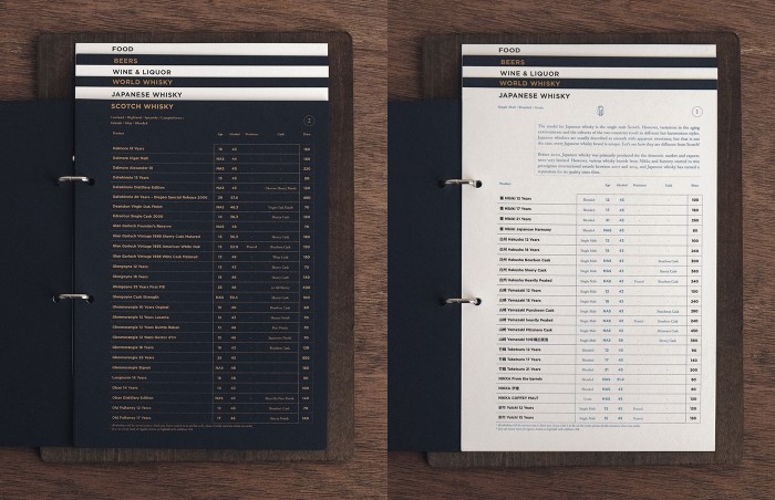
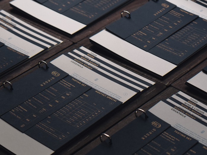
I’ve been working a lot with metallics for two different projects in our studio at the moment. This identity popped out at me for its simple lines and metallic ink usage. The grid layouts are so refined and excellent with just the right amount of nod to classic design. The highly geographic graphic forms create an architectural aesthetic that’s nearly formulaic. The Vita Mak team explains their approach:

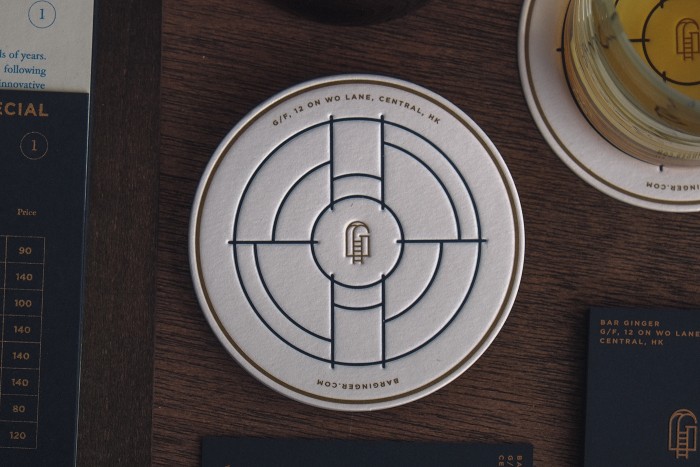
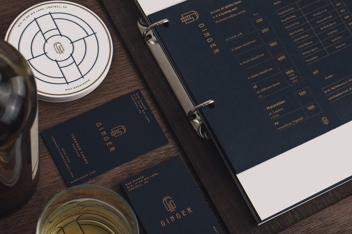
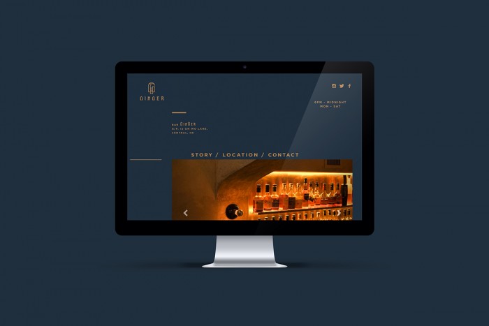
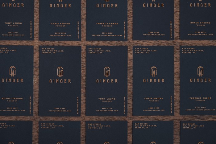
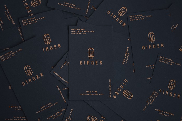
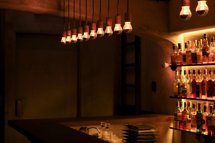
The identity is inspired by Art deco style and integrates with contemporary style, describes a scene about climbing over a wall with a ladder, get into another side of world for pure taste experience. This scene is embed in the Logo with the shape of ‘G’ of Ginger – name of the bar. Custom typeface made for logotype express medieval visual element subtly where could be found in Bar interior.

Designed by Vita Mak & Power Nap Over

1b847632311569.5679a23ff2ae3

3fcc2c32311569.567ae8116f486

4c45de32311569.5679a4e186cc1

8d136532311569.5679a23feed2d

8e94d932311569.567ae81173ac3

32ddb132311569.567ae8117289d

72d0f932311569.567ae811794c8

658ac832311569.567ae8117b6e4

66631632311569.567ae8116a80b

b17a3e32311569.567ae8117a676

d7595732311569.5679a23ff0336

f686d732311569.567ae8116cec3

The Forktales Podcast™: Interviews with restaurant industry leaders and visionaries

Restaurant and advertising industry headlines and thinking

Reviews of restaurant experiences from around the globe 

Reviews of our favorite design, business, & restaurant books

Our favorite typography and fonts

Inspiration in your inbox

Get the latest inspiration in your inbox every Monday morning, for FREE!

"*" indicates required fields

This field is for validation purposes and should be left unchanged.

Delicious Bits in your Inbox!

Get the latest and greatest content delivered to your inbox for free!

"*" indicates required fields

This field is for validation purposes and should be left unchanged.