Dark wood on the walls? Check. White subway tile? Check. Word pattern of ingredients on walls? Check. “Farm to Table”? Check. “Fresh, never frozen, farm-raised beef”? Check. Congratulations Johnny Rockets, you just entered 2010.
Many brands in the casual dining space are feeling the threat of the fast casual evolution. Rather than re-evaluating their business model to figure out what doesn’t work, they’ve turned to brand evolution as a means to “attract the Millennial market.” While I don’t disagree that the brand for restaurants like Johnny Rockets, TGI Fridays, and others are in dire need of an upgrade, the root of the problem has yet to be identified and remedied in an innovative manner. Let’s face it, people don’t need or want the casual dining experience. We can order just fine on our own, and the level of service is borderline abysmal on the best days. Until the casual dining world gets privy to the fact, or, better yet, until they get the brass tacks to actually make real change, these rebrands are going to be simply putting lipstick on a pig.
But, let’s talk about Johnny Rockets new prototype design in detail. It’s obvious they checked the boxes on “what Millennials want” when it comes to interiors missing the opportunity to do something truly unique. This redesign firmly sets the brand the category of forgettable. In fact, one could easily remove the new logo for Johnny Rockets (also rather banal), and slap up a Fridays, Chili’s, Ruby Tuesday, Rocking Wednesday’s, Happy Thursdays logo on there and no one would notice a difference. There is no heart in this design, and I can only assume in the brand itself.
Restaurant brands are too busy playing it safe, or simply copying what they think works for today’s market that they’re completely missing the point. It’s not “farm fresh” we want. It’s not hipper interiors that Millennials love. It’s character and a life beyond shoveling burgers onto our plates. It’s a bigger ideal and a commitment to owning a unique vibe and lifestyle that really speaks to people. Be different, be unique, and by God, be your true self.
If I’m coming off jaded or a bit perturbed it’s because watching an investment of this size relegate itself to an unremarkable ploy to try to get “Millennial” is just one of a multitude that miss the mark completely. So, hold on tight, I’m about to unleash… let’s get into the details, shall we?
![]()
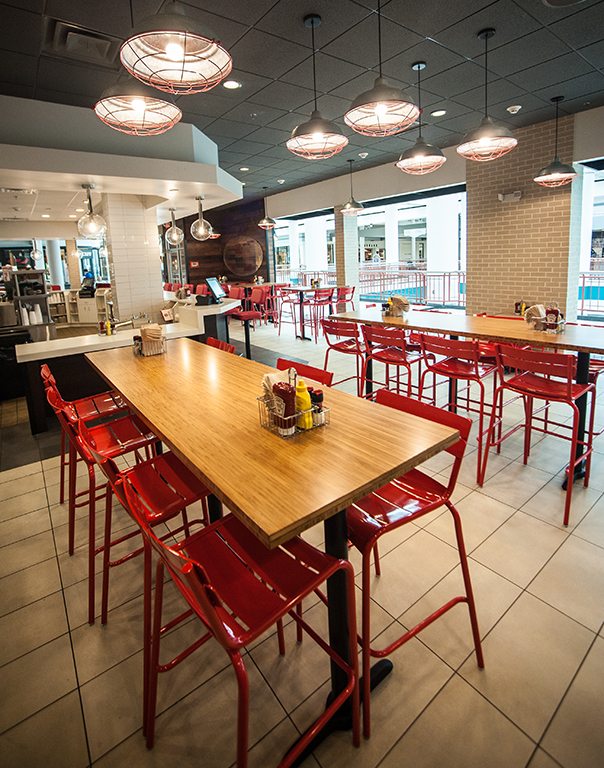
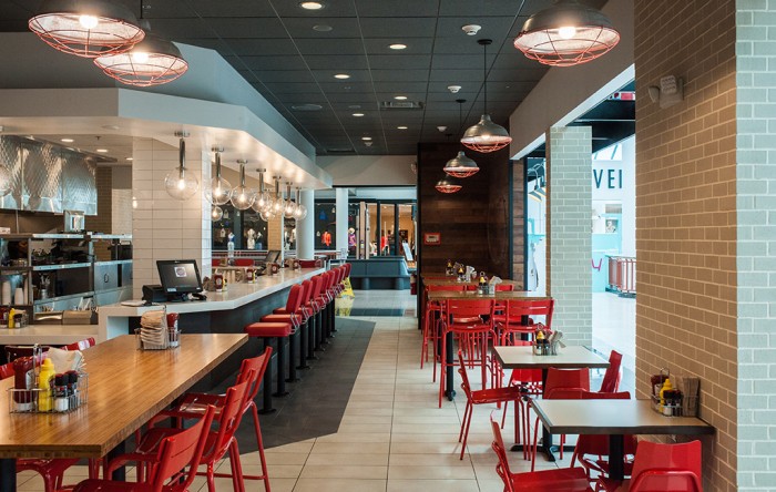
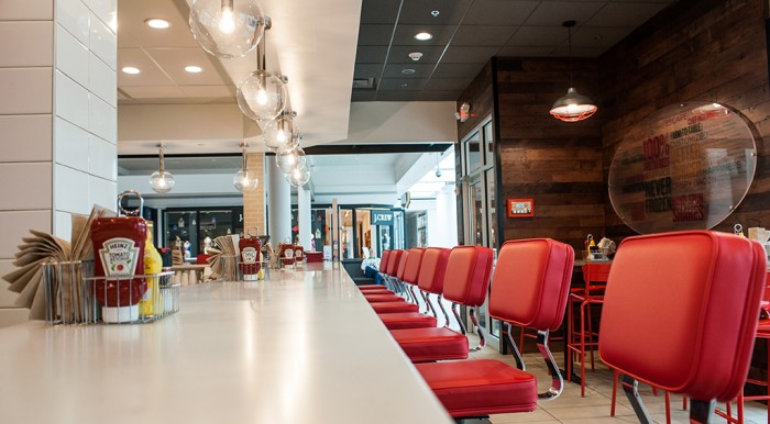
Congrats. This looks just like Friday’s and every other casual chain. Unremarkable.
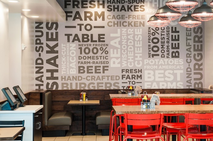
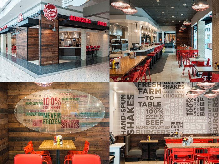
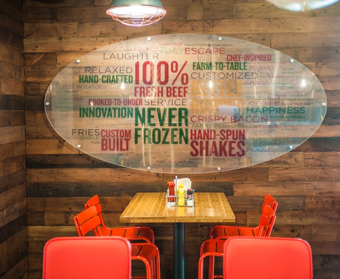
A wall of words that represent food? How novel. Everything on this wall isn’t a claim to fame, it’s how things SHOULD be done. You’re proud that your food isn’t borderline prison food? Well… good for you.
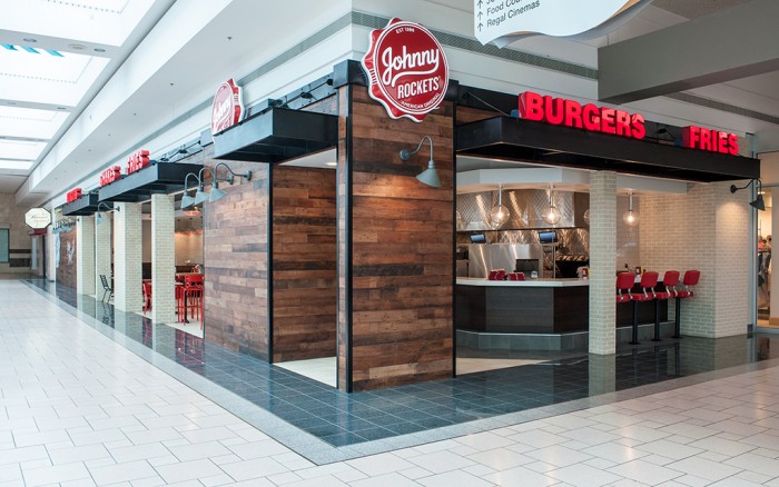
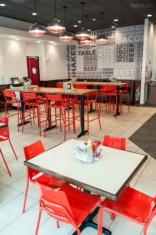
Yup. This is a restaurant. Which one? Who knows and who cares?
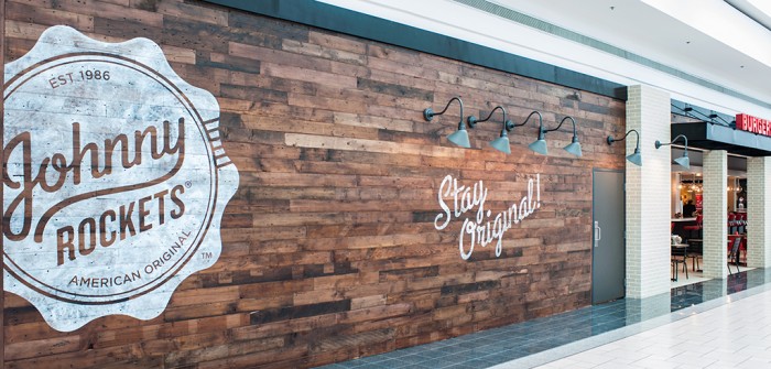
“Stay original.” Yeah. I think we’re good at that, but maybe Johnny Rockets needs to read its own wall.
This is the ugliest thing I’ve seen in a long time. The yellow letters are unreadable, and the rest just looks terrible and cheap.

“Hey look, barn lights shining on wood? We’re so Millennial, buy our burgers.”