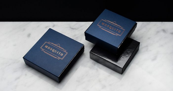
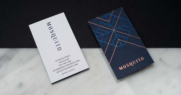
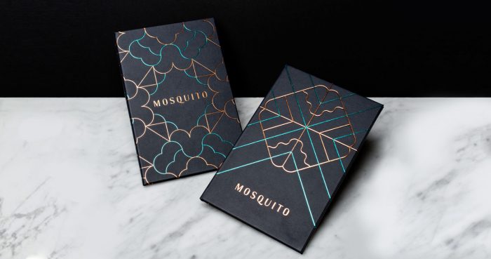
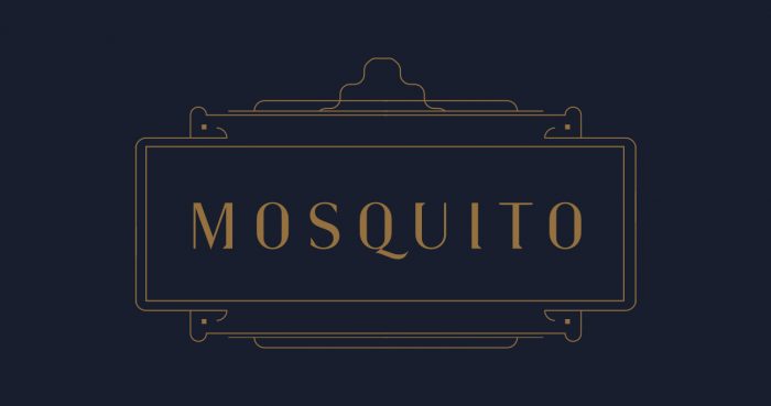
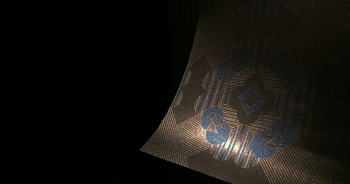
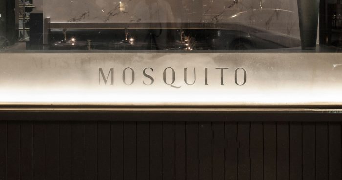
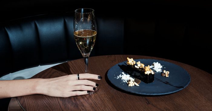
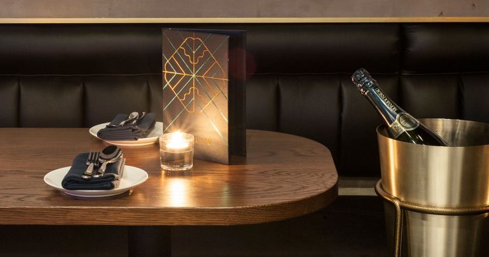
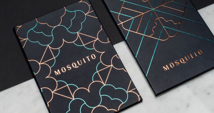
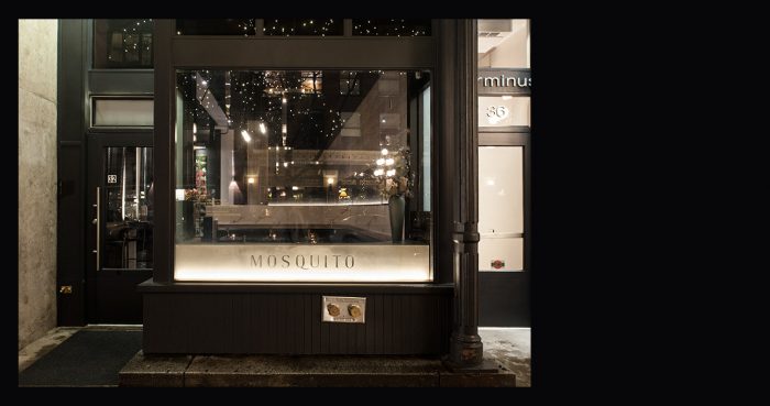
Mosquito bar’s brand identity design direction is best described as Art Deco, but it’s fresher and new. The bar “has a simple offering : a champagne bar without the caviar and a dessert bar without the frosting,” states the Glasfurd & Walker website. Based in Vancouver, this brand has a moody, and semi-dramatic atmosphere which the brand identity does an excellent job of communicating.
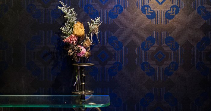
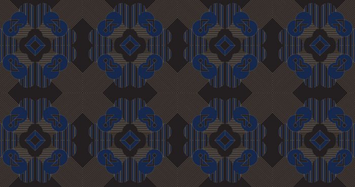
Lead by geometric patterns and a bounding box elements, the brand is refined and elegant. What helps this pop is the use of two foil stamp colors: blue and gold. The typography is interesting in that’s it’s not a typical grotesk san-serif, nor is it remotely close to a serif. However it does fluctuate in thickness on downstrokes giving it a transitional look. It’s distinctive and serves as a strong statement without the need for a graphic accompaniment.
Designed by Glasfurd & Walker